Home advantage in test cricket
February 4, 2019
As England began their batting collapse in the recent first test vs West Indies, there was a discussion in the office about how poorly a lot of teams seem to travel in test cricket at the moment, and whether or not this has changed recently.
This seemed like a great question to try and answer with some data analysis so I scraped test match results since 1946 off of ESPN cricinfo and dived in. I chose 1946 simply so there we no gaps in the data I was collecting (the results are stored by year), and it seemed a sensible enough point to understand “modern” cricket from.
The first thing I wanted to look at was whether or not the win rate of home teams had changed much over time. The answer is that yes, it has gotten more likely for the home team to win a test match but a big part of this is down to the falling number of draws.
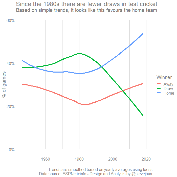
This graph was built from yearly data, the figures are simply the total number of tests won by the home and away teams divided by the total number of test matches played in that year. Throughout this post I’ve made heavy use of loess, which is a type of regression, to produce smooth lines for the visualisations. I think this helps to make sense of trends in quite a messy dataset, but it is worth noting that the patterns you will see in the raw data are less clear than these summaries might suggest.
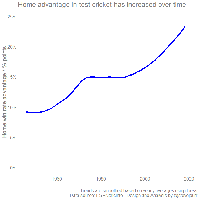
As the thing we ultimately care about is “Home advantage” we can simplify this graph to only look at one variable. Throughout I’m going to consider home advantage to be the difference in win rate between the home team and the away team. So if the home team wins 50% of the time, and the away team 30% of the time then there’s a home advantage of 20% points.
For transparency, here is the same graph with all the individual yearly figures shown as dots:
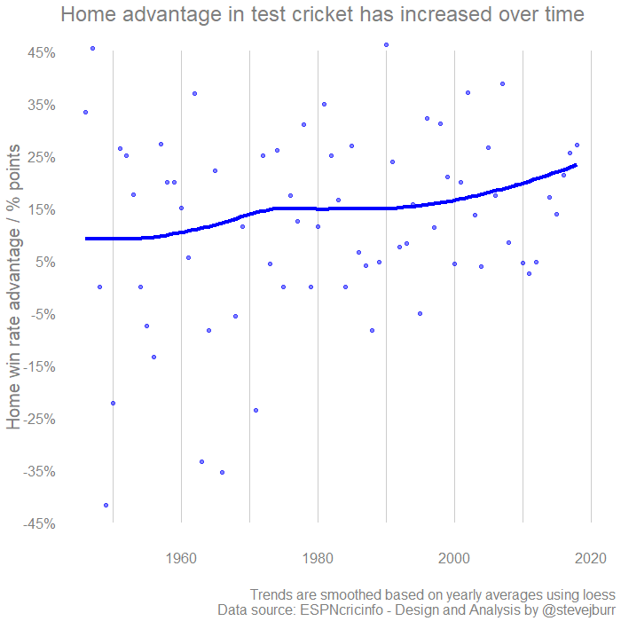
Because it makes the data easier to visualise, I’ve chosen to only use the smoothed data for all the other plots.
At this point, we can be relatively confident that we are seeing the home team winning more often, but this isn’t a perfect measure of the home advantage. It might be the case that the better teams are choosing to play at home more often, and so top line win rates are failing to accurate account for the relative strength of the two teams.
To try and get around this, I’ve turned to the Elo system. This was initially developed for chess, but has been repurposed for use with many other sports as well as card and video games. While working on this post, I referenced a few other great articles here and here.
The way an Elo system works is that each team has a rating score which represents how good they are. This begins at 1000 for all teams and then is updated after each game. The winning team gains points, while the losing team loses an equivalent number of points. The amount of points gained/lost depends on the likelihood of the result. If an underdog wins, then they will gain a significant number of points whereas a massive favourite winning wouldn’t gain many points.
The number of points shifted after each game also depends on a parameter called a “k” factor - for this analysis I have set it at 30 based on some fairly rough analysis.
One challenge within cricket is that draws can be the result of close games but also poor weather. This isn’t taken into account within the Elo ratings, it would perhaps be better to exclude the result of games where a minimum number of days / overs were not completed but I haven’t looked into this at present. The Elo approach also only predicts the chances of one side or the other winning, it does not directly predict the probability of there being a draw. I don’t think that is a major issue for the purposes I’m using it for here.
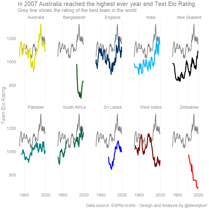
If we calculate test cricket Elo ratings for major test playing nations since 1946 we get the following:
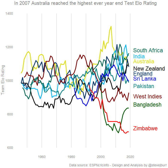
This suggests that India and South Africa are currently the best teams in the world and that England really should be doing better vs the West Indies. These ratings are not perfectly aligned to the ICC Rankings, the top two teams are swapped and England stand out as being much lower here (though both approaches have England/New Zealand/Australia at very similar ratings).
Data viz aside - Really this is too many lines to have in one chart, and too many of the cricketting nations have very similar colour choices for their ODI kits making it hard to distinguish the lines here. Perhaps this alternative is better?
Using this system, the difference in Elo rating between two teams allows us to calculate directly the probability of each side winning the game. Once we have that, we can get back to answering the original question of home advantage. Across each year, we can compare the difference in observed win rates for home teams compared to what we would expect based on the relative strengths of the two teams.
This shows a similar pattern to the naive win rate approach, but with a smaller magnitude -
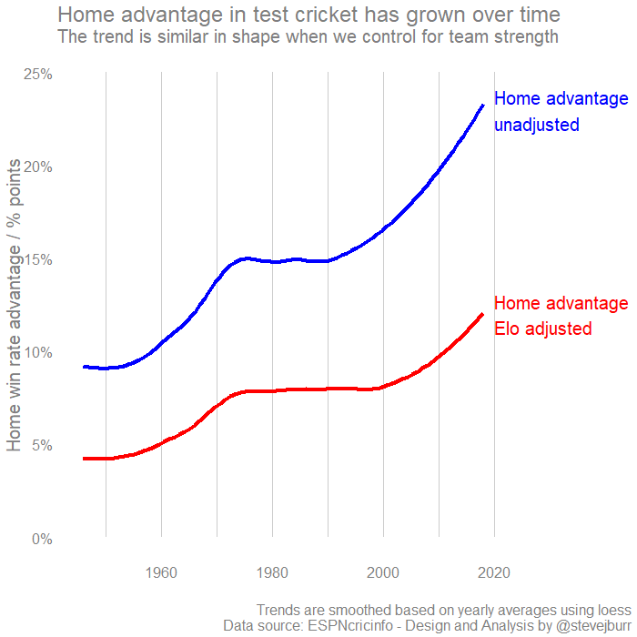
This suggests, that on average a nation playing a home test match has a win rate which is +10% points higher than the skill difference between the teams would suggest. Before the first England vs West Indies test the Elo ratings would have suggested that West Indies only had a 24% chance of winning - adjusting for home advantage this rises to around 34% - so the stats don’t hide England’s blushes, they should have won this series even away from home.
I hope you’ve found this an interesting read - I’d love to read comments either below or on twitter. All the code I’ve used to run this analysis along with the test cricket win rate and Elo datsets can be found on Github.