MakeoverMonday 10-09-2018
September 15, 2018
This week’s #MakeoverMonday challenge was to take a dataset contributed by ProPublica of spending by politicians/government agencies at properties owned by Donald Trump.
They had already created an interactive visualisation as part of their original article:
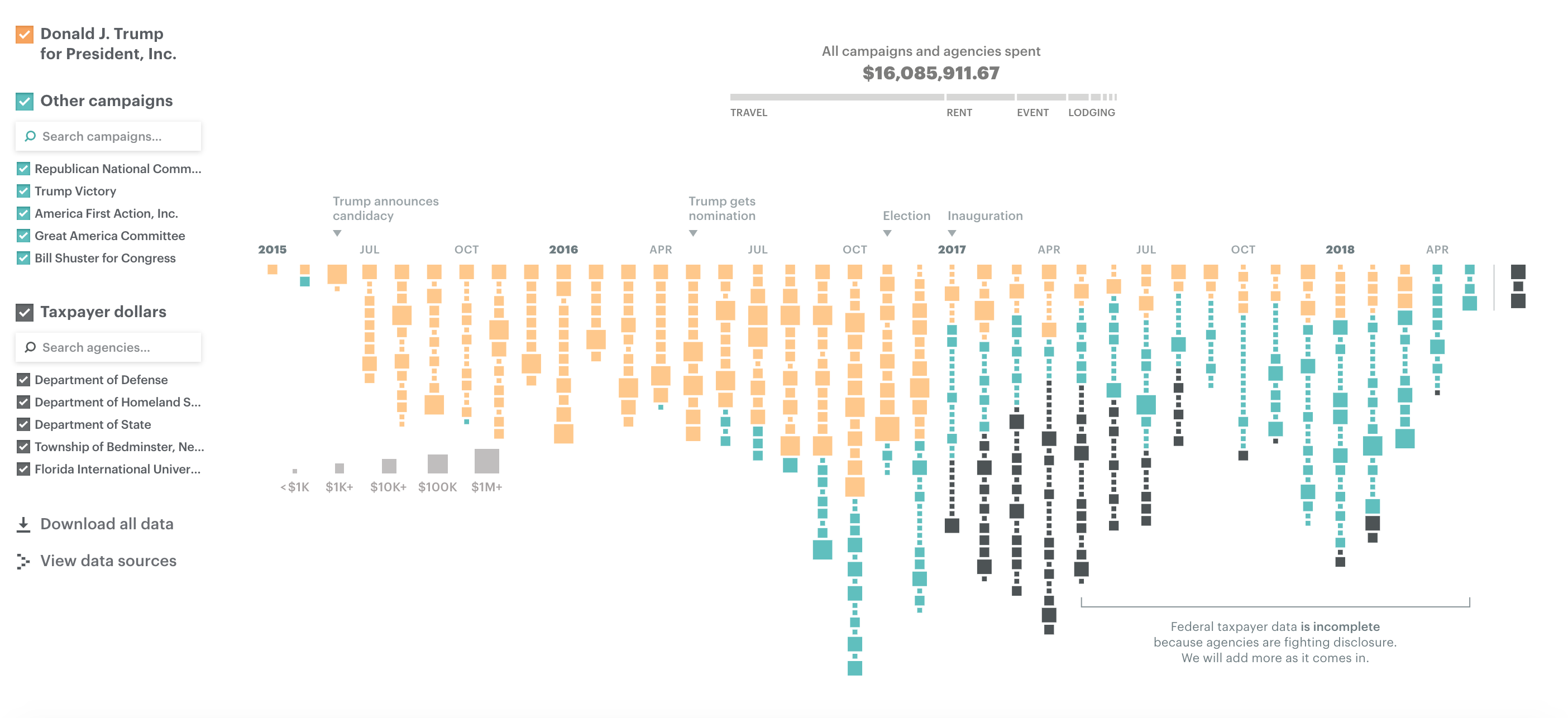
The original piece looks wonderful, and as an interactive piece which you can take your time exploring it provides all the data you would need. However, though it’s great to see all the invidiual pieces of expenditure the different sized boxes are fairly similarly sized and it’s really hard to visually understand the aggregated totals.
Initially, I wanted to try and keep the individual level detail, while also showing the absolute scale more clearly. Unfortunately I couldn’t find a good way to do this. During this process, I decided that the two things I was most interested in were the categorisation of the spending (e.g. travel, rent) and the type of group which made the spending (e.g. Trump’s campaign, Government Organisations).
I decided that the best way to show this information was a simple stacked bar:
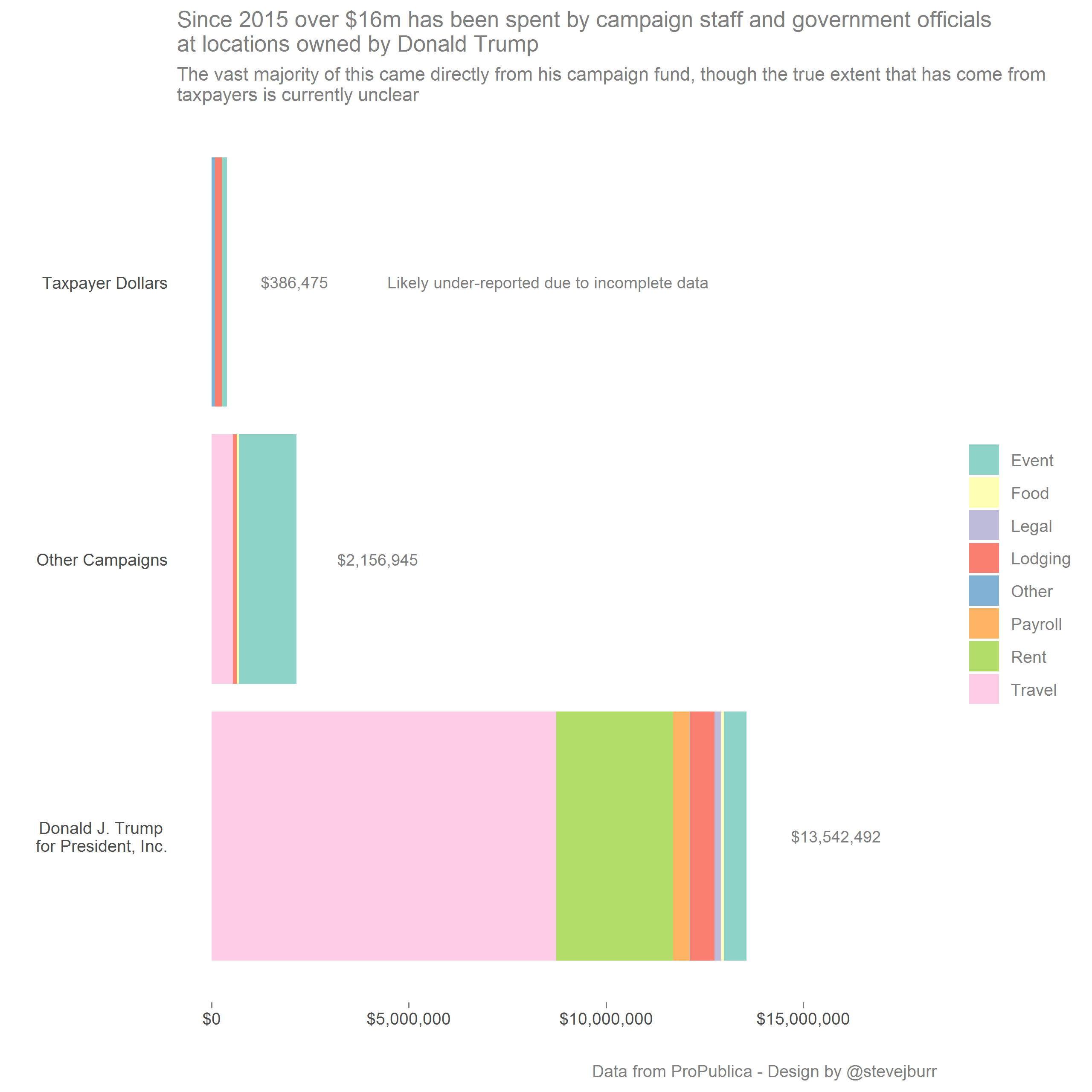
This makes the scale of all the different expenses really clear - most of the money is a result of Trump’s presidential campaign spending at properties he owns, rather than a huge transfer of money directly from Government organisations / taxpayers (though this data is noted as incomplete).
With this number of categories, it becomes hard to pick a number of colours - I ended up using one of the ColorBrewer scales which are built into ggplot2. These are OK, but I’m not entirely happy with these - as usual having spent a lot of time on the data manipulation / exploration I didn’t have the time to really think about these final design decisions.
Ultimately, I’m not sure there’s much interesting to say with the dataset - there are some nicely designed charts people have put together - but there isn’t much that grabs my attention beyond the topline figure. For that reason, I really like Charlie Hutcheson’s submission which presents this information in a clear way without adding anything too sensationsist on top.
All my code for this project is on my Github.