MakeoverMonday 12-11-2018
November 19, 2018
The #MakeoverMonday topic for this week was diversity amongst tech companies. The original visualisation was by David McCandless and takes the form of a number of bar charts:
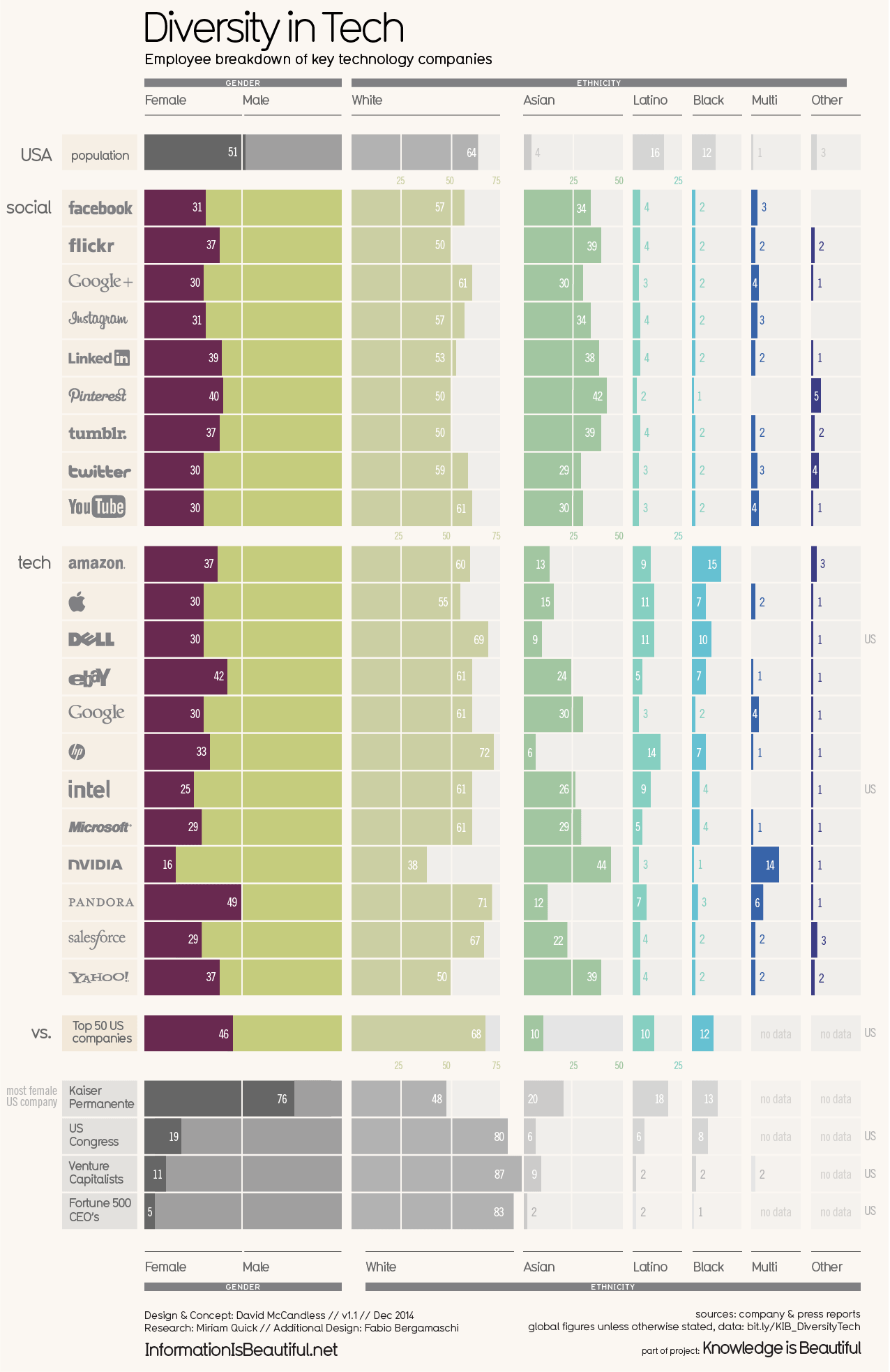
What do I like about the original?
- It’s very nicely designed, it looks really clean.
- Using the company logos is a great touch which makes it easier to recognise what the bars represent.
- The inclusion of benchmarks like the US population and Congress adds useful context for interpretting the visualisation.
What don’t I like about the original?
- I’m not sure that segmenting the bars at 50% or 25% intervals is that helpful, though it looks nice to the eye.
- I think it would be worth trying to make it easier to visually compare each company to the US population benchmark.
- I’m not sure of the purpose of the light grey bars in the background, I find them a bit distracting even though they do look nice.
I came up with a similar approach, using something close to a bullet chart to show the data:
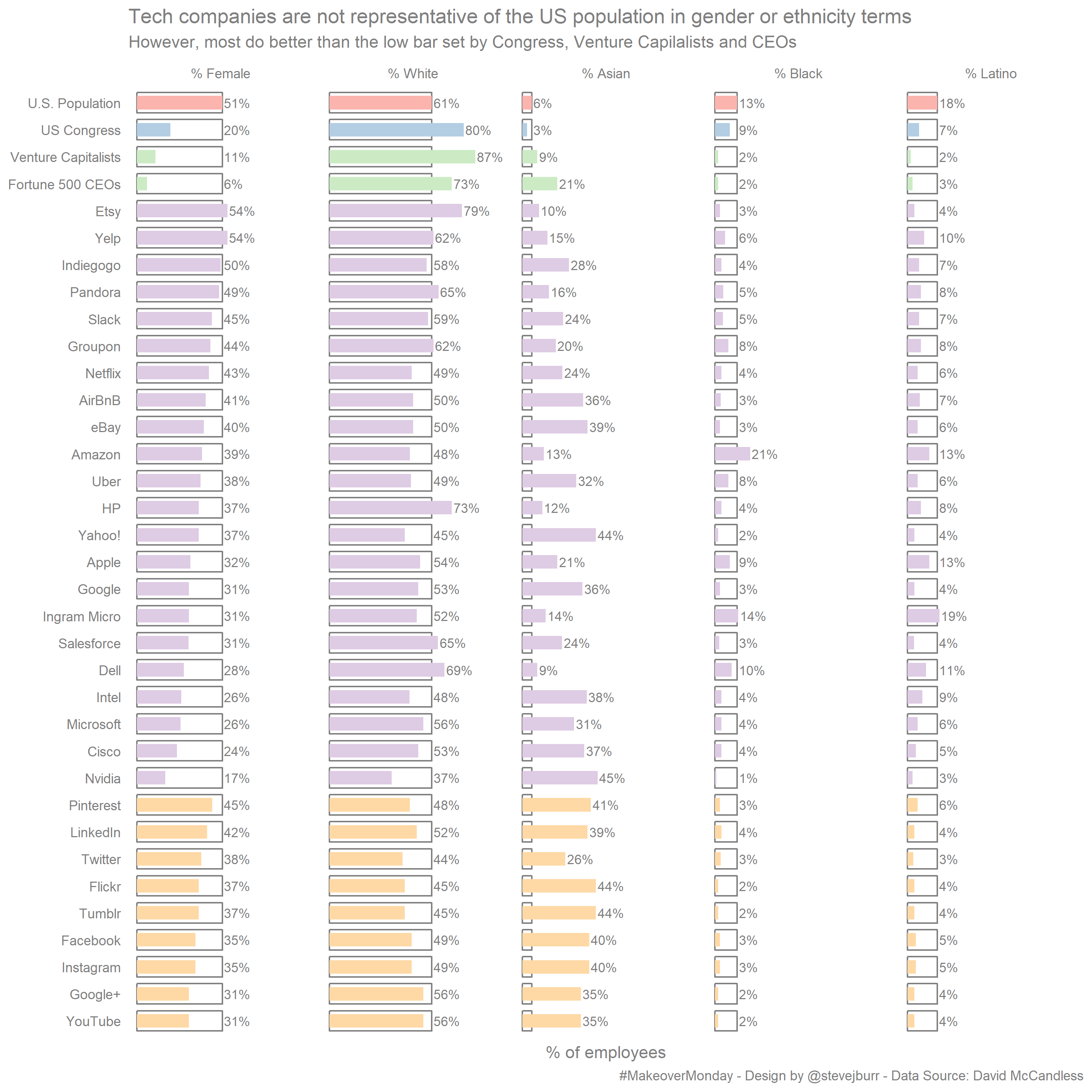
- I’ve put all the non-tech company figures at the top to provide a broader perspective straight away.
- I’ve used an empty bar with a grey outline to show the US population benchmark throughout, the idea being to make it really clear where there is a under / over representation.
- I decided to cut down on the number of categories, only showing one of % Female/% Male and focussing on the largest ethnicity groups to make it easier to read. I think another seperate visualisation is needed to look at the smaller ethnic groups.
My version definitely looks less polished than the original, and if I were to spend more time it would be on this aspect. However, I think it is more effectively showing me the information that I want to know than the original.
The dataset can be found on data.world and my code is on my Github.