MakeoverMonday 17-09-2018
September 23, 2018
MakeoverMonday this week was on the topic of transport costs, and remaking a chart original produced by DW.com.
The original visualisation was a simple line chart showing the prices of train and plane tickets as the date of the journey approaches.
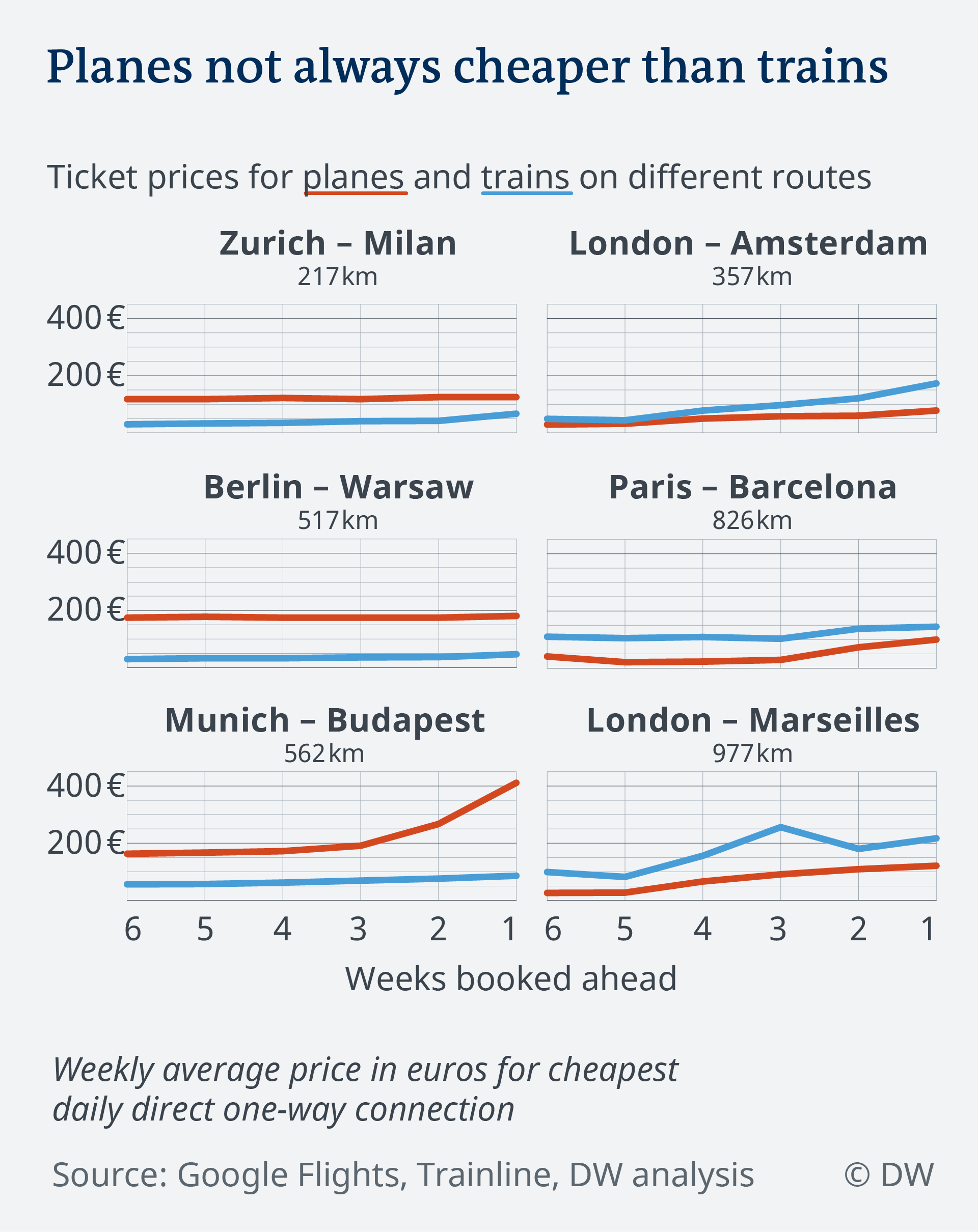
This definitely isn’t a bad way of displaying the data. It’s clear which mode of transport is cheaper (and this is neatly linked to the title using colour), and the change over time is shown. I would personally make a few further tweaks to this, particularly:
- Remove the gridlines.
- Label the starting / end values directly on the charts.
- Consider whether a consistent scale is the best idea (only one mode of transport on one route really gets close to €400).
Throughout the rest of the article a number of other factors are explored, for example journey length (with/without the time it takes to actually board a plane), the environmental impact and the true cost accounting for environmental impact. Most of these are included in the full dataset, however I didn’t find it particularly clear how some of the elements referenced in the article are created or what specifically some of the columns in the table are.
With that in mind, I kept my approach relatively simple by looking only at the cost and CO2 released by the journey. I decided that the gap between the two modes of transport was of more interest than the absolute cost, if I have to make a journey I want to pick the cheaper option and I’d like to know if it gets relatively better or worse value the closer I get to the day of travel. I ended up showing this with a scatter plot of the gaps in €s and kgs of CO2:
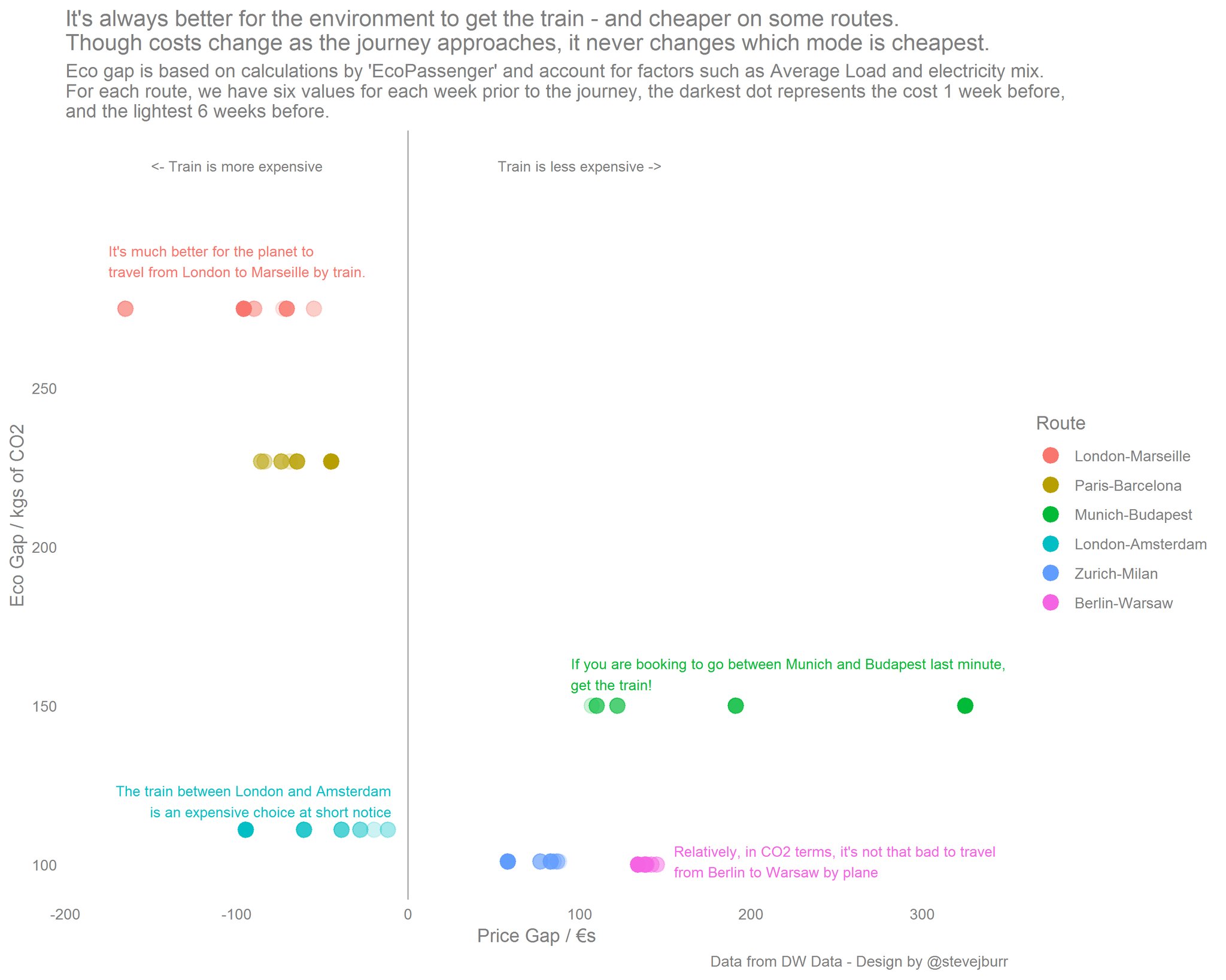
A few thoughts looking back on this visualisation a few days later:
- The CO2 axis doesn’t vary with time, so really ends up acting as a way of spacing out the different routes and doesn’t really encode that much information. In hindsight it probably would have been better to just have a seperate plot for showing this information.
- Using transparency to encode time isn’t that clear, it allows you to get a vague idea of what is going on but it works better with some colours than others and isn’t very intuitive. I felt that this way of showing time needed more explanation than a simple key, which added a lot of text to the subtitle. The original line chart approach is probably more intuitive.
- I’m fairly happy with how the labelling on the chart has turned out. I think it looks fairly good, is not too distracting and is something I want to experiment more with. When putting single static visualisations onto twitter, they can be hard to understand out of context. Including clear titles and directly labelling of individual points can be an effective way of doing this. I want my MakeoverMonday / TidyTuesday visualisations to be easily understood by anyone just from a single image, but have this image also be reasonable small, clear and compelling. This is a lofty goal, and this particular visualisation falls someway short but was a good lesson in how to do the labelling exercise.
Ultimately, I think it would have been better to stick to something closer to the orginal and to have used some sort of line chart to show the data.
My favourite submission this week was by Michał Mokwiński who used three different chart types to clearly show journey length, CO2 emissions and cost over time. Splitting the three metrics into three seperate visualisations enabled him to keep the individual parts simple. In particular I think that the line charts with directly labelled start and end points improve on the original by making better use of space. Michał’s submission can be seen here.
The original dataset can be found on data.world and my code is on Github.