MakeoverMonday 19-11-2018
November 19, 2018
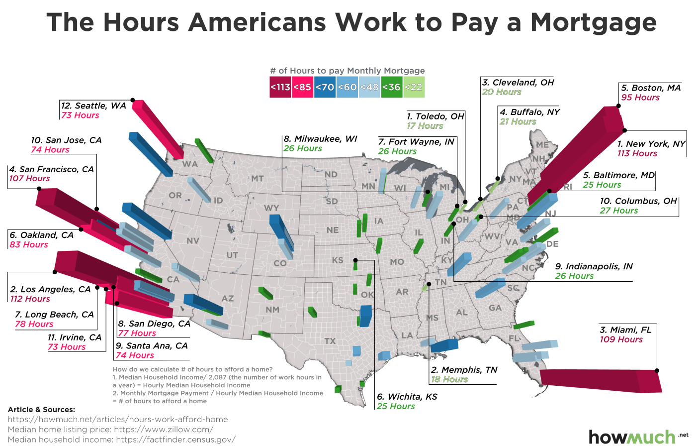
This week #MakeoverMonday was looking at how house prices compare to salaries in a number of US cities.
The original visualisation is from howmuch.net -
What do I like about this:
- You can see where the cities are because of the use of the map.
- The text labels are consistently coloured in the same way as the bars which makes it easier to understand.
- The 3D bars look a bit like
What don’t I like about this:
- It’s really hard to accurately read the heights of the bars from above.
- Some of the bars overlap / blend into each other making it impossible to pick them out.
I decided to just do a simple dot / lolipop chart, with colours to show the number of hours as per the original visualisation.
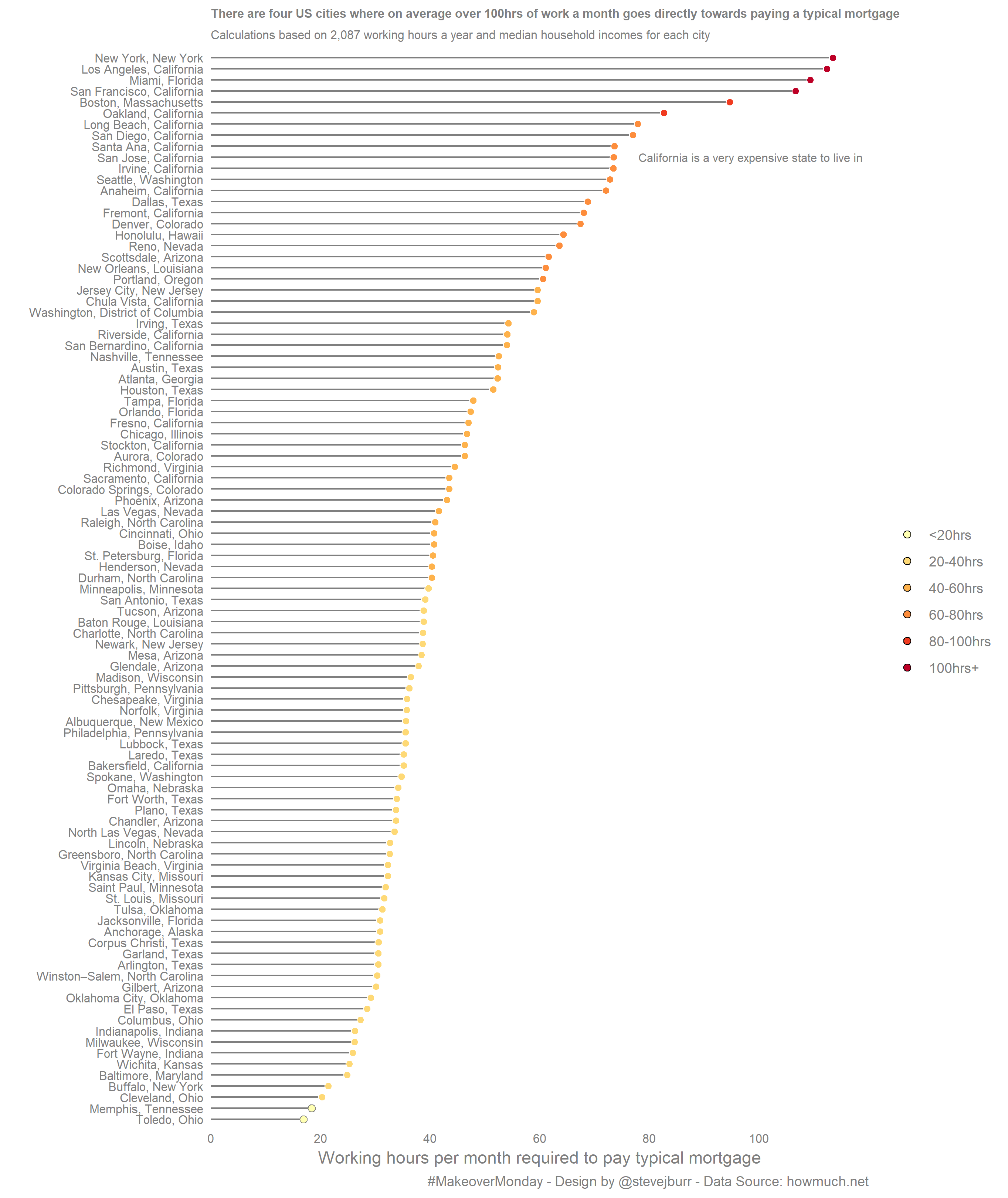
I originally had coloured the lines as well as the dots, but couldn’t get this to work with my chosen colour pallette. I think this is a better thing to do, but didn’t have enough time to come up with a good looking set of colours which also worked well for thin lines.
One key thing which is lost with my approach is the clear positioning of the cities. If you know the names / where the states are then you can ultimately get to this but the pattern of expensive costs vs cheaper interiors is less visually clear.
The dataset can be found on data.world and my code is on my Github.