MakeoverMonday 22-10-2018
October 23, 2018
It’s been a few weeks since I’ve been able to look at a #MakeoverMonday as I’ve been very busy with other things.
But back at it this week, this time looking at beer prices at different baseball grounds.
The original viz for this week was itself an old makeover done by Andy Kriebel back in 2014.
This looks as follows:
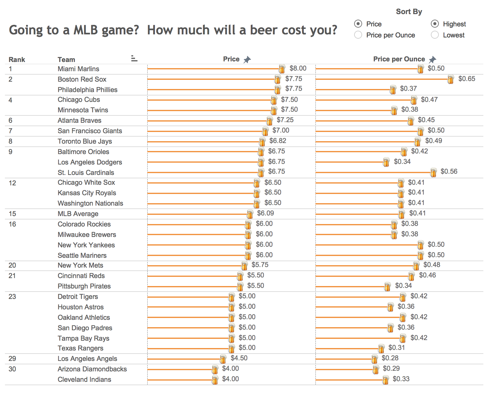
What do I like about this:
- It’s arranged vertically so the labels are easy to read
- It’s ordered by price per beer (and in the interactive version you can change the ordering to aid investigation)
- It’s has an engaging but informative title so you want to read it and know what it’s about
What don’t I like about this:
- I’m personally not a fan of the little beer icons - but others might find this fun and disagree
- “MLB Average” shouldn’t have rank, and it shouldn’t factor into the overall rankings as it’s not a discrete item
- I think there are too many data points being shown to want to label all the specific values. Labelling directly on a plot is advocated by a lot of people, but here I think it results in the graph being too cluttered. Especially if it’s an interactive where you can use tooltips to show this information if you want it, I’d prefer not to include these here
- I think that the size of a beer is quite important when comparing the price but you can’t see what this is without a fair amount of work.
My remake looks as follows (view the image in a new tab to get a bigger version):
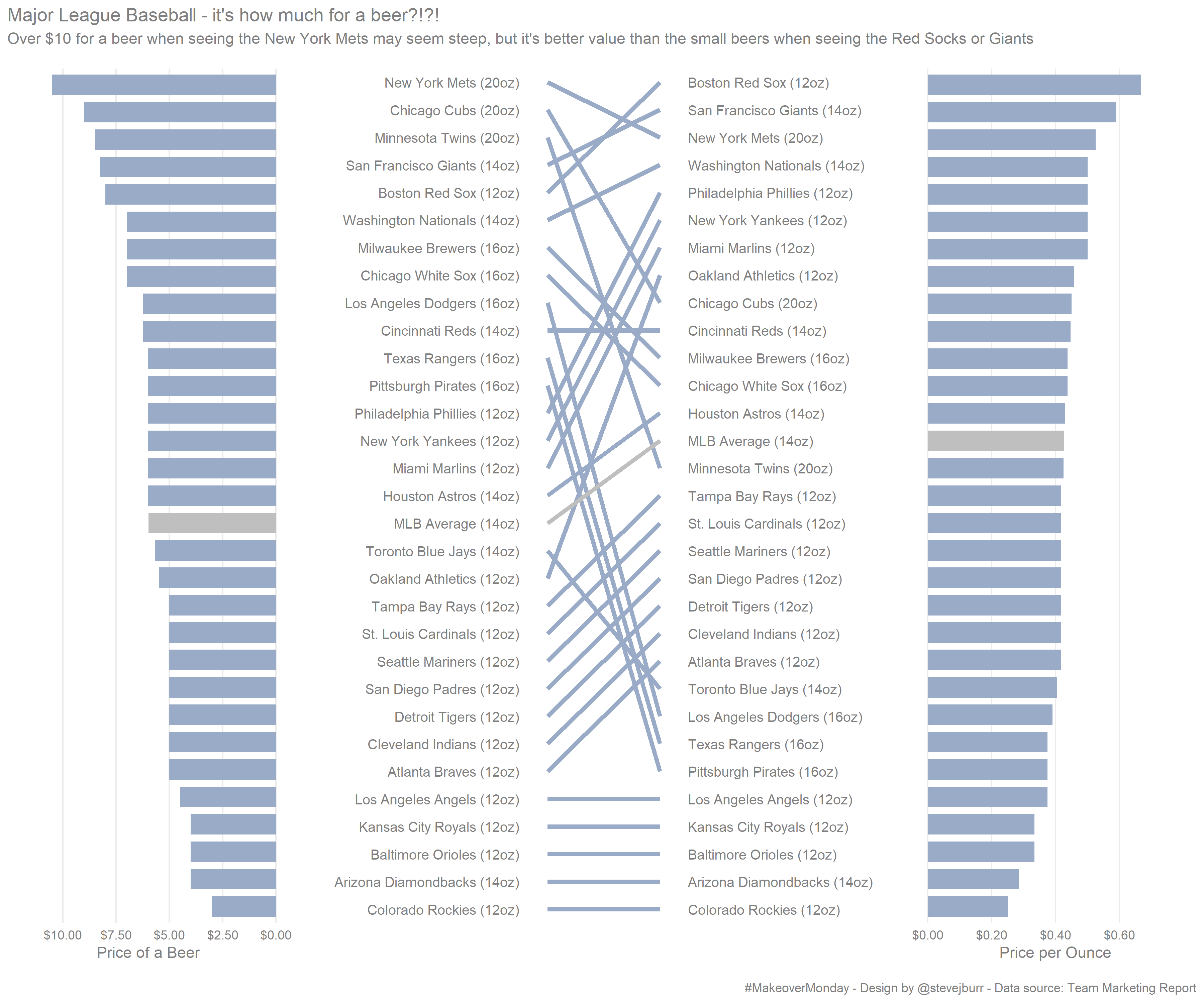
As usual, I’m using ggplot2 to create a static visualisation which adds further constraints to the design task. In this case, if I want to rankings on two dimensions, I can’t rely on being able to re-sort the data to show it effectively. So I’ve decided to create a bar chart for both price per beer and price per ounce of beer, and then linked them with a slope chart to enable a visual comparison of differences in rank.
I included the size of beer sold by each team within the labels, this was inspired by the original chart by Cork Gaines which Andy remade originally. I think this is important information to include.
I’ve made it clear that the average values are different using colour. The particular blue used is based on the MLB blue but I thought this was too intense so I selected a lighter tint from the values found here.
I don’t the specific values are that important, I think the rank order and approximately knowing if a beer is closer to $5 or $10 is enough so I’ve not labelled each data point and relied on the grid lines for comparison. I think this is reasonable, and results in a much cleaner visualisation.
Note the data is different to the original as I’ve used the 2018 data in the dataset not the years used in the original so the precise values are not the same.
This was a great chance to try out Thomas Lin Pedersen’s excellent patchwork package which makes it much easier to combine together multiple ggplot2 visulations together. It’s much less work than doing the same thing using grid/grid.extra directly as I’ve done in the past, so I’ll definitely be using it more in the future.
Overall, after spending a good 2-3 hours looking at this dataset and iterating on different approaches, I’m fairly happy with where I’ve gotten to. There are some subtle alignment challenges which I didn’t want to invest the time in solving perfectly but other than that I wouldn’t change anything. That said, I’d not gone through all the other submissions yet and I might find an alternative approach(es) I prefer.
The code I used to produce this visualisation is on my github and the dataset / discussion can be found here.
If you’be read all this and would like to discuss it further, I’d love to hear you thoughts below or on twitter.