MakeoverMonday 29-10-2018
October 29, 2018
This week the topic of #MakeoverMonday was the subject of hand washing after using the toilet.
The original visualisation had more detail than was included in the dataset provided to work with and looked as follows:
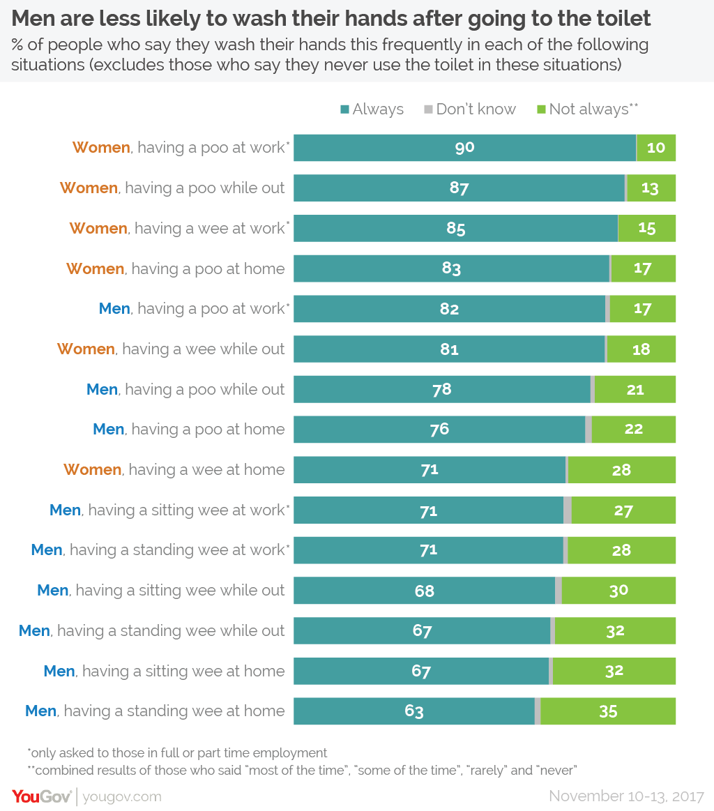
What did I like about this:
- The use of colour to highlight men and women in the title of the chart
- Summarising down to the level of “Always” vs “Not Always” makes the most important points without the need to try and differentiated between somewhat ambiguous levels.
- The ordering of the bars makes it easy to unpick the key story.
What don’t I like about this:
- Perhaps showing all the levels isn’t needed - not a problem with the provided dataset.
- It’s not that easy to compare men vs women for the same situations (where appropriate) but this is what is called out explicitly in the title of the visualisation.
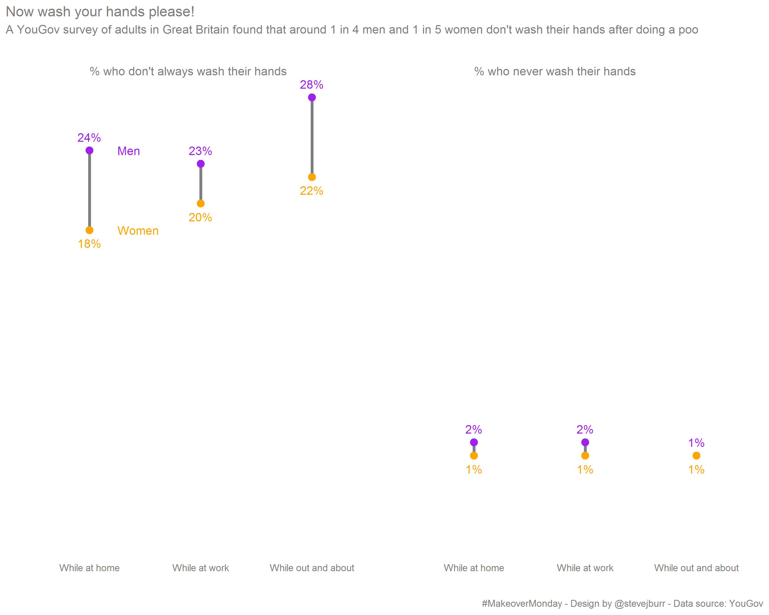
One important point which is discussed on the data.world page for this task in detail is that “Never” actually includes those who don’t use the toilet in the specified location, which probably isn’t what you actually want to visualise. So by getting hold of a bit of additional data I was able to remove these records and rescale the percentages accordingly. Thanks to @statsninja for finding the extra data.
I chose to focus on the proportion of respondents who don’t “Always” wash their hands (this included those who don’t know how often they wash their hands, I figure you are likely to be fairly certain if you always do something which I feel is reasonable). I also showed the proportion who “Never” wash their hands, which is an interesting headline / attention grabbing number. As in the original visualisation, I don’t think that it’s worthwhile to break out the in between levels.
I used purple/orange as the two colours to avoid any stereotypical gendered colours, I’m still not sure either way whether this is a good or a bad thing to do in general (I think that a large number of people would intuitively / quickly guess the correct labelling of the points if I used red/blue which is potentially useful).
In contrast to the original visual, I wanted to allow a direct comparison of men vs women for the same situations, one of the key insights to take away from the data is that men are less likely to wash their hands than women.
I could have been slightly more precise with my wording in the subtitle and said “don’t always” instead of just “don’t”, and perhaps putting a statement like “Men are less likely to wash their hands than women” as the main title would have been more effective.
This week I wanted to try and get the visualisation finished within an hour, which I managed to do fairly easily. I also wanted to keep the time I spent on this write up to a minimum which I’ve also been sucessful in doing. As a result, I’m fairly happy with what I came up with. Having less time means that it is not possible to iterate through multiple different approaches before choosing a final visual. But in many real world cases time is also limited so practicing working more quickly is useful. Limitting the time investment also makes it more achievable to take part in #MakeoverMonday every week, which is important as I’ve missed a few weeks due to time pressure.
If you have any comments on this visualisation, then please post below or find me on Twitter. The code I used to generate this visualisation is on my GitHub and the original article can be found here.