MakeoverMonday 31-10-2018
October 5, 2018
This MakeoverMonday was looking at the prices of avocados in the USA. The original visualisation looked like this:
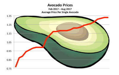
What about the original could be improved?
- The background image is distracting and makes it harder to read the graph.
- Though it’s clear from the title, I’d rather have some indication of time on the x-axis.
- I don’t think the gridlines are needed and add to the sense of clutter.
- I want more context, is this price rise unusual? Is it a continuation of a longer trend or a short term bump?
I decided to stick with a line graph but split out the price of organic and regular avocados as seperate lines:
The key design decisions I made when producing this remake were:
- I labelled the peaks within each year, and showed in percentage terms how much the peak exceeds the average for that year. I think this helps put these trends in context, and allows comparison of the price spikes across multiple years. This isn’t a perfect measure to use as the size of the peaks will influence the average we are comparing them to, but I think it serves the desired purpose while being easy to understand.
- I added dotted lines to show the average price within each year, these aren’t explicitly labelled but my hope is that their meaning is clear from the commentary at the top of the visualisation (which talks about peaks and yearly averages).
- By showing a longer term trend, we can see that the peak prices in 2017 were the highest for a number of years but there was also a sharp increase within a year in 2016.
- I decided to use gridlines to divide the x-axis into chunks by year, I think this works nicely alongside the the yearly baselines. I felt that any additional labelling of time would introduce too much unneeded clutter.
- I tried to pick a pair of colours which would be associated with the subject matter.
- In contrast to the original I added currency symbols to the y-axis to make it clear what this represents.
If I was to redo this, I think I would try to also include the provided volume information (i.e. how many avocados are sold) as this provides additional information which is related to prices (e.g. are prices going up due to higher demand? or do high prices put people off buying?). It would also be a good idea to do a bit more reading / research and then offer some more explanation around why the prices might be rising, as the lack of explanation raised a lot of questions with people looking at the visualisation.
The original dataset can be found here and my code is on my GitHub.
I’ve now enabled comments on my blog, so I’d welcome any comments / discussion on what I’ve done!