MakoverMonday 26-11-2018
November 26, 2018
The subject of #MakeoverMonday this week was a chart by Statistica looking at the cost of a night out in a variety of cities around the world.
The original visualisation was a stacked area chart:
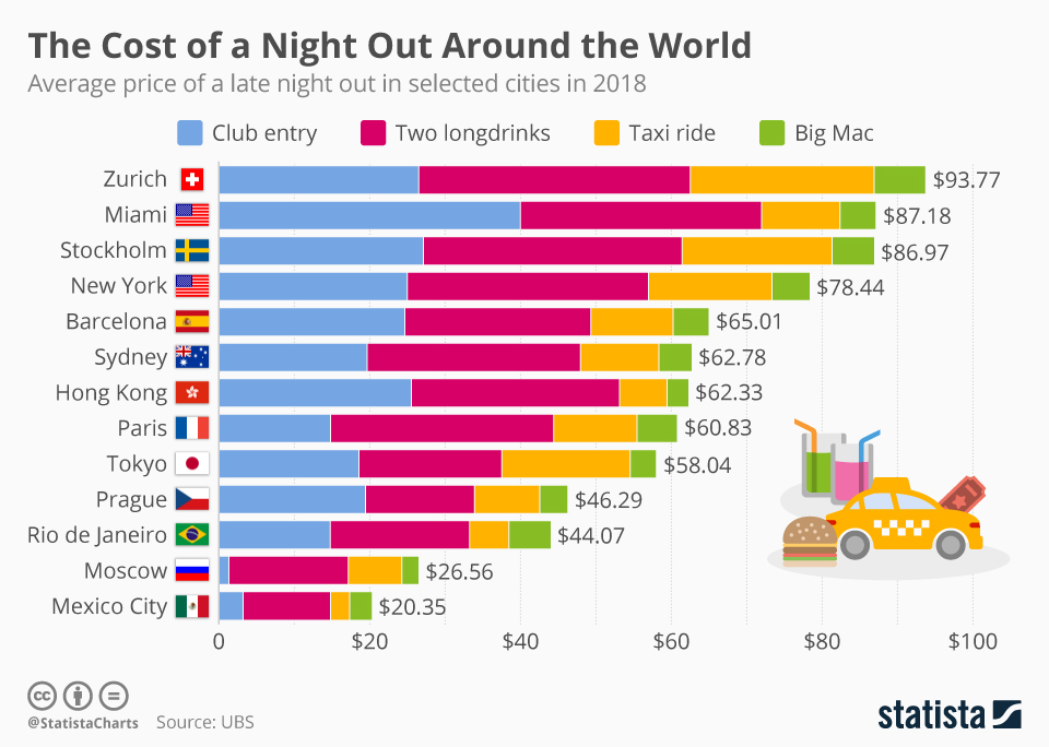
What do I like about the original?
- It strikes a nice playful tone with the use of colours and the image, which is good for a less serious topic.
- The data is nicely sorted, so it’s obvious which are the most expensive and cheapest cities.
- The overall totals are shown clearly on at the ends of the bars.
- The bars are shown horizontally which makes the labels easier to read.
What don’t I like about the original?
- It’s a stacked bar chart, so you can only really compare the “Club entry” values, and the overall values because nothing else has a common baseline. This means that you miss patterns in the data.
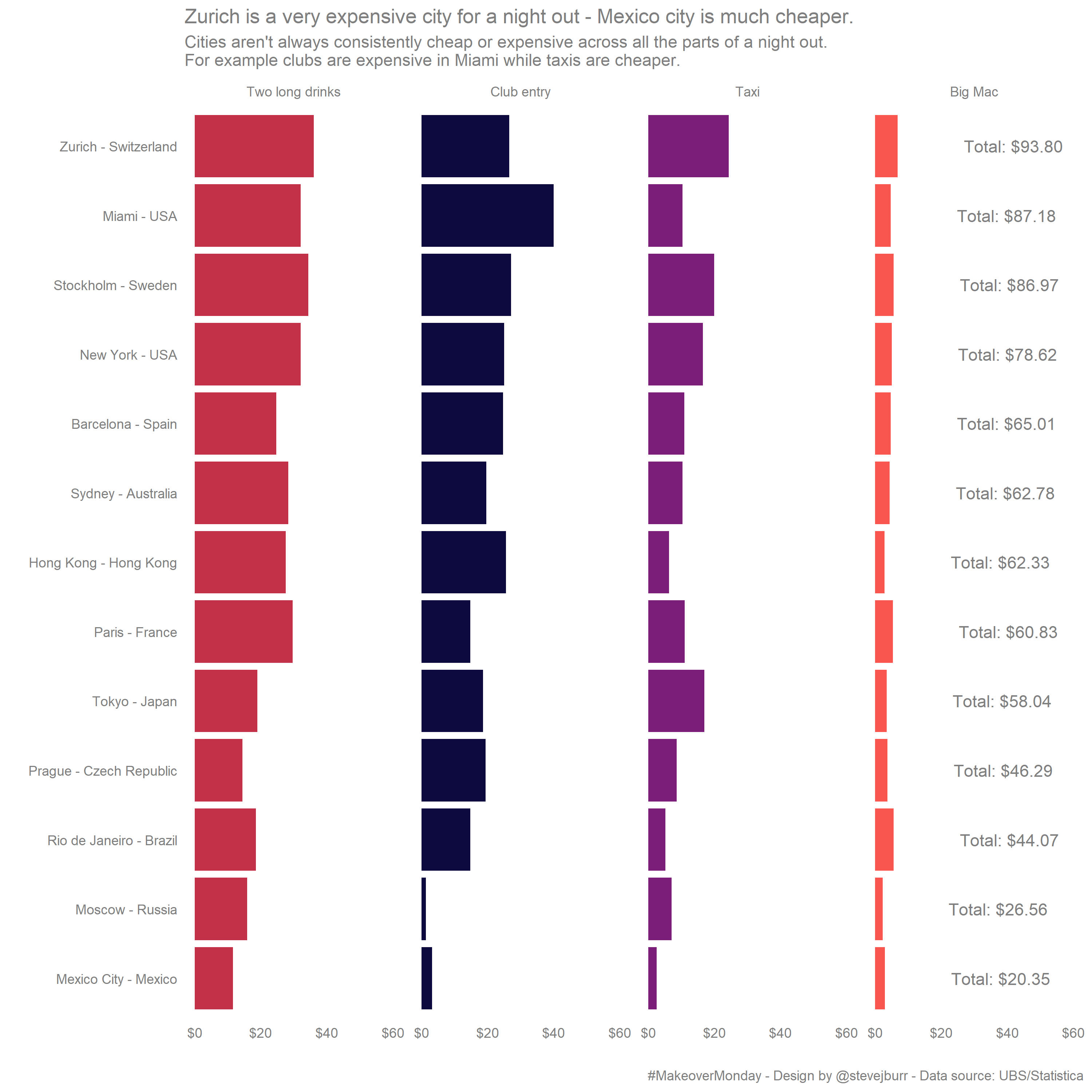
I decided to do something similar to the original, but move from a stacked bar to four seperate bar charts so that you can easily see if there are any patterns in the individual series. I called out one of these in the heading of my chart. I kept the same ordering as the original (ordering by overall cost) even though I didn’t directly chart the total. One potential weakeness of my approach is that the overall total can’t be easily seen visually. I did consider adding a fifth bar chart for the total, but I don’t think this is really needed, and it would take up a lot of space which would make it harder to pick out smaller differences in the remaining four bar charts.
My code for recreating this visualisation is on Github, the dataset and links to the original article can be found here.