Replicating Flowingdata Population Charts in R
October 25, 2018
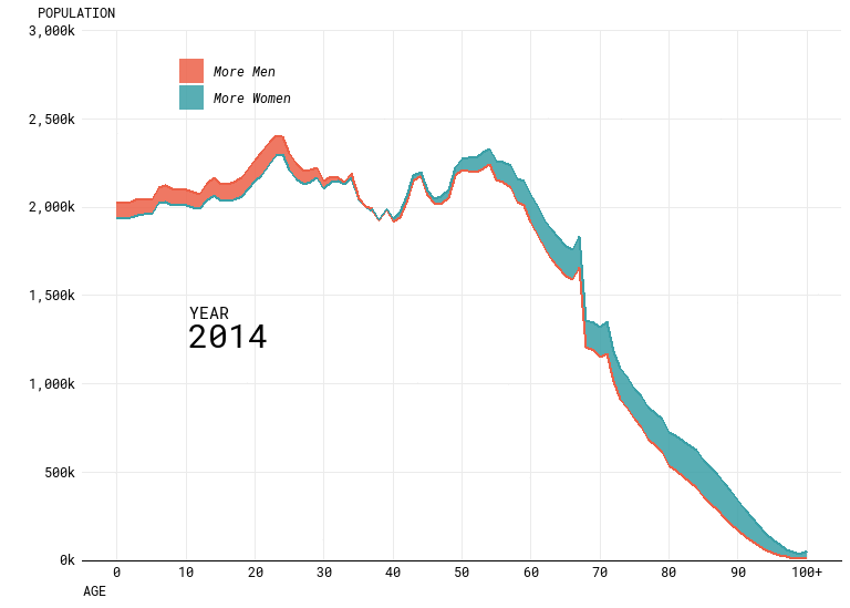
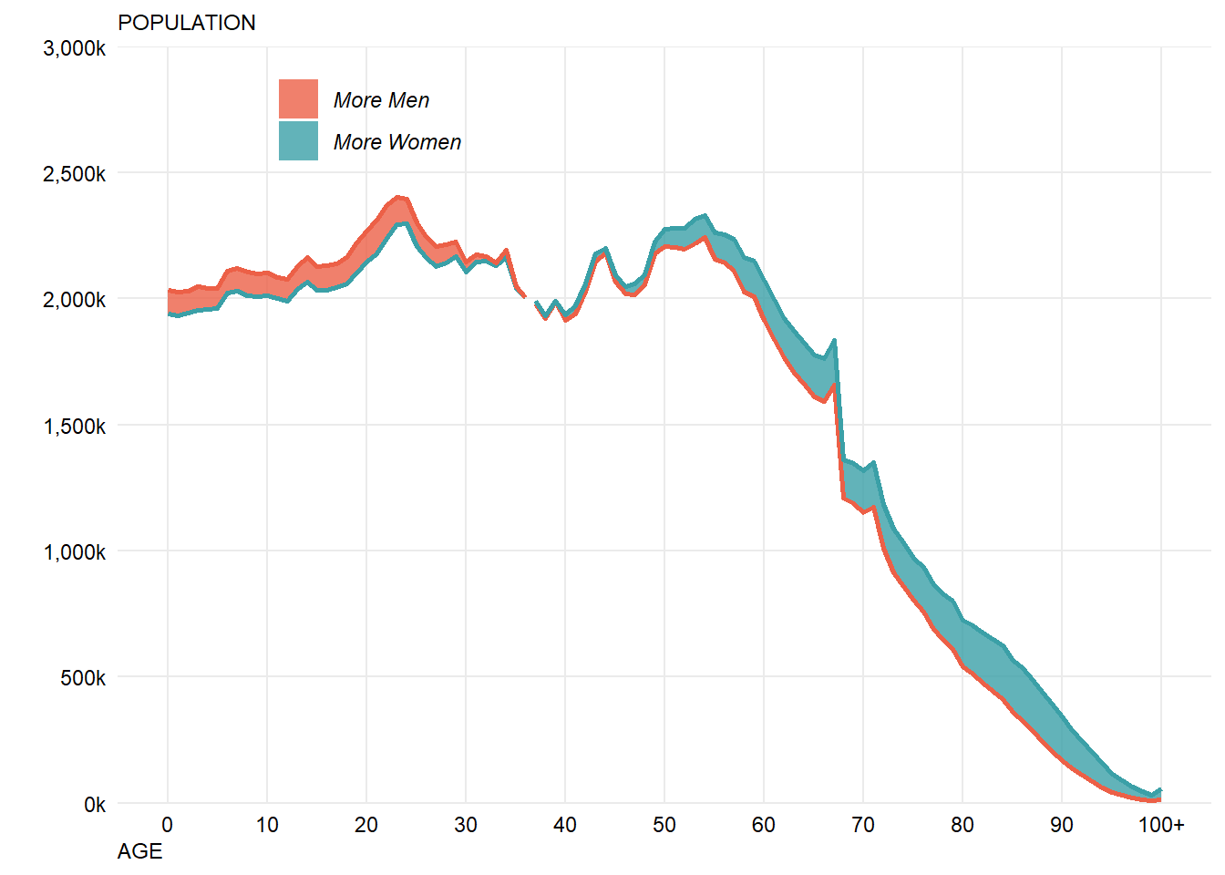
Nathan Yau recently produced a number of really nice looking visualisations of population data as part of an article entitled “Ask the Question, Visualize the Answer”. We talked about these at work and wondered how exactly he made them. In this post, I’m going to try and work through replicating his work for one of the visualisations in particular, this animated difference plot:
Note, I’m mostly interested in the visual aspect and may not get around to working out which specific font he used. I’m also going to be writing this post as a live / stream of conciousness / working document with minimal editting so there may or may not end up being dead ends, hopefully this is still useful.
Step 1 - Get the data
Nathan helpfully links to the CDC for access to the projections, I ended up getting my data from this specific link. This tool enables you to download a text file of the data. This file is relatively small, but also has a load of meta data / notes in the footer, to make my life easier I just deleted this information before trying to use it in R but it would be better to deal with this programmatically.
Load the required packages:
library(tidyverse)
library(gganimate)
Then let’s read in the data:
#Read in the data
data <- read_tsv("National Population Projections 2014-2060.txt")

#View the first few records:
head(data)
## # A tibble: 6 x 8
## Notes Year `Year Code` Age `Age Code` Gender `Gender Code`
## <chr> <int> <int> <chr> <chr> <chr> <chr>
## 1 <NA> 2014 2014 < 1 ~ 0 Female F
## 2 <NA> 2014 2014 < 1 ~ 0 Male M
## 3 <NA> 2014 2014 1 ye~ 1 Female F
## 4 <NA> 2014 2014 1 ye~ 1 Male M
## 5 <NA> 2014 2014 2 ye~ 2 Female F
## 6 <NA> 2014 2014 2 ye~ 2 Male M
## # ... with 1 more variable: `Projected Populations` <int>#Keep only the required columns
data %>% filter(is.na(Notes)) %>% select(`Age Code`, Gender, Year, `Projected Populations`) -> data
#Check this has worked
head(data)## # A tibble: 6 x 4
## `Age Code` Gender Year `Projected Populations`
## <chr> <chr> <int> <int>
## 1 0 Female 2014 1939928
## 2 0 Male 2014 2031919
## 3 1 Female 2014 1933019
## 4 1 Male 2014 2024845
## 5 2 Female 2014 1941924
## 6 2 Male 2014 2030157We’ll also need the specific colours which Nathan used - I’ve grabbed these using the colour picker tool in paint which hopefully does the job well enough.
men <- "#ec6047"
women <- "#3ba0a7"
colours <- c(men,women)
Step 2 - Build a basic plot for a single year
Before worrying about the animation, let’s start with a single year of data, gganimate plays nicely with ggplot2 so the final stage should be simple once this is done.
Looking at the plot, it looks like we’re going to need to use geom_ribbon for the bulk of the visualisation, which requires an upper/lower bound for the area to be drawn. This means that the data will need a bit of reformatting - first we need to transpose the data so we have a column for Male and Female with a single row for year. Then we will need a column for the highest/lowest value and a further column to flag up which value is highest.
This is probably easier to explain via code:
data %>% group_by(Year, `Age Code`) %>%
  spread(key=Gender, value=`Projected Populations`) %>% #transposition
  mutate(Upper=max(Female,Male),
         Lower=min(Female,Male),
         UpperGender = if_else(Upper==Male,"Male","Female"),
         LowerGender = if_else(Lower==Male,"Male","Female")) -> chartData

head(chartData)
## # A tibble: 6 x 8
## # Groups: Year, Age Code [6]
## `Age Code` Year Female Male Upper Lower UpperGender LowerGender
## <chr> <int> <int> <int> <int> <int> <chr> <chr>
## 1 0 2014 1939928 2031919 2031919 1939928 Male Female
## 2 0 2015 1954084 2046747 2046747 1954084 Male Female
## 3 0 2016 1968007 2061349 2061349 1968007 Male Female
## 4 0 2017 1981628 2075603 2075603 1981628 Male Female
## 5 0 2018 1994394 2088981 2088981 1994394 Male Female
## 6 0 2019 2006229 2101377 2101377 2006229 Male FemaleWe should now be in a position to start creating the visual.
chartData %>% filter(Year==2014) %>%
  ggplot() +
  geom_ribbon(aes(x=`Age Code`,ymin=Lower,ymax=Upper,group=1)) #group is required because `Age Code` is a factor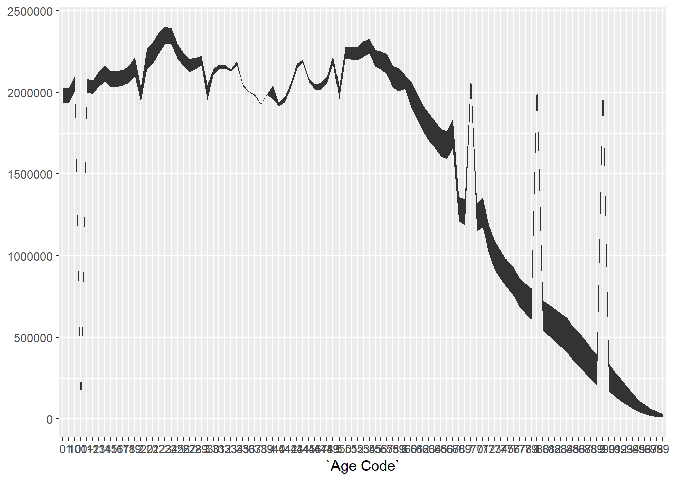
This gives us the right shape, but there looks to be something odd going on with the jumps. This is due to the variable “Age Code” being a character variable which is turned into a factor by ggplot2 when used as an x-axis value.
Because factors are being sorted alphabetically you end up with the projection for 100 near the start, which causes the first spike. We can confirm this:
str(as.factor(chartData$`Age Code`))## Factor w/ 101 levels "0","1","10","100+",..: 1 1 1 1 1 1 1 1 1 1 ...As you can see, the third and fourth values of the factor are 10 and 100+ not 2 and 3 as we would want, hence the spikes in the chart.
It’s probably easiest to just code this variable as a numeric value, as text is only needed to signify 100+ which can be dealt with later when labelling the chart.
chartData %>% ungroup() %>% mutate(`Age Code`=as.numeric(str_replace(`Age Code`,"\\+",""))) -> chartDataWith those changes made, we can now revist the chart:
chartData %>% filter(Year==2014) %>%
  ggplot() +
geom_ribbon(aes(x=`Age Code`,ymin=Lower,ymax=Upper)) 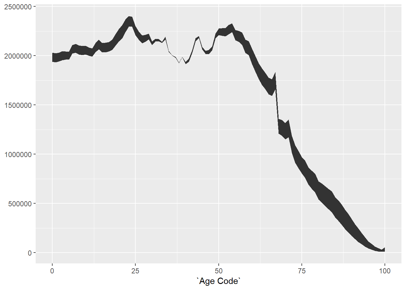
This is now starting to look a bit more promising, we have the right shape for the graph. Because Age Code is now numeric, ggplot2 is also automatically doing some a bit nice looking with the axis labelling.
Now, let’s try to colour the ribbon based on the highest value:
chartData %>% filter(Year==2014) %>%
  ggplot() +
  geom_ribbon(aes(x=`Age Code`,ymin=Lower,ymax=Upper,fill=UpperGender))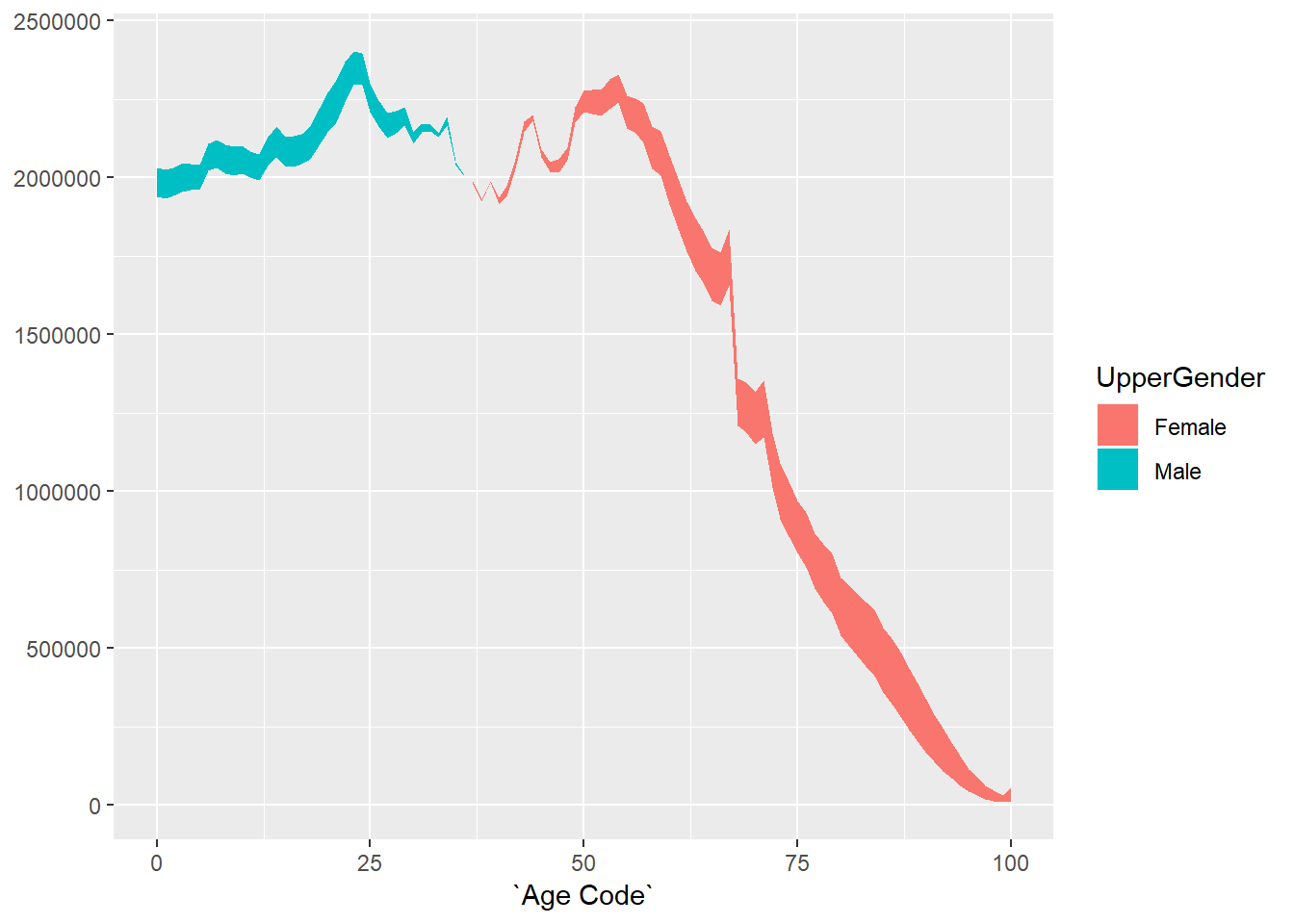
The original plot also has lines bordering the shaded region, so let’s add those using geom_line:
chartData %>% filter(Year==2014) %>%
  ggplot() +
  geom_ribbon(aes(x=`Age Code`,ymin=Lower,ymax=Upper,fill=UpperGender)) +
  geom_line(aes(x=`Age Code`,y=Lower,colour=LowerGender)) +
  geom_line(aes(x=`Age Code`,y=Upper,colour=UpperGender))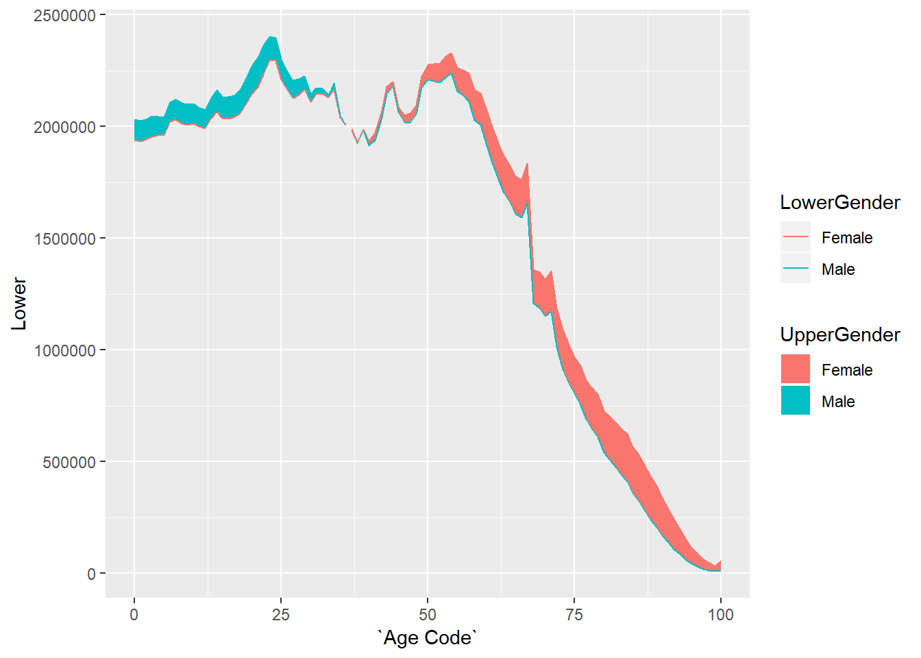
We now have the basic chart that we need, but it doesn’t look very visually appealling, the next step is to do some formatting to get closer to the original.
Step 3 - Formatting the single year plot
First let’s adjust the axis labelling to match the original:
chartData %>% filter(Year==2014) %>%
  ggplot() +
  geom_ribbon(aes(x=`Age Code`,ymin=Lower,ymax=Upper,fill=UpperGender)) +
  geom_line(aes(x=`Age Code`,y=Lower,colour=LowerGender)) +
  geom_line(aes(x=`Age Code`,y=Upper,colour=UpperGender)) +
  scale_y_continuous("POPULATION", #the title for the axis
                     limits=c(0,3000000), #set the top and bottom value
                     expand=c(0,0), #don't expand beyond the specified limits
                     breaks=c(0,500000,1000000,1500000,2000000,2500000,3000000), #specify what to put on the axis
                     labels=scales::comma_format(scale=0.001,suffix="k")) + # format the displayed numbers using the scales package
  scale_x_continuous("AGE", #axis title
                     breaks= c(0,10,20,30,40,50,60,70,80,90,100),
                     labels=c("0","10","20","30","40","50","60","70","80","90","100+")) +
  theme(text=element_text(colour="black"), #all text is black
        axis.text = element_text(colour="black"), #make sure labels are black also
        axis.title.y=element_text(vjust=1,angle=0), #move the label of the y to the top and don't rotate it
        axis.title.x=element_text(hjust=0,angle=0)) #move the label of the x axis to the left and don't rotate it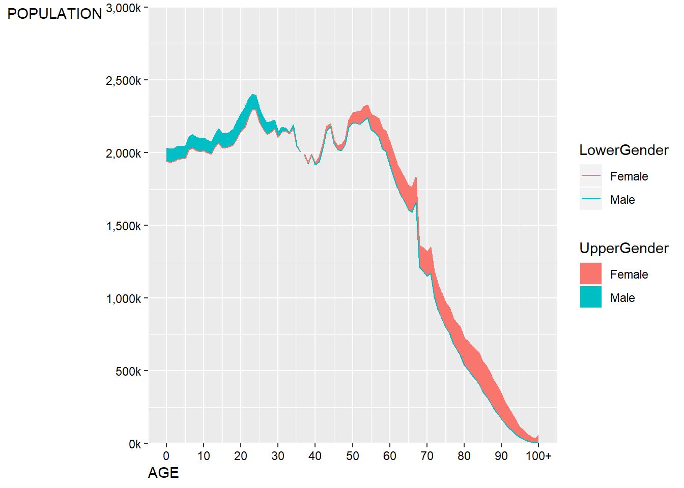
This is fairly close, but it doesn’t quite get the y-axis label in the right place. As there’s no title on this plot, we can cheat slightly and just use a left aligned subtitle to the plot to play the role of a y-axis label.
chartData %>% filter(Year==2014) %>%
  ggplot() +
  geom_ribbon(aes(x=`Age Code`,ymin=Lower,ymax=Upper,fill=UpperGender)) +
  geom_line(aes(x=`Age Code`,y=Lower,colour=LowerGender)) +
  geom_line(aes(x=`Age Code`,y=Upper,colour=UpperGender)) +
  scale_y_continuous("", #the title for the axis
                     limits=c(0,3000000), #set the top and bottom value
                     expand=c(0,0), #don't expand beyond the specified limits
                     breaks=c(0,500000,1000000,1500000,2000000,2500000,3000000), #specify what to put on the axis
                     labels=scales::comma_format(scale=0.001,suffix="k")) + # format the displayed numbers using the scales package
  scale_x_continuous("AGE", #axis title
                     breaks= c(0,10,20,30,40,50,60,70,80,90,100),
                     labels=c("0","10","20","30","40","50","60","70","80","90","100+")) +
  labs(subtitle="POPULATION")+
  theme(text=element_text(colour="black"), #all text is black
        plot.subtitle=element_text(size=9),
        axis.text = element_text(colour="black"), #make sure labels are black also
        axis.title.x=element_text(hjust=0,angle=0)) #move the label of the x axis to the left and don't rotate it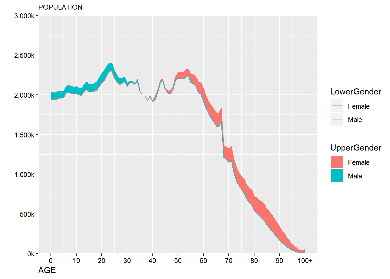
This still isn’t quite what we want - it’s currently left algined to the axis not the plot edge, this can be manually adjusted:
chartData %>% filter(Year==2014) %>%
  ggplot() +
  geom_ribbon(aes(x=`Age Code`,ymin=Lower,ymax=Upper,fill=UpperGender)) +
  geom_line(aes(x=`Age Code`,y=Lower,colour=LowerGender)) +
  geom_line(aes(x=`Age Code`,y=Upper,colour=UpperGender)) +
  scale_y_continuous("", #the title for the axis
                     limits=c(0,3000000), #set the top and bottom value
                     expand=c(0,0), #don't expand beyond the specified limits
                     breaks=c(0,500000,1000000,1500000,2000000,2500000,3000000), #specify what to put on the axis
                     labels=scales::comma_format(scale=0.001,suffix="k")) + # format the displayed numbers using the scales package
  scale_x_continuous("AGE", #axis title
                     breaks= c(0,10,20,30,40,50,60,70,80,90,100),
                     labels=c("0","10","20","30","40","50","60","70","80","90","100+")) +
  labs(subtitle="POPULATION")+
  theme(text=element_text(colour="black"), #all text is black
        plot.subtitle=element_text(size=9),
        axis.text = element_text(colour="black"), #make sure labels are black also
        axis.title.x=element_text(hjust=0,angle=0,size=9)) -> p #move the label of the x axis to the left and don't rotate it

#turn the plot into a gtable object
g <- ggplotGrob(p)
#adjust the position of the subtitle
g$layout$l[g$layout$name == "subtitle"] <- 1
#draw the new plot
grid::grid.draw(g)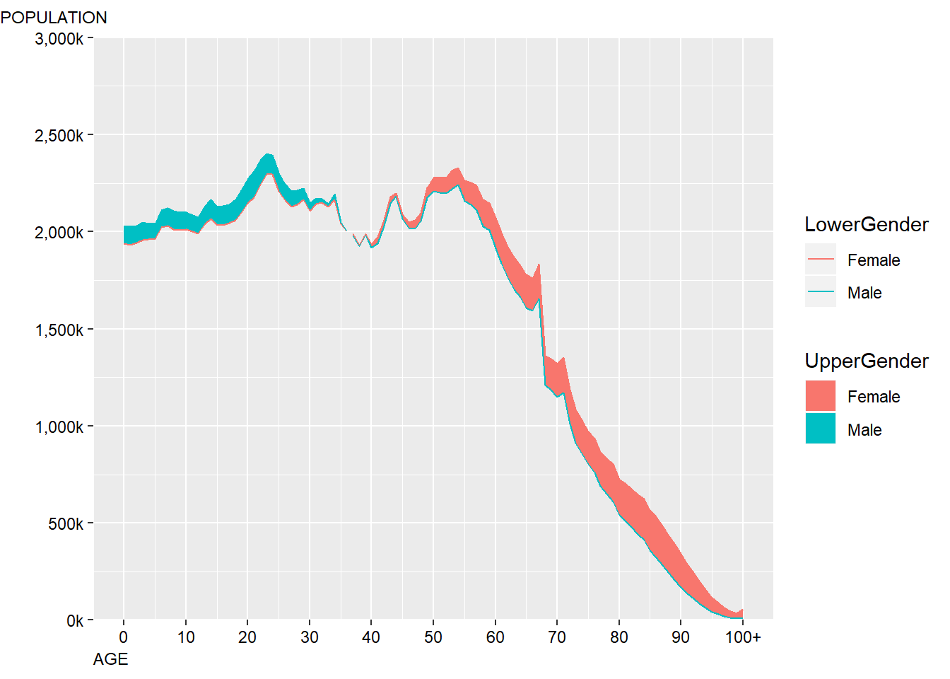
This is close enough for now, precise positioning and alignments of objects within ggplot2 can often be quite time consuming which is why a lot of people choose to incorporate Adobe Illustrator into their workflows in order to add the finishing touches.
Next I’ll adjust the general style of the plot so that it is a bit clearer:
chartData %>% filter(Year==2014) %>%
  ggplot() +
  geom_ribbon(aes(x=`Age Code`,ymin=Lower,ymax=Upper,fill=UpperGender)) +
  geom_line(aes(x=`Age Code`,y=Lower,colour=LowerGender)) +
  geom_line(aes(x=`Age Code`,y=Upper,colour=UpperGender)) +
  scale_y_continuous("", #the title for the axis
                     limits=c(0,3000000), #set the top and bottom value
                     expand=c(0,0), #don't expand beyond the specified limits
                     breaks=c(0,500000,1000000,1500000,2000000,2500000,3000000), #specify what to put on the axis
                     labels=scales::comma_format(scale=0.001,suffix="k")) + # format the displayed numbers using the scales package
  scale_x_continuous("AGE", #axis title
                     breaks= c(0,10,20,30,40,50,60,70,80,90,100),
                     labels=c("0","10","20","30","40","50","60","70","80","90","100+")) +
  labs(subtitle="POPULATION")+
  theme_minimal() + #apply my prefered theme which is close to what Nathan used
  theme(text=element_text(colour="black"), #all text is black
        plot.subtitle=element_text(size=9),
        axis.text = element_text(colour="black"), #make sure labels are black also
        axis.title.x=element_text(hjust=0,angle=0,size=9),
        panel.grid.minor.x=element_blank(), #turn off minor gridlines
        panel.grid.minor.y=element_blank(), #turn off minor gridlines
        ) -> p

#turn the plot into a gtable object
g <- ggplotGrob(p)
#adjust the position of the subtitle
g$layout$l[g$layout$name == "subtitle"] <- 1
#draw the new plot
grid::grid.draw(g)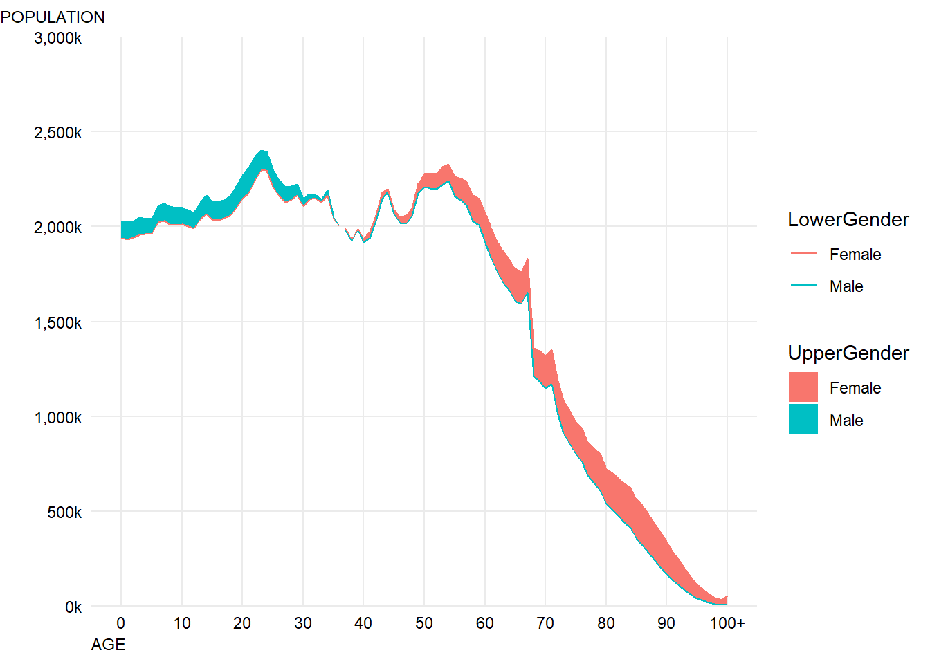
This looks pretty good - the next step is to adjust the colours so they match the original and sort out the legends.
chartData %>% filter(Year==2014) %>%
  ggplot() +
  geom_ribbon(aes(x=`Age Code`,ymin=Lower,ymax=Upper,fill=UpperGender)) +
  geom_line(aes(x=`Age Code`,y=Lower,colour=LowerGender),show.legend = FALSE) +
  geom_line(aes(x=`Age Code`,y=Upper,colour=UpperGender),show.legend = FALSE) + #we don't need the line colours to have a legend
  scale_fill_manual("",#don't label the legend
                    breaks=c("Male","Female"), #choose the order to display in
                    labels=c("More Men","More Women"), #match the labelling used in the original
                    values=c(women,men), #colours to use, in the order of the factor not displayed order
                    aesthetics = c("colour", "fill"))+ #change both the line and fills together
  scale_y_continuous("", #the title for the axis
                     limits=c(0,3000000), #set the top and bottom value
                     expand=c(0,0), #don't expand beyond the specified limits
                     breaks=c(0,500000,1000000,1500000,2000000,2500000,3000000), #specify what to put on the axis
                     labels=scales::comma_format(scale=0.001,suffix="k")) + # format the displayed numbers using the scales package
  scale_x_continuous("AGE", #axis title
                     breaks= c(0,10,20,30,40,50,60,70,80,90,100),
                     labels=c("0","10","20","30","40","50","60","70","80","90","100+")) +
  labs(subtitle="POPULATION")+
  theme_minimal() + #apply my prefered theme which is close to what Nathan used
  theme(text=element_text(colour="black"), #all text is black
        plot.subtitle=element_text(size=9),
        axis.text = element_text(colour="black"), #make sure labels are black also
        axis.title.x=element_text(hjust=0,angle=0,size=9),
        panel.grid.minor.x=element_blank(), #turn off minor gridlines
        panel.grid.minor.y=element_blank(), #turn off minor gridlines
        legend.position = c(0.2,0.92), #position legend over the plot
        legend.text = element_text(face="italic") #make italic
        ) -> p

#turn the plot into a gtable object
g <- ggplotGrob(p)
#adjust the position of the subtitle
g$layout$l[g$layout$name == "subtitle"] <- 1
#draw the new plot
grid::grid.draw(g)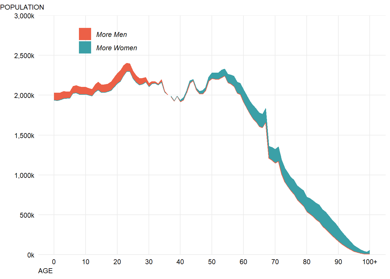
In the original, the fill is slightly transparent so that you can see the top line, so let’s make a small change to both the fill alpha values and the line widths to do that:
chartData %>% filter(Year==2014) %>%
  ggplot() +
  geom_ribbon(aes(x=`Age Code`,ymin=Lower,ymax=Upper,fill=UpperGender),
              alpha=0.8) + #make fill slightly transparent
  geom_line(aes(x=`Age Code`,y=Lower,colour=LowerGender),size=0.9,show.legend = FALSE) +
  geom_line(aes(x=`Age Code`,y=Upper,colour=UpperGender),size=0.9,show.legend = FALSE) + #we don't need the line colours to have a legend
  scale_fill_manual("",#don't label the legend
                    breaks=c("Male","Female"), #choose the order to display in
                    labels=c("More Men","More Women"), #match the labelling used in the original
                    values=c(women,men), #colours to use, in the order of the factor not displayed order
                    aesthetics = c("colour", "fill"))+ #change both the line and fills together
  scale_y_continuous("", #the title for the axis
                     limits=c(0,3000000), #set the top and bottom value
                     expand=c(0,0), #don't expand beyond the specified limits
                     breaks=c(0,500000,1000000,1500000,2000000,2500000,3000000), #specify what to put on the axis
                     labels=scales::comma_format(scale=0.001,suffix="k")) + # format the displayed numbers using the scales package
  scale_x_continuous("AGE", #axis title
                     breaks= c(0,10,20,30,40,50,60,70,80,90,100),
                     labels=c("0","10","20","30","40","50","60","70","80","90","100+")) +
  labs(subtitle="POPULATION")+
  theme_minimal() + #apply my prefered theme which is close to what Nathan used
  theme(text=element_text(colour="black"), #all text is black
        plot.subtitle=element_text(size=9),
        axis.text = element_text(colour="black"), #make sure labels are black also
        axis.title.x=element_text(hjust=0,angle=0,size=9),
        panel.grid.minor.x=element_blank(), #turn off minor gridlines
        panel.grid.minor.y=element_blank(), #turn off minor gridlines
        legend.position = c(0.2,0.92), #position legend over the plot
        legend.text = element_text(face="italic") #make italic
        ) -> p

#turn the plot into a gtable object
g <- ggplotGrob(p)
#adjust the position of the subtitle
g$layout$l[g$layout$name == "subtitle"] <- 1
#draw the new plot
grid::grid.draw(g)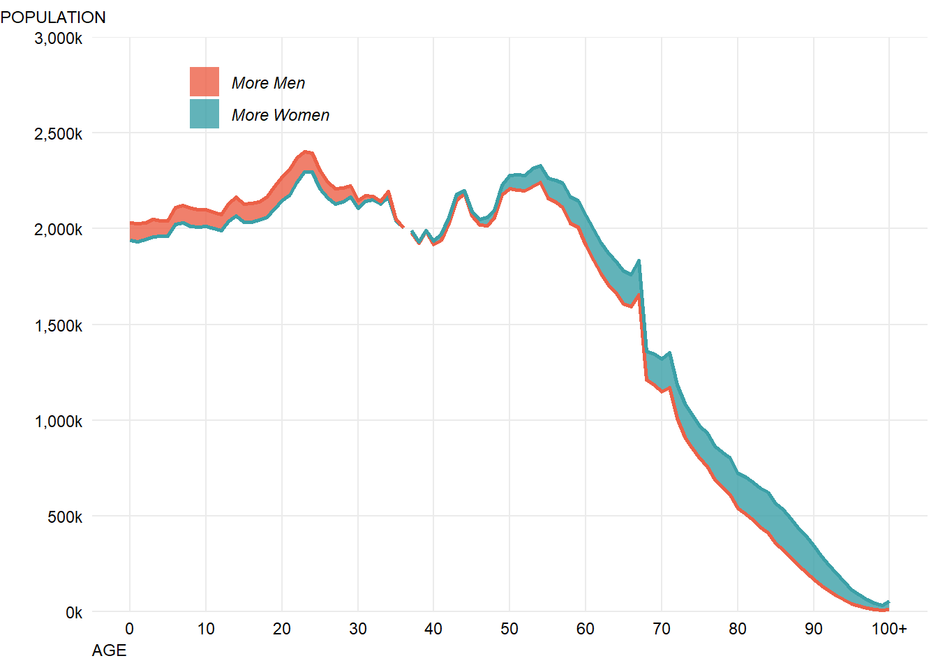
This looks pretty close now, having a quick scan through Google Fonts, it looks like “Roboto Mono” is somewhat similar to the font use so I’ll go with that and apply it using the showtext package:
library(showtext)
font_add_google("Roboto Mono", "roboto")

showtext_auto()

chartData %>% filter(Year==2014) %>%
  ggplot() +
  geom_ribbon(aes(x=`Age Code`,ymin=Lower,ymax=Upper,fill=UpperGender),
              alpha=0.8) + #make fill slightly transparent
  geom_line(aes(x=`Age Code`,y=Lower,colour=LowerGender),size=0.9,show.legend = FALSE) +
  geom_line(aes(x=`Age Code`,y=Upper,colour=UpperGender),size=0.9,show.legend = FALSE) + #we don't need the line colours to have a legend
  scale_fill_manual("",#don't label the legend
                    breaks=c("Male","Female"), #choose the order to display in
                    labels=c("More Men","More Women"), #match the labelling used in the original
                    values=c(women,men), #colours to use, in the order of the factor not displayed order
                    aesthetics = c("colour", "fill"))+ #change both the line and fills together
  scale_y_continuous("", #the title for the axis
                     limits=c(0,3000000), #set the top and bottom value
                     expand=c(0,0), #don't expand beyond the specified limits
                     breaks=c(0,500000,1000000,1500000,2000000,2500000,3000000), #specify what to put on the axis
                     labels=scales::comma_format(scale=0.001,suffix="k")) + # format the displayed numbers using the scales package
  scale_x_continuous("AGE", #axis title
                     breaks= c(0,10,20,30,40,50,60,70,80,90,100),
                     labels=c("0","10","20","30","40","50","60","70","80","90","100+")) +
  labs(subtitle="POPULATION")+
  theme_minimal() + #apply my prefered theme which is close to what Nathan used
  theme(text=element_text(colour="black",family="roboto"), #all text is black
        plot.subtitle=element_text(size=9),
        axis.text = element_text(colour="black"), #make sure labels are black also
        axis.title.x=element_text(hjust=0,angle=0,size=9),
        panel.grid.minor.x=element_blank(), #turn off minor gridlines
        panel.grid.minor.y=element_blank(), #turn off minor gridlines
        legend.position = c(0.2,0.92), #position legend over the plot
        legend.text = element_text(face="italic") #make italic
) 
Unfortunately this way of specifying fonts doesn’t seem to play nicely with my solution to left aligning the title. An alternative is to just manually tweak the hjust value until the positioning looks right in this case (this is not transferable to different lenght titles, but that doesn’t matter for this example).
For some reason I can’t work out, the fonts are not making it through the rendering process from Rmarkdown into the final HTML page. I’ll manually import a final image with the correct fonts, but for now take it on faith that the fonts look about right in these images…
showtext_auto()

chartData %>% filter(Year==2014) %>%
  ggplot() +
  geom_ribbon(aes(x=`Age Code`,ymin=Lower,ymax=Upper,fill=UpperGender),
              alpha=0.8) + #make fill slightly transparent
  geom_line(aes(x=`Age Code`,y=Lower,colour=LowerGender),size=0.9,show.legend = FALSE) +
  geom_line(aes(x=`Age Code`,y=Upper,colour=UpperGender),size=0.9,show.legend = FALSE) + #we don't need the line colours to have a legend
  scale_fill_manual("",#don't label the legend
                    breaks=c("Male","Female"), #choose the order to display in
                    labels=c("More Men","More Women"), #match the labelling used in the original
                    values=c(women,men), #colours to use, in the order of the factor not displayed order
                    aesthetics = c("colour", "fill"))+ #change both the line and fills together
  scale_y_continuous("", #the title for the axis
                     limits=c(0,3000000), #set the top and bottom value
                     expand=c(0,0), #don't expand beyond the specified limits
                     breaks=c(0,500000,1000000,1500000,2000000,2500000,3000000), #specify what to put on the axis
                     labels=scales::comma_format(scale=0.001,suffix="k")) + # format the displayed numbers using the scales package
  scale_x_continuous("AGE", #axis title
                     breaks= c(0,10,20,30,40,50,60,70,80,90,100),
                     labels=c("0","10","20","30","40","50","60","70","80","90","100+")) +
  labs(subtitle="POPULATION")+
  theme_minimal() + #apply my prefered theme which is close to what Nathan used
  theme(text=element_text(colour="black",family="roboto"), #all text is black
        plot.subtitle=element_text(size=9,hjust=-0.085), # manually tweak subtitle position
        axis.text = element_text(colour="black"), #make sure labels are black also
        axis.title.x=element_text(hjust=0,angle=0,size=9),
        panel.grid.minor.x=element_blank(), #turn off minor gridlines
        panel.grid.minor.y=element_blank(), #turn off minor gridlines
        legend.position = c(0.2,0.92), #position legend over the plot
        legend.text = element_text(face="italic") #make italic
) 
There’s one odd looking element, there’s a gap in the plot where the lines should cross over. One slightly hacky solution is to duplicate the records where the cross over occurs:
chartData %>% arrange(Year, `Age Code`) %>%
  filter(UpperGender!=lag(UpperGender) &`Age Code` > 0) -> crossOvers

crossOvers %>% mutate(UpperGender=if_else(UpperGender=="Male","Female","Male"),
                      LowerGender=if_else(LowerGender=="Male","Female","Male")) -> crossOvers

chartData %>% rbind(crossOvers) -> chartData2
Another solution might be to explictly draw two ribbons for each year and not rely on ggplot2 to fill in the gaps.
The hacky solution broadly looks like it works:
chartData2 %>% filter(Year==2014) %>%
  ggplot() +
  geom_ribbon(aes(x=`Age Code`,ymin=Lower,ymax=Upper,fill=UpperGender),
              alpha=0.8) + #make fill slightly transparent
  geom_line(aes(x=`Age Code`,y=Lower,colour=LowerGender),size=0.9,show.legend = FALSE) +
  geom_line(aes(x=`Age Code`,y=Upper,colour=UpperGender),size=0.9,show.legend = FALSE) + #we don't need the line colours to have a legend
  scale_fill_manual("",#don't label the legend
                    breaks=c("Male","Female"), #choose the order to display in
                    labels=c("More Men","More Women"), #match the labelling used in the original
                    values=c(women,men), #colours to use, in the order of the factor not displayed order
                    aesthetics = c("colour", "fill"))+ #change both the line and fills together
  scale_y_continuous("", #the title for the axis
                     limits=c(0,3000000), #set the top and bottom value
                     expand=c(0,0), #don't expand beyond the specified limits
                     breaks=c(0,500000,1000000,1500000,2000000,2500000,3000000), #specify what to put on the axis
                     labels=scales::comma_format(scale=0.001,suffix="k")) + # format the displayed numbers using the scales package
  scale_x_continuous("AGE", #axis title
                     breaks= c(0,10,20,30,40,50,60,70,80,90,100),
                     labels=c("0","10","20","30","40","50","60","70","80","90","100+")) +
  labs(subtitle="POPULATION")+
  theme_minimal() + #apply my prefered theme which is close to what Nathan used
  theme(text=element_text(colour="black",family="roboto"), #all text is black
        plot.subtitle=element_text(size=9,hjust=-0.085), # manually tweak subtitle position
        axis.text = element_text(colour="black"), #make sure labels are black also
        axis.title.x=element_text(hjust=0,angle=0,size=9),
        panel.grid.minor.x=element_blank(), #turn off minor gridlines
        panel.grid.minor.y=element_blank(), #turn off minor gridlines
        legend.position = c(0.2,0.92), #position legend over the plot
        legend.text = element_text(face="italic") #make italic
) 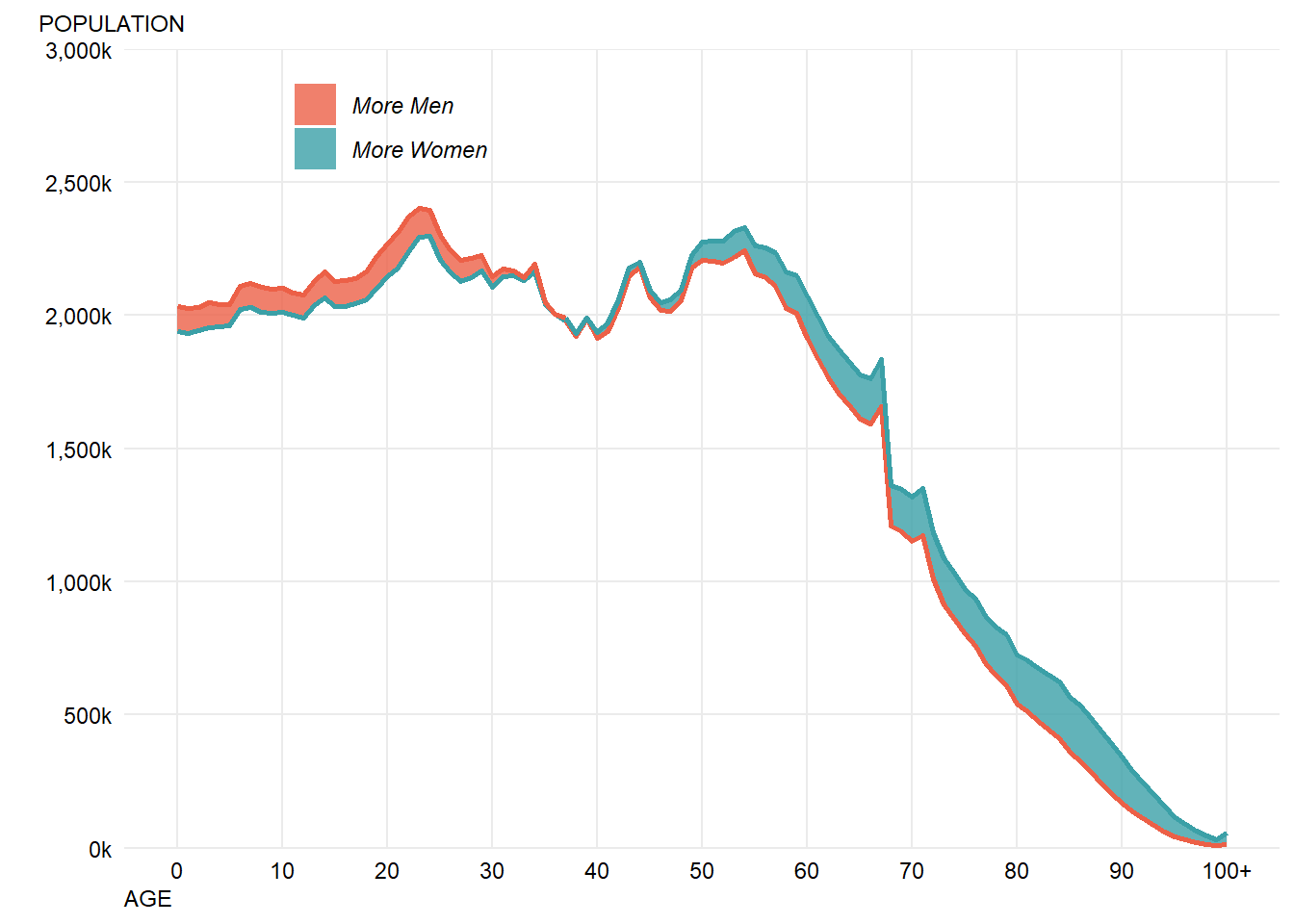
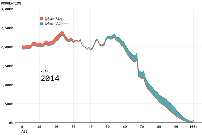
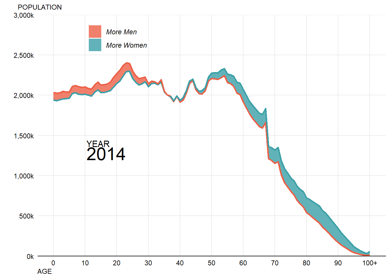
Before getting to animation there are two more missing formatting points - the solid x-axis line and the year value. These are fairly easy to add:
chartData2 %>% filter(Year==2014) %>%
  ggplot() +
  geom_ribbon(aes(x=`Age Code`,ymin=Lower,ymax=Upper,fill=UpperGender),
              alpha=0.8) + #make fill slightly transparent
  geom_line(aes(x=`Age Code`,y=Lower,colour=LowerGender),size=0.9,show.legend = FALSE) +
  geom_line(aes(x=`Age Code`,y=Upper,colour=UpperGender),size=0.9,show.legend = FALSE) + #we don't need the line colours to have a legend
  annotate("text",x=10.5,y=1400000,label="YEAR",colour="black",family="roboto",size=4,hjust="left")+
  annotate("text",x=10.5,y=1275000,label="2014",colour="black",family="roboto",size=8,hjust="left")+
  scale_fill_manual("",#don't label the legend
                    breaks=c("Male","Female"), #choose the order to display in
                    labels=c("More Men","More Women"), #match the labelling used in the original
                    values=c(women,men), #colours to use, in the order of the factor not displayed order
                    aesthetics = c("colour", "fill"))+ #change both the line and fills together
  scale_y_continuous("", #the title for the axis
                     limits=c(0,3000000), #set the top and bottom value
                     expand=c(0,0), #don't expand beyond the specified limits
                     breaks=c(0,500000,1000000,1500000,2000000,2500000,3000000), #specify what to put on the axis
                     labels=scales::comma_format(scale=0.001,suffix="k")) + # format the displayed numbers using the scales package
  scale_x_continuous("AGE", #axis title
                     breaks= c(0,10,20,30,40,50,60,70,80,90,100),
                     labels=c("0","10","20","30","40","50","60","70","80","90","100+")) +
  labs(subtitle="POPULATION")+
  theme_minimal() + #apply my prefered theme which is close to what Nathan used
  theme(text=element_text(colour="black",family="roboto"), #all text is black
        plot.subtitle=element_text(size=9,hjust=-0.065), # manually tweak subtitle position
        axis.text = element_text(colour="black"), #make sure labels are black also
        axis.title.x=element_text(hjust=0,angle=0,size=9),
        axis.line.x=element_line(colour="black"), # add a solid black x axis line
        panel.grid.minor.x=element_blank(), #turn off minor gridlines
        panel.grid.minor.y=element_blank(), #turn off minor gridlines
        legend.position = c(0.2,0.92), #position legend over the plot
        legend.text = element_text(face="italic") #make italic
) 
This now gets pretty close to the final output - if I reimport the final image with the correct fonts then it looks as follows:
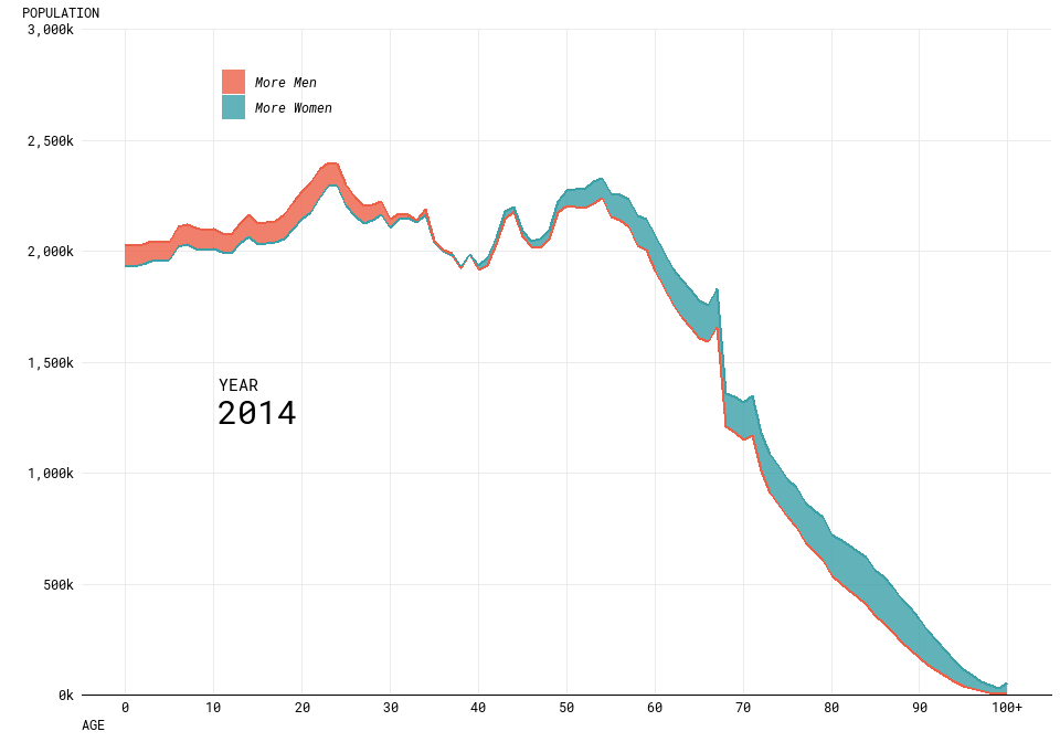
Some of the alignment isn’t perfect, and the resolution isn’t high as the original and some of the lines could be smoother but partly this is a challenge of trying to get lots of different tools and packages to work well together. Fine tuning graphics in R is definitely still fairly challenging and frustrating.
Additionally, I’m not sure that I’m that much of a fan of doing all of this work directly into the RMarkdown document which will become the blog post - seems to be too many moving parts.
Step 3 - Producing the animation
The gganimate package is quite new, and currently there aren’t a load of examples to look at when trying to use it. When I tried to simply animate my existing visualisation, this didn’t work as well as I hoped. Specifically, it didn’t want to animate my geom_ribbon at all and I’m not sure why.
So, for now I’m going to leave it as two animated lines. In order to get the years in the right place, I ended up coming up with a hacky solution which moved the plot title to the right place using hjust/vjust which doesn’t feel like it should be the solution. However, I couldn’t immediately work out how to get gganimate to label the frame anywhere except the title.
The final code I used to produce the animation is below:
showtext_auto()
chartData2 %>%
  ggplot() +
  geom_line(aes(x=`Age Code`,y=Lower,colour=LowerGender),size=0.9) +
  geom_line(aes(x=`Age Code`,y=Upper,colour=UpperGender),size=0.9) +
  annotate("text",x=10.5,y=1400000,label="YEAR",colour="black",family="roboto",size=4,hjust="left")+
  scale_colour_manual("",#don't label the legend
                    breaks=c("Male","Female"), #choose the order to display in
                    labels=c("Men","Women"), #match the labelling used in the original
                    values=c(women,men), #colours to use, in the order of the factor not displayed order
  )+
  scale_y_continuous("", #the title for the axis
                     limits=c(0,3000000), #set the top and bottom value
                     expand=c(0,0), #don't expand beyond the specified limits
                     breaks=c(0,500000,1000000,1500000,2000000,2500000,3000000), #specify what to put on the axis
                     labels=scales::comma_format(scale=0.001,suffix="k")) + # format the displayed numbers using the scales package
  scale_x_continuous("AGE", #axis title
                     breaks= c(0,10,20,30,40,50,60,70,80,90,100),
                     labels=c("0","10","20","30","40","50","60","70","80","90","100+")) +
  labs(title='{frame_time}',
       subtitle="POPULATION")+
  theme_minimal() + #apply my prefered theme which is close to what Nathan used
  theme(text=element_text(colour="black",family="roboto"), #all text is black
        plot.title = element_text(size=14,hjust=0.16,vjust=-135),
        plot.subtitle=element_text(size=9,hjust=-0.13), # manually tweak subtitle position
        axis.text = element_text(colour="black"), #make sure labels are black also
        axis.title.x=element_text(hjust=0,angle=0,size=9),
        axis.line.x=element_line(colour="black"), # add a solid black x axis line
        panel.grid.minor.x=element_blank(), #turn off minor gridlines
        panel.grid.minor.y=element_blank(), #turn off minor gridlines
        legend.position = c(0.2,0.92), #position legend over the plot
        legend.text = element_text(face="italic") #make italic
  ) +
  transition_time(Year) +
  ease_aes('linear') -> animation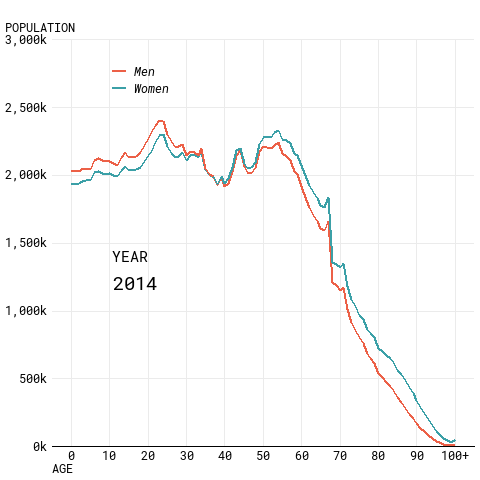
Conclusions
- Specific formatting of plots in pure R is hard.
- Fonts in particular are a nightmare.
- All the different ways of rendering plots and the different impacts on positioning etc. are annoying/hard to understand.
- gganimate isn’t super easy to pick up and do whatever you want with it without quite a bit of effort.
I’ve not quite gotten to the final visualisation as I hope to do, but got pretty close and found this a useful learning experience even if it was at times quite frustrating!
If you’ve read all this and found it useful/interesting then please let me know! I’d also welcome any recommendations on how I could have done any of this better (especially how to get to the final plot using R).
UPDATE 27/10/2018
Wow, this has a gotten a lot of attention!
Firstly, thanks to everyone who has read this, and thanks in particular for Nathan Yau and Thomas Lin Pedersen for their replies to me on Twitter.
It seems like gganimate should be able to cope with what I’m asking it to do, so at some point soon I’m going to produce a reprex and file an issue on Github to try and solve this mystery.
Nathan shared that he uses the “animation” package / ImageMagick to produce his work, so I’ve taken a look into using that to turn the static plots into an animation. This was fairly simple, and pretty sucessful (my version is still lower resolution / doesn’t have the smoothest curves, the alignment isn’t perfect and the font in my key isn’t correct).
The key steps were:
- Create a more transparent set of lines/ribbons for the 2014 data, by creating a seperate filtered dataset and passing this to ggplot2. This creates the “shadow” effect in the original visualisation.
- Put a loop around the single year visualisation code to filter to each year in turn
- Save the individual plot for each year to disk with a fixed name
- Create a list (in the right order) of the images created and pass this list to the “im.convert” function.
#loop through years and then combine together using imagemagick (via animation package)
library(animation)
## Warning: package 'animation' was built under R version 3.5.1chartData2 %>% filter(Year==2014) -> chartData2_first # get a 2014 version of the dataset to use for the "shadow" effect
chartData2 %>% distinct(Year) %>% pull() -> years #get all of the unique years in the data to loop through
i <- 0 #keep track of the frame number, initially it's zero
#files list needs to be in numeric not alphabetical, (wildcards don't work properly) so create an empty list to append to
filelist <- c()
for (year in years){
i <- i+1
chartData2 %>% filter(Year==year) %>%
ggplot() +
geom_ribbon(data=chartData2_first,aes(x=`Age Code`,ymin=Lower,ymax=Upper,fill=UpperGender),
alpha=0.25) + #make fill slightly transparent
geom_line(data=chartData2_first,aes(x=`Age Code`,y=Lower,colour=LowerGender),size=0.9,show.legend = FALSE,alpha=0.5) +
geom_line(data=chartData2_first,aes(x=`Age Code`,y=Upper,colour=UpperGender),size=0.9,show.legend = FALSE,alpha=0.5) +
geom_ribbon(aes(x=`Age Code`,ymin=Lower,ymax=Upper,fill=UpperGender),
alpha=0.8) + #make fill slightly transparent
geom_line(aes(x=`Age Code`,y=Lower,colour=LowerGender),size=0.9,show.legend = FALSE) +
geom_line(aes(x=`Age Code`,y=Upper,colour=UpperGender),size=0.9,show.legend = FALSE) + #we don't need the line colours to have a legend
annotate("text",x=10.5,y=1400000,label="YEAR",colour="black",family="roboto",size=4,hjust="left")+
annotate("text",x=10.5,y=1275000,label=year,colour="black",family="roboto",size=8,hjust="left")+
scale_fill_manual("",#don't label the legend
breaks=c("Male","Female"), #choose the order to display in
labels=c("More Men","More Women"), #match the labelling used in the original
values=c(women,men), #colours to use, in the order of the factor not displayed order
aesthetics = c("colour", "fill"))+ #change both the line and fills together
scale_y_continuous("", #the title for the axis
limits=c(0,3000000), #set the top and bottom value
expand=c(0,0), #don't expand beyond the specified limits
breaks=c(0,500000,1000000,1500000,2000000,2500000,3000000), #specify what to put on the axis
labels=scales::comma_format(scale=0.001,suffix="k")) + # format the displayed numbers using the scales package
scale_x_continuous("AGE", #axis title
breaks= c(0,10,20,30,40,50,60,70,80,90,100),
labels=c("0","10","20","30","40","50","60","70","80","90","100+")) +
labs(subtitle="POPULATION")+
theme_minimal() + #apply my prefered theme which is close to what Nathan used
theme(text=element_text(colour="black",family="roboto"), #all text is black
plot.subtitle=element_text(size=9,hjust=-0.065), # manually tweak subtitle position
axis.text = element_text(colour="black"), #make sure labels are black also
axis.title.x=element_text(hjust=0,angle=0,size=9),
axis.line.x=element_line(colour="black"), # add a solid black x axis line
panel.grid.minor.x=element_blank(), #turn off minor gridlines
panel.grid.minor.y=element_blank(), #turn off minor gridlines
legend.position = c(0.2,0.92), #position legend over the plot
legend.text = element_text(face="italic") #make italic
)
ggsave(paste0("frame",i,".png"),width = 7.68,height=5.49,dpi=100) #save the image
filelist <- c(filelist,paste0("frame",i,".png")) #append to the file list
}
#point convert at the short path to imagemagick convert - fails if a space in the path
ani.options(convert = 'C://PROGRA~1//IMAGEM~1.8-Q//convert.exe',
interval=0.15)
im.convert(filelist, output = "animation.gif", convert = c("convert"),
clean = TRUE) #TRUE deletes the .png files after running the code.## Executing:
## "C://PROGRA~1//IMAGEM~1.8-Q//convert.exe -loop 0 -delay 15
## frame1.png frame2.png frame3.png frame4.png frame5.png
## frame6.png frame7.png frame8.png frame9.png frame10.png
## frame11.png frame12.png frame13.png frame14.png frame15.png
## frame16.png frame17.png frame18.png frame19.png frame20.png
## frame21.png frame22.png frame23.png frame24.png frame25.png
## frame26.png frame27.png frame28.png frame29.png frame30.png
## frame31.png frame32.png frame33.png frame34.png frame35.png
## frame36.png frame37.png frame38.png frame39.png frame40.png
## frame41.png frame42.png frame43.png frame44.png frame45.png
## frame46.png frame47.png "animation.gif""## Output at: animation.gif