Scatter plots, best fit lines (and regression to the mean)
March 31, 2019
Last week I came across an interesting conversation on twitter, which raised something I hadn’t thought about before:
Something I embarrassingly never thought about visually until reading @yudapearl 's #bookofwhy. People tend to overestimate correlations because people don't think about regressions using least-squares, they think about them as orthogonal regression. #DataScience #dataviz pic.twitter.com/791MR33CtJ
— Nick Strayer (@NicholasStrayer) March 18, 2019
There were a number of good responses, including links to a few blog posts digging into how all this works, but I wanted to try and summarise what I think are the most important points and have a go at putting together my own versions of the visualisations.
In short, if I have a scatter plot of some data, there are at least three different ways to put a line of best fit through the data -
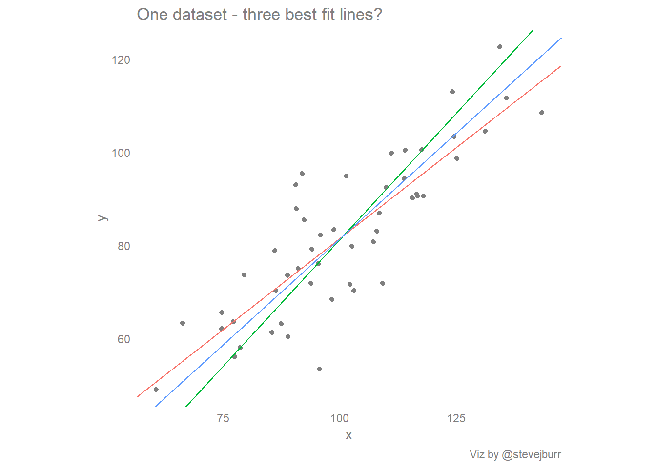
This post explores the how, why and interpretation of these three lines and at the end offers some thoughts on what this means for the creation of data visualisations and for doing exploratory data analysis using visualisations as a key tool.
The basics
We’re going to need some simulated data to plot, so let’s simulate some using R:
library(tidyverse)
# Ensure reproducibility by setting random number seed
set.seed(123)
#
x <- rnorm(50,mean=100,sd=20)
# y = 0.8 * x + noise
y <- 0.8 * x + rnorm(50,mean=0,sd=10)

#combine x and y into a single data frame for easy use:
data <- data.frame(x,y)
This data has a true underlying deterministic relationship between x and y, and then I have added some random noise to these data so that all the points don’t lie on a straight line.
We can easily plot these data using ggplot2:
ggplot(data) +
  geom_point(aes(x=x,y=y),colour="grey50")+
  #force consistent size of x/y axis
  coord_equal() +
  #style the plot
  theme_minimal() +
  theme(panel.grid=element_blank(),
        text=element_text(colour="grey50"),
        axis.title=element_text(colour="grey50"),
        axis.text=element_text(colour="grey50"),
        legend.text=element_text(colour="grey50")) -> basic_scatter

basic_scatter + labs(title="Scatter plot of simulated data where x partly determines y",caption="Viz by @stevejburr")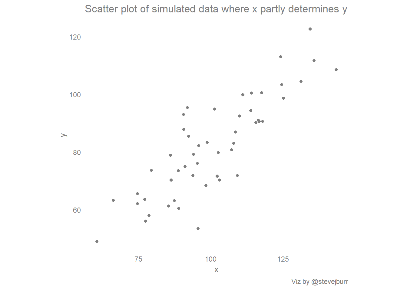
The linear regression line
Let’s start with the standard “best fit” line, the regression line which predicts y from x:
#fit the model
line1 <- lm(y~x)$coef
#extract the slope from the fitted model
line1.slope <- line1[2]
#extract the intercept from the fitted model
line1.intercept <- line1[1]

#redraw the scatted plot with the regression line added:
ggplot(data) +
  geom_point(aes(x=x,y=y),colour="grey50")+
  geom_abline(aes(slope=line1.slope,intercept=line1.intercept),colour="#F8766D")+ # draw the regression line
#force consistent size of x/y axis
  coord_equal() +
  #style the plot
  theme_minimal() +
  theme(panel.grid=element_blank(),
        text=element_text(colour="grey50"),
        axis.title=element_text(colour="grey50"),
        axis.text=element_text(colour="grey50"),
        legend.text=element_text(colour="grey50")) -> scatter_with_yx #this plot is saved for later

#print the plot
scatter_with_yx + labs(title="Linear regression fit y~x overlaid on simulated data",caption="Viz by @stevejburr")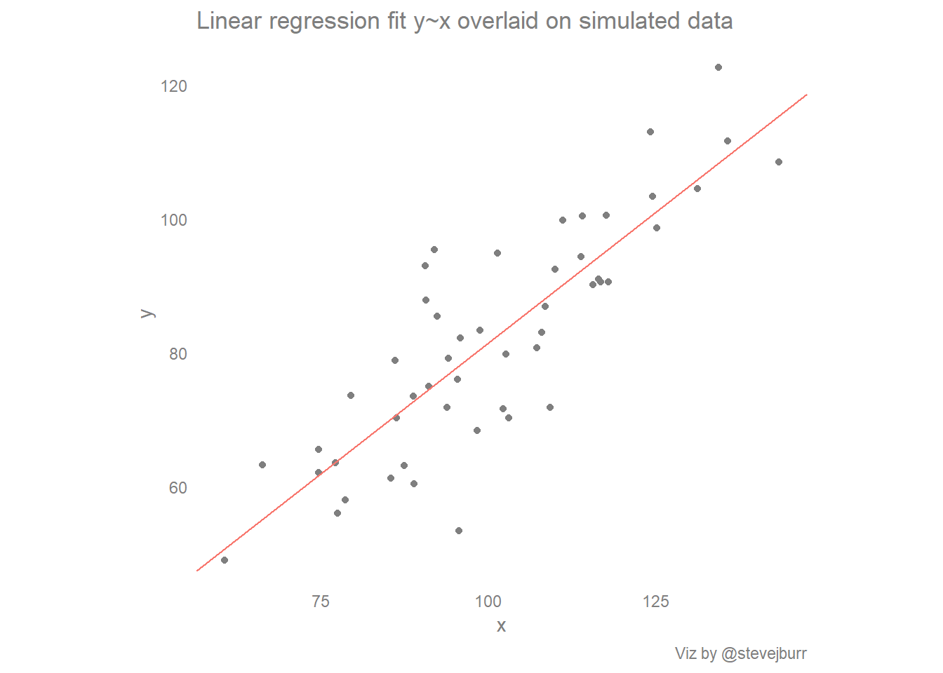
What is the standard regression line doing?
When you perform a standard linear regression analysis and predict a variable y from another variable x, you are making some assumptions about the relationship between the two variables which you might forget about in the context of best fit lines.
The linear model being fit by the regression analysis can be expressed as:
y = Bx + intercept + errorThe key assumption here is that there is a simple linear relationship between x and y, whereby each unit increase in x results in a corresponding increase of B in y. Any variation in the data not captured by this relationship is assumed to be the result of random variation. Within most regression analyses this error is assumed to be normally distributed with mean 0 and constant variance across all the values of x (i.e. we predict the data equally well at any point on the line).
A real example of this comes from the work of Francis Galton which helped to give regression analysis its name. Galton studied the relationship between the heights of parents and their children. He noted that though taller parents have taller children, those children are less exceptionally tall than their parents. That is, heights “regress to the mean”.
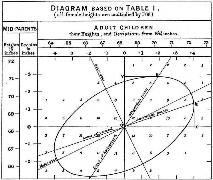
Galton’s linear regression analysis of parent and child heights - Source: Wikipedia
This comes down to the random part of the model which isn’t captured by the coefficients. When someone is exceptionally tall, the model says that this is partly due to underlying factors we can measure (e.g. genetics - approximated by parent height) but also partly driven by random chance. In other words, a very tall parent may pass on the genetic traits for being tall but not the specific combination of other random factors which led to their exceptional height - luck is not inherited!
Effects like this can be seen in all sorts of fields, for example sports (see the “Sports Illustrated Cover Curse”), company performance and performance of fund managers. When you measure over time, you tend to see that the best performers in one time period tend to do worse in subsequent periods (and vice versa, the worst performers will tend to do better than next year). One aspect of their performance is down to underlying skills / fundamentals but what makes them exceptional in one year is the extra element of good or bad luck.
These examples help to give some real world intuition to this concept (and help you reason about the future from what you’ve observed in the past) but we can look at this in more abstract terms. This is well explained in Gelman/Hill’s regression analysis book, and I’ve tried to illustrate their example in the next visualisation.
The code to do this is a little bit longer than the previous plots, but most of it deals with standardisation of the variables. This means that we subtract the mean of each variable from each observation of that variable, so the values are centered about 0, which now represents the average value. We also divide each value by the standard deviation, meaning each value shows how many standard deviations away from the mean each observation is. As the data is simulated from a normal distribution, nearly all of the values will lie between -3/+3, with the vast majority between -2/+2.
Standardising both variables in this way helps us to understand how extreme values of x relate to extreme values of y without having to worry about units and relative volatility.
#A function to standardise a variable:
stdize <- function(x){(x-mean(x))/sd(x)}

#build a data frame from vectors x and y:
stdData <- data.frame(x,y)
#calculate the standardised value of each variable, and the mean/sd:
stdData %>%
  mutate_all(funs(stdize,mean,sd)) -> stdData

#calculate the regression line using standardised variables:
stdlm <- lm(y_stdize ~ x_stdize, data=stdData)

#extract the coefficients:
stdData$slope <- coef(stdlm)[2]
stdData$intercept <- coef(stdlm)[1]
#calculate predicted values of y using the regression line:
stdData$y_hat <- (stdData$x_stdize * stdData$slope) + stdData$intercept

# plot the results:
ggplot(stdData) +
  geom_vline(aes(xintercept=0),colour="grey80")+
  geom_hline(aes(yintercept=0),colour="grey80")+
  geom_point(aes(x=x_stdize,y=y_stdize),colour="grey50") +
  geom_abline(aes(slope=slope,intercept=intercept),colour="#F8766D") +
  geom_abline(aes(slope=1,intercept=0),colour="#F8766D",linetype=2) +
  scale_y_continuous("Standard deviations from mean of y") +
  scale_x_continuous("Standard deviations from mean of x")+
  coord_equal() +
  theme_minimal()+
  theme(panel.grid=element_blank(),
        axis.title=element_text(colour="grey50"),
        axis.text=element_text(colour="grey50"),
        text=element_text(colour="grey50"),
        plot.title = element_text(size=10),
        plot.subtitle = element_text(size=8)) +
  labs(title="Illustration of regression to the mean using standardised variables.",
       subtitle="With standardised variables, the gradient of the line is the correlation between the two variables.\nIf there is perfect correlation, then this gradient is equal to 1 (dotted line).\nIf the correlation is less than this then we will observe 'regression to the mean'.\nIf x is say 2sd from the mean of x, then y will be predicted to be 2*gradients from the mean of y.\nFor a gradient of less than 1, y is predicted to be closer to the mean than x, this is regression to the mean.",
       caption="Viz by @stevejburr")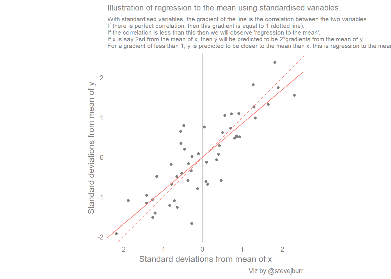
Another, final, way of thinking about this is that linear regression is estimating the mean value of y conditional on the value of x. In other words, if we have a lot of data for a given problem, and we want to predict a new value y based on a fixed value of x, then the best thing to do is predict the new y value to be the average of all the data points with the same value of x. In most real cases, we won’t have enough data to just consider x values with the same value as what we want to predict, so the regression analysis allows us to make use of all the data we have across all the values of x to make a prediction at specified value of x.
We can satisfy ourselves that the linear regression line represents the average value of y given a value of x by doing some summarisation. If we split x into five approximately equal chunks, calculate the average value of y within each of these chunks and then add these averages to the scatter plot we see that the linear regression line comes very close to these conditional means:
#add conditional mean of y given a banded value of x to a basic scatter plot

#use cut to create evenly sized groups
data$x_group <- cut(data$x,5)

#calculate end points for the cuts, and the conditional means between those values
data %>%
  group_by(x_group) %>%
  summarise(y_bar = mean(y),
            max_x=max(x),
            min_x=min(x)) -> condMeans

#add the conditional means to the existing scatter plot:
scatter_with_yx +
  geom_segment(data=condMeans,
               aes(x=min_x,xend=max_x,y=y_bar,yend=y_bar))+ labs(title="Linear regression fit y~x overlaid on simulated data",
                                                                 subtitle="The line matches closely to conditional means evaluated across bands of x values",caption="Viz by @stevejburr")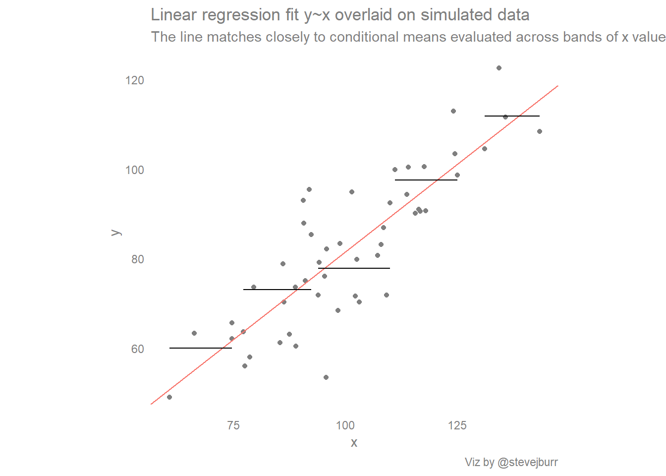
The “natural” line
The starting point for this post was a diagram stating that the “best fit” line people will draw through a cloud of points isn’t the same line that is produced by a linear regression analysis. So what exactly is this “natural” line?
The linear regression line tries to put a line through the points so that vertical error (predicted y vs actual y) is minimised, whereas the natural line is accounting for both differences in the x and y directions and trying to position the line to minimise both these quantities. This is finding the line with the shortest diagonal distance to each data point, as opposed to the vertical distance in the linear regression case.
The shortest distance from a point to a line is the perpendicular distance, that is to say the line which goes through the point and forms a right angle with the other line. These two lines are orthogonal, and hence finding this “natural” line is “Orthogonal Regression”, or “Deming Regression”.
There are packages for running Deming Regression in R, but we don’t need those when looking at this two dimensional example. This is because the “natural” line is also the first principal component of the data.
I’m not going to go into detail here on what principal components analysis is, but the essential goal is to transform a dataset so that instead of describing data points with a set of (x,y) coordinates we instead use a different set of coordinates where the two axis are aligned to the variation in the data.
The components are ordered so that the first component explains most of the variance in the data, and subsequent components are orthogonal to those that have come before (in the same way that the y axis is at right angles to the x axis). This sounds a little abstract, but in the example of this 2D scatter plot, the process amounts to visually rotating the cloud of points so that the long/stretched out part of the cloud becomes the new x axis (the first principal component) and the remaining variation becomes the new y axis:
#enables easy combining of plots:
library(patchwork)

#identify the principal components of x/y
#extract the positions of each data point on the new axes
#plot on a scatterplot
prcomp(cbind(x,y))$x %>%
  as.data.frame %>%
  ggplot(aes(x=PC1,y=PC2)) +
  geom_point(colour="grey50") +
  #coord_equal() +
  theme_minimal()+
  theme(panel.grid=element_blank(),
        axis.title=element_text(colour="grey50"),
        axis.text=element_text(colour="grey50"),
        text=element_text(colour="grey50")) -> pca_scatter

#combine the new scatter with the original one
basic_scatter + labs(title="Simulated data, before and after PCA transformation") + pca_scatter + labs(caption="Viz by @stevejburr")  + plot_layout(ncol=1)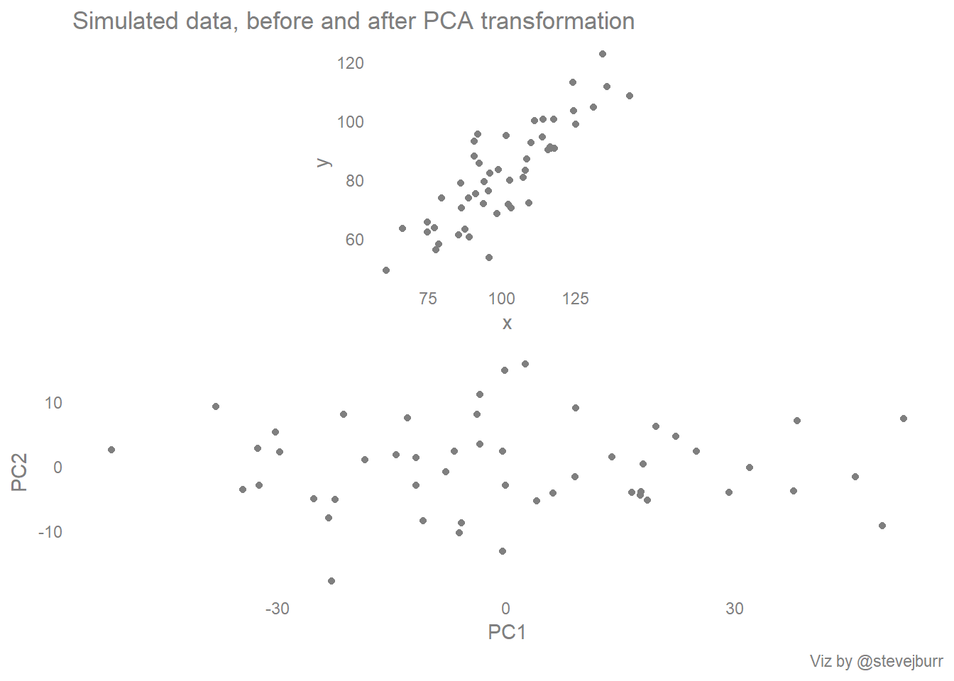
The information we need to use in order to draw a best fit line is held within the “rotations” part of the object returned by the prcomp function:
pca <- prcomp(cbind(x,y))$rotation
pca
## PC1 PC2
## x 0.7398530 -0.6727685
## y 0.6727685 0.7398530We are interested in the first principal component in this case, because that’s the one which captures most of the variance in the two variables. This table shows how the two original variables x and y contribute to each of the principal components, by dividing the value for y by the value for x for the first principal component we get the gradient of the line. As the line will go through the point (mean(x),mean(y)) this allows us to calculate the value of the slope:
pca.slope <- pca[2,1] / pca[1,1]
pca.intercept <- mean(y) - (pca.slope * mean(x))
Once we have these values, we can plot the line on the scatter plot in the same way as before:
ggplot(data) +
  geom_point(aes(x=x,y=y),colour="grey50")+
  geom_abline(aes(slope=pca.slope,intercept=pca.intercept),colour="#619CFF")+ # draw the regression line
#force consistent size of x/y axis
  coord_equal() +
  #style the plot
  theme_minimal() +
  theme(panel.grid=element_blank(),
        text=element_text(colour="grey50"),
        axis.title=element_text(colour="grey50"),
        axis.text=element_text(colour="grey50"),
        legend.text=element_text(colour="grey50")) +
  labs(title="Simulated data with best fit line from PCA overlaid",
       subtitle="This approach makes poorer predictions of y at extreme values of x",
       caption="Viz by @stevejburr")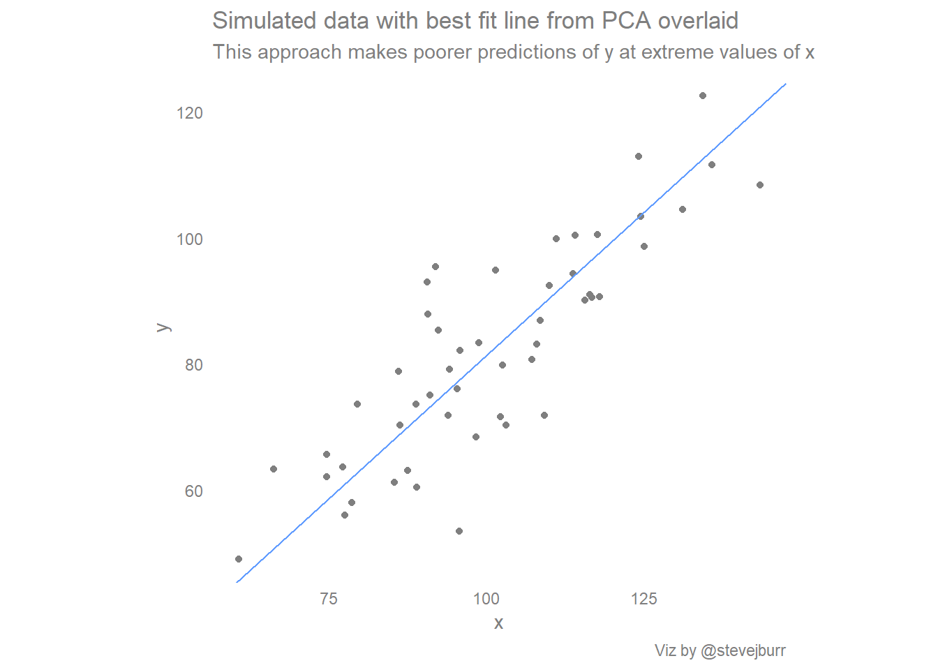
If you draw the natural line in your head, then you can think of the standard regression line as being produced by pulling the ends of the natural line towards the center of the data to moderate the predictions. I think this is a nice, intuitive way of thinking about these different approaches which captures a lot of the reasons behind the differences.
The final line
The final of three lines we could easily include is the regression line of x being predicted by y. The direction of this line is defined in much the same way as the first line, but it makes the reverse assumptions about the relationship between the two variables. Traditionally scatter plots are designed with the assumption that whatever is on the y axis is best viewed as being predicted (or sometimes “caused”) by whatever is on the x axis, so this often isn’t the most useful line to add. However, I like the symmetry it adds to the visualisation, and it provides context around how the line would look if we are wrong about the direction we are thinking about the relationship.
Without dwelling further, the line can be created and plotted as follows:
#model x using y (what if x is actually predicted by y)
line2 <- lm(x~y)$coef
#y = mx + c
#(y-c) = mx
#x = (1/m)y - (c/m)
line2.slope <- (1/line2[2])
line2.intercept <- -(line2[1]/line2[2])

ggplot(data) +
  geom_point(aes(x=x,y=y),colour="grey50")+
  geom_abline(aes(slope=line2.slope,intercept=line2.intercept),colour="#00BA38")+ # draw the regression line
#force consistent size of x/y axis
  coord_equal() +
  #style the plot
  theme_minimal() +
  theme(panel.grid=element_blank(),
        text=element_text(colour="grey50"),
        axis.title=element_text(colour="grey50"),
        axis.text=element_text(colour="grey50"),
        legend.text=element_text(colour="grey50")) +
  labs(title="Simulated data with best fit line x~y overlaid",
       caption="Viz by @stevejburr")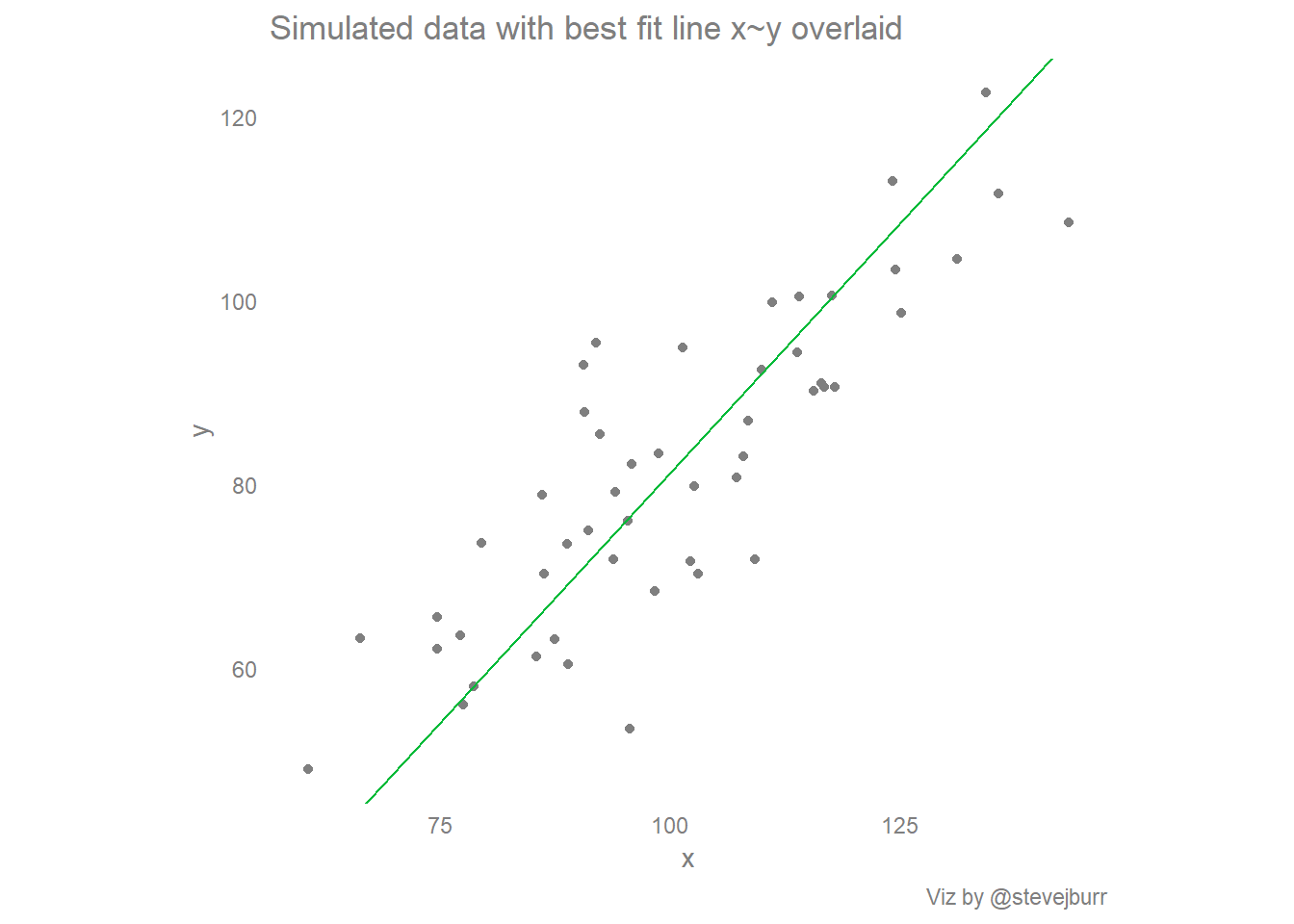
Putting it all together:
Now we have a way of calculating the three different lines, it would be nice to be able to view them on a single visualisation. We could just add the three calls to “geom_abline” used for the individual plots to a single plot, but that is not the most elegant solution.
Additionally, I’d like to visually show the quantity which each approach to drawing a line minimises, so I decided to do some data manipulation to transform the data to make this easier.
Most of this is fairly simple data manipulation code - the main exception is that I personally didn’t find the formula for working out the closest distance from a point to a line at all obvious so had to look it up.
Let’s run the analysis and take a look at the top of the dataset:
#create a clean dataset of just the x and y values:
data <- data.frame(x,y)

#calculate where each point would be on each line of best fit, if it was on it
#these datapoints are labelled "xhat_", "yhat_"
#ultimately want a "long" dataset which has a column specifying which line a variable corresponds to
data %>%
  #calculate the positions using the line equations:
  mutate(yhat_line1=(x*line1.slope+line1.intercept),
         xhat_line1=x,
         yhat_line2=y,
         xhat_line2=(y-line2.intercept)/line2.slope,
         #https://en.wikipedia.org/wiki/Distance_from_a_point_to_a_line
         a=pca.slope,
         b=-1,
         c=pca.intercept,
         xhat_line3=(b*(b*x-a*y)-(a*c))/((a*a)+(b*b)),
         yhat_line3=(a*(-b*x+a*y)-(b*c))/((a*a)+(b*b)),
         #add the slopes/intercepts to this data frame:
         slope_line1=line1.slope,
         slope_line2=line2.slope,
         slope_line3=pca.slope,
         intercept_line1=line1.intercept,
         intercept_line2=line2.intercept,
         intercept_line3=pca.intercept
         )%>%
  #drop intermediate variables
  select(-c(a,b,c)) %>%
  #transpose to a long form
  gather(key="key",value="value",-c(x,y)) %>%
  # have "yhat_line1", want two colums of "yhat" "line1"
  separate(key,c("type","line"),"_") %>%
  #then transpose to be fatter, so we have cols for xhat, yhat etc
  spread(key="type",value="value") %>%
  #relable the lines with more description names, and order the factor for plotting:
  mutate(line=case_when(
           line=="line1" ~ "y~x",
           line=="line2" ~ "x~y",
           line=="line3" ~ "PCA"
         ),
         line=factor(line,levels=c("y~x","x~y","PCA"))) -> data
head(data)
## x y line intercept slope xhat yhat
## 1 60.66766 49.06417 y~x 3.230082 0.7824607 60.66766 50.70014
## 2 60.66766 49.06417 x~y -27.497092 1.0876326 70.39257 49.06417
## 3 60.66766 49.06417 PCA -9.543868 0.9093273 62.38055 47.18047
## 4 66.26613 63.26862 y~x 3.230082 0.7824607 66.26613 55.08073
## 5 66.26613 63.26862 x~y -27.497092 1.0876326 83.45255 63.26862
## 6 66.26613 63.26862 PCA -9.543868 0.9093273 72.51533 56.39630Then we can make the plots:
#basic scatter plot with conditional means:
ggplot() +
  geom_point(data=distinct(data,x,y),
             aes(x=x,y=y),colour="grey50")+
  geom_abline(data=distinct(data,line,slope,intercept),
              aes(slope=slope,intercept=intercept,colour=line))+
  scale_colour_discrete("")+
  coord_equal() +
  theme_minimal() +
  theme(panel.grid=element_blank(),
        text=element_text(colour="grey50"),
        axis.title=element_text(colour="grey50"),
        axis.text=element_text(colour="grey50"),
        legend.text=element_text(colour="grey50"),
        plot.title=element_text(size=10),
        plot.subtitle=element_text(size=8)
        ) +
  geom_segment(data=condMeans,
               aes(x=min_x,xend=max_x,y=y_bar,yend=y_bar)) +
  labs(title="The regression line y~x fits the data best, in the context of being able to predict y from x.",
       subtitle="The PCA line goes through the center of the data, but makes worse predictions of y at the extremes",
       caption="Viz by @stevejburr")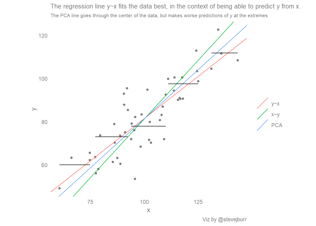
#facetted scatter plot with three sets of residual lines
data %>%
  ggplot() +
  facet_grid(line ~ .) +
  geom_point(aes(x=x,y=y,colour=line),show.legend=F)+
  geom_abline(aes(slope=slope,intercept=intercept,colour=line),show.legend=F)+
  geom_segment(aes(x=x,y=y,xend=xhat,yend=yhat,colour=line),show.legend=F)+
  scale_colour_discrete("")+
  coord_equal() +
  theme_minimal() +
  theme(panel.grid=element_blank(),
        text=element_text(colour="grey50"),
        axis.title=element_text(colour="grey50"),
        axis.text=element_text(colour="grey50"),
        legend.text=element_text(colour="grey50"),
        strip.text=element_text(colour="grey50"),
        plot.title=element_text(size=10)) +
  labs(title="Different lines of best fit, and the residuals they minimise",
       caption="Viz by @stevejburr")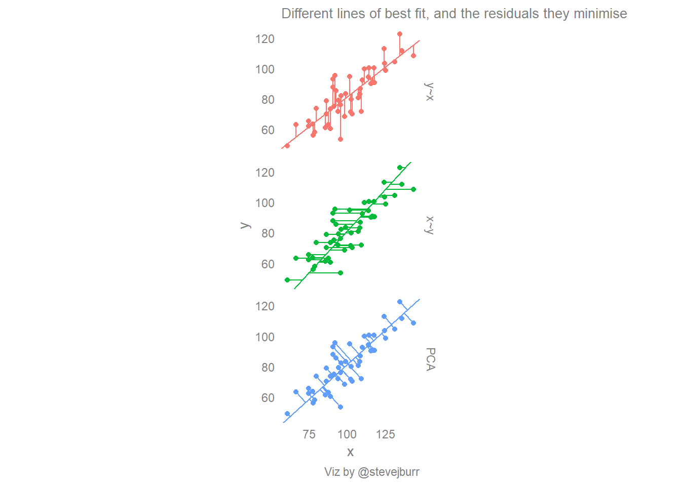
Conclusion
There are multiple ways of drawing a line of best fit through a simple (x,y) scatter plot, and each make different assumptions about the underlying relationships between the two variables.
If the goal is prediction of y from x, when it likely that the relationship between the two variables does run in that direction, then the least squares / linear regression fit will give the most reliable estimates of y throughout the full range of x.
It has been suggested that the most natural line that people draw by eye is in fact the orthogonal regression (PCA) line. If that is indeed the case then this will lead to over estimates of the correlation between two variables and a tendency for estimates done “by eye” to be too low for small values and too high for larger values (when there is a positive correlation between the two variables).
This is worth keeping in mind when doing exploratory analysis by hand, and explictly drawing on standard linear regression lines may help to avoid mistakes when interpreting these relationships.
References
- https://benediktehinger.de/blog/science/scatterplots-regression-lines-and-the-first-principal-component/
- https://onunicornsandgenes.blog/2013/05/31/how-to-draw-the-line-with-ggplot2/
- Gelman & Hill “Data Analysis Using Regression and Multilevel/Hierarchcial Models” - Section 4.3
- https://en.wikipedia.org/wiki/Linear_regression
- https://en.wikipedia.org/wiki/Deming_regression
- https://en.wikipedia.org/wiki/Distance_from_a_point_to_a_line