The danger of stacked area charts
September 23, 2018
Earlier in the week, I saw an interesting tweet which reminded me just how important the ordering of a stacked area chart is, and how hard they can be to interpret:
The Africanization of global poverty
— Justin Sandefur (@JustinSandefur) September 21, 2018
[Or, how changing the order of a stacked area chart can really add emphasis.]
World Bank, original:https://t.co/lnKFxJhRUS
The Economist, revisedhttps://t.co/2V7FonVgEa pic.twitter.com/PEaPRneKHD
Because all layers build on previous ones, you can only easily understand the area of the bottom level which has a common baseline. The Economist have put Sub-Saharan Africa at the bottom to make the relative change much clearer (extreme poverty has fallen in every other region).
A few of the replies to the original tweet seemed to imply that one or other of these charts was using some sort of trickery to make a specific point, which I don’t think is an entirely fair comment to make. There’s no such thing as an “objective” visualisation, design choices make a difference to how the data is perceived and there’s nothing wrong with shaping the visual to make a particular interpretation more clear.
But this did get me thinking about how else this data could be displayed, so I downloaded the dataset and tried out a few approaches.
The original data is from the World Bank, and can be downloaded as a .csv here.
This code reads in the data downloaded from the website and then does a small amount of manipulation to get the data ready to use in subsequent steps:
library(tidyverse)
library(streamgraph)
library(gridExtra)

data <- read_csv("RegionalTable_1.9.csv")


data %>% filter(!(regionTitle %in% c("World Total","World less Other High Income"))) %>%
  transmute(Year=requestYear,
            Region=regionTitle,
            `Number in Extreme Poverty / millions`=hc*population) -> data
This code then produces two rough stacked area charts using ggplot2 - I kept with the default colours for speed, and because they work equally well for both lines and areas (most of the ColorBrewer pallettes don’t work well for lines):
data %>% ggplot() +
  geom_area(aes(x=Year,y=`Number in Extreme Poverty / millions`,fill=Region),position = position_stack(reverse = TRUE)) +
  theme_minimal() +
  theme(text=element_text(colour="grey50"),
        axis.text = element_text(colour="grey50"),
        axis.title= element_text(colour="grey50",size=8),
        panel.grid= element_blank()) -> plot1


data %>% ggplot() +
  geom_area(aes(x=Year,y=`Number in Extreme Poverty / millions`,fill=Region),position = position_stack(reverse = FALSE))  +
  theme_minimal() +
  theme(text=element_text(colour="grey50"),
        axis.text = element_text(colour="grey50"),
        axis.title= element_text(colour="grey50",size=8),
        panel.grid= element_blank()) -> plot2

grid.arrange(plot1,plot2,nrow=2)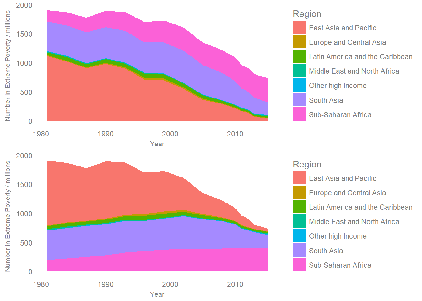
The order of these don’t exactly match the two from twitter, but they do show the impact of having Sub-Saharan Africa at the top and the bottom of the stack respectively.
When I read the first graph, I get a feeling that the number of people in poverty in Sub-Saharan Africa has gone down as a result of the falling baseline. In the second version, the constant zero baseline makes it clear that in fact this has increased while all other regions have fallen. The first layout makes it hard to naturally come to the right conclusion, and this sensitivity to stack order presents a challenge - Should I make one plot for each possible order? Which order is best? Is one “fairer” than the others?
Even though I know it’s the same data, just stacked in two different ways, the patterns which jump out of the visualisations are very different. As the point of a visualisation is to use our visual perception to understand data, this is very important.
Both of these representations make it clear that the overall number of people in poverty has fallen over time. One alternative way of showing the data which makes the changes of individual regions easier to see, but makes it harder to see the total is a simple line graph:
data %>% ggplot() +
  geom_line(aes(x=Year,y=`Number in Extreme Poverty / millions`,col=Region),size=1.1)  +
  theme_minimal() +
  theme(text=element_text(colour="grey50"),
        axis.text = element_text(colour="grey50"),
        axis.title= element_text(colour="grey50"),
        panel.grid= element_blank())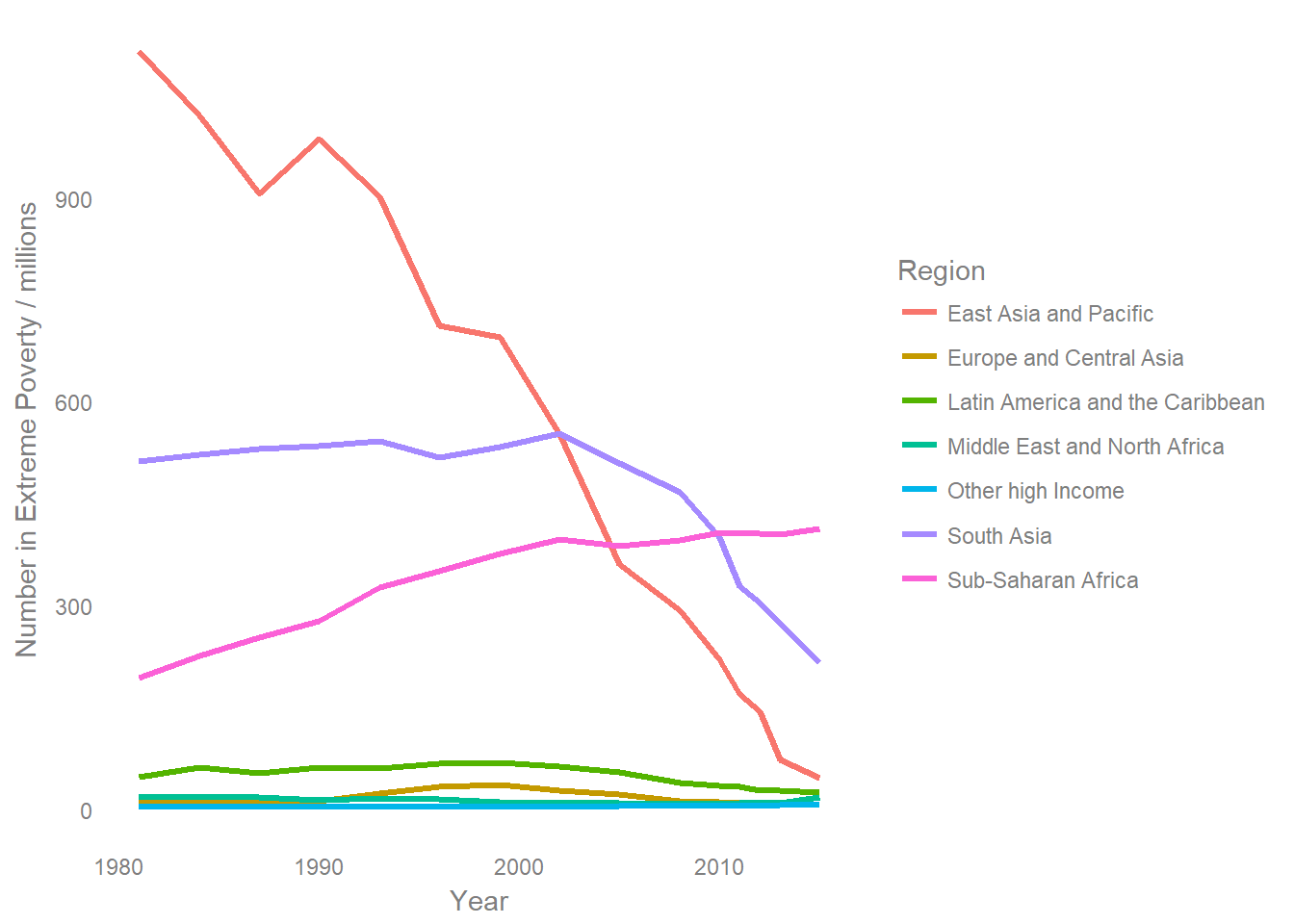
I personally nearly always prefer this approach, it’s rare that I feel that explicitly showing the part to whole relationship justifies the increased difficulty in interpretation which stacking causes.
If the total is also important, then you can either include it as an additional line, or as a smaller additional plot. Including a total line can make it hard to see the changes in smaller series, and it will impact on the interpetation of other lines due to the extended scale. However, in this example, I don’t think it’s detrimental to add a total.
data %>% group_by(Year) %>%
  summarise(`Number in Extreme Poverty / millions`=sum(`Number in Extreme Poverty / millions`)) -> total

data %>% ggplot() +
  geom_line(aes(x=Year,y=`Number in Extreme Poverty / millions`,col=Region),size=1.1)  +
  geom_line(data=total,aes(x=Year,y=`Number in Extreme Poverty / millions`),size=1.1,colour="grey50")+
  annotate("text",x=1980,y=1960,label="Total - all regions",hjust=0,col="grey50") +
  theme_minimal() +
  theme(text=element_text(colour="grey50"),
        axis.text = element_text(colour="grey50"),
        axis.title= element_text(colour="grey50"),
        panel.grid= element_blank())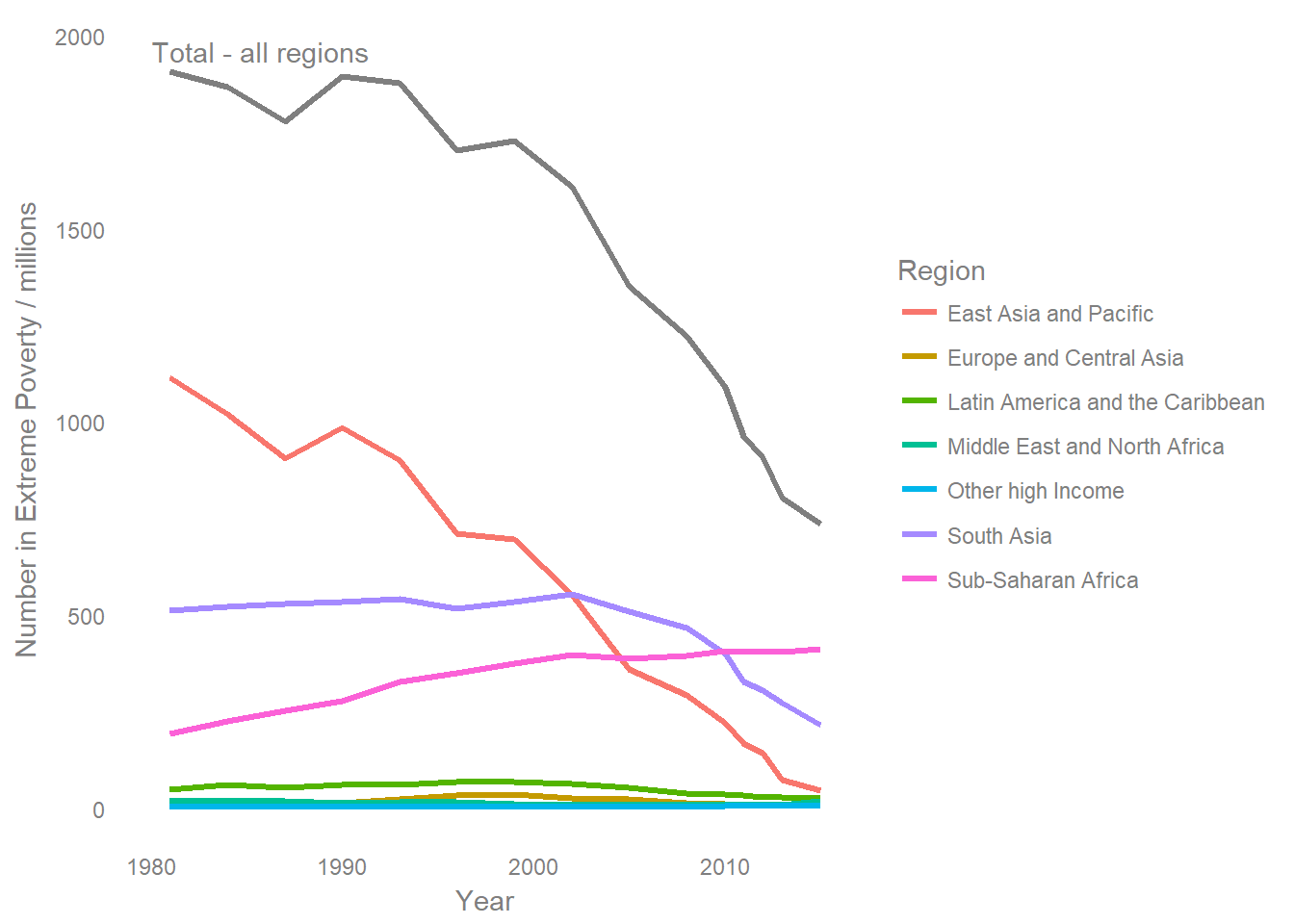
When the plot can be made interactive, then a “streamgraph” type layout can be used. I’m writing a longer post just focussing on streamgraphs which I hope to publish soon - but the general idea is that you can make it easier to interpret the relative size of stacked areas by having a non-zero baseline. The streamgraph layout selects a baseline so that the slope of the all the layers is minimised, this puts all the layers on a more even footing when comparing them.
This easier interpetation of changes isn’t without cost, the downside is that without a zero baseline it’s much harder to interpet the absolute value of a given area, and you can’t just look at the top of the stack to get a total. Tooltips which appear when the mouse is hovered over a specific point on the graph can help in this regard, but again it’s a trade off, something is made easier at the cost of making something else harder.
A paper which goes into more detail on different ways of stacking areas can be found here.
data %>% mutate(value=`Number in Extreme Poverty / millions`,
                Region=as.factor(Region)) %>%
  streamgraph("Region","value","Year",offset="wiggle",interpolate="linear")
data %>% mutate(value=`Number in Extreme Poverty / millions`,
Region=as.factor(Region),
Region=factor(Region, levels=rev(levels(Region)))) %>%
streamgraph("Region","value","Year",offset="wiggle",interpolate="linear")When using the streamgraph approach, I don’t get a qualitively different feel when I switch the ordering, which does make it feel somewhat more objective as a way of displaying the data. However, this isn’t really a classic use case for a streamgraph. Streamgraphs really shine when there are a lot of categories which appear / disappear overtime, the original use case looked at the box office performance of individual movies over time, where the interactive tooltips become increasingly vital.
So what’s the right answer?
The best approach really depends on what you want your audience to take away from the chart.
- If I wanted a fair comparison between all the different regions over time, then I’d use the line chart of the individual regions.
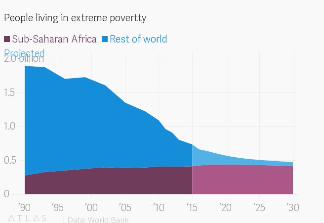
- If I wanted to show the total number of people in poverty, and clearly highlight one region then I’d use a stacked area chart with that region on the bottom. Due to the difficulty in interpretting other areas, I’d also be tempted to only show the region of interest and group everything else into “all others” as Quartz did with their version:
- I think it’s hard to effectively show both the changes in individual lines and their contribution to a total. If I needed to do this then I’d probably prefer to split it into two graphs, one showing the total and one showing the regions. However, adding a total line as I did above might also work well in some cases.
Having multiple categories stacked on top of each other always runs the risk of making the visualisation hard to interpet, so I usually try to avoid it if possible.
Thanks a lot for getting this far, if you’d like to discuss this post with me, then get in touch via Twitter.