Tidy Tueday - 18-09-2018
September 23, 2018
For this #TidyTuesday there we two different datasets to look at, one was a table from an article in the magazine of the “Soaring Society of America” and the other was a dataset containing detailed information on US airports. Though tangentially related (they both talk about flying) I didn’t see a clear connection for one piece of work, so only focussed on one.
Both datasets and some further explanation can be found here.
I thought that the gliding dataset would be a more interesting challenge. It’s a very small dataset, but the context is fairly complex and technical. The original table was pretty hard for me to follow and understand, so the task I set myself was to try and make something which is slightly more visual and can be digested more quickly.
The table from the original article looks like this:
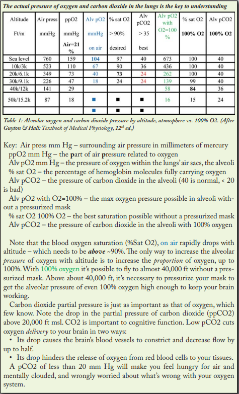
I didn’t find the labelling particularly obvious, and it takes a lot of work to understand which columns are showing the same things in different contexts (e.g. with or without an oxygen supply). There also seem to be inconsistencies between the text and the table, for example the text references “ppCO2” but there are no columns with this label in the table, while the explanation is consistent with the trend in “Alv pCO2”.
From reading the table and all the surrounding text, I’ve decided that the two key stats are the “% of haemoglobin molecules which are saturated with O2” which is labelled as “% sat O2” in the original, and “Partial pressure of CO2 in the alveoli” which is labelled as “Alv pCO2”. I picked these because they have an accompanying benchmark, the header of the table states that “% sat O2” should be atleast 90% and that “Alv pCO2” should be above 35.
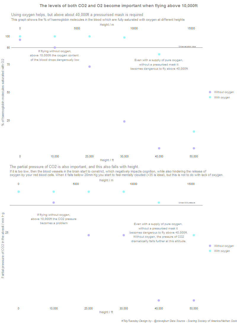
I took these two measures both with and without oxygen and visualised them with a scatter plot. I added a lot of annotation directly on the charts, as well as fairly long titles. My intention was to simplify the message from the original article and more directly connect it to the data. I think that I’ve succeeded in making it easier to understand, but this is hard to know for sure as I’ve spent so long reading all the information!
My final visualisation looks as follows:
Looking back on it now, there are some things I would change:
- I’ve noticed that I only labelled the primary x axis (the one in ft) with a comma formatted set of numbers, while the secondary axis (ms) doesn’t have commas which is inconsistent.
- I’d add a more breaks to the y axis in the second plot, and make sure one of these shows the critical 35 value as I did in the first plot. Currently it’s not that clear what the horitzontal line represents here.
- I’d increase the seperation between the two plots even more than I have already.
- I’d like to spend longer playing around with the sizes of all the different text elements, it feels slightly too small as is. This is really hard (or atleast fiddly) to do directly in R, especially when you start combining multiple plots together and then exporting to .png. I haven’t yet identified a workflow for getting from something which looks good in R to something which looks good as a final exported image without loads of trial and error.
- Finally, I didn’t want to use lines to connect the individual points because the relationship isn’t necessarily linear, and I didn’t want to be misleading. However, I think adding some lines may have helped the visualisation to feel less sparse. Generally it’s good to avoid too much detail, and white space isn’t necessarily bad, but I’m not sure if the balance is quite right here.
This was a really interesting challenge, I enjoyed trying to take something complicated and make it simpler to understand using a visualisation - though there wasn’t a whole lot of coding / analysis involved in this. It really made me think about the importance of making your data clear because I really struggled with the original. Hopefully my version makes it easier to understand, but would welcome feedback on this on twitter.
All the code for making this plot is on Github.