Tidy Tuesday 04-09-2018
September 9, 2018
Over the last few months, I’d been taking part in #MakeoverMonday to practice different types of visualisation. I’ve not written these up yet, but plenty of examples can be seen on my Twitter.
This initiative is mainly focussed on the Tableau community, so working in R and focussing on static visuals means that my submissions don’t often fit in with the wide variety of interactive dashboards.
Until last week, I’d not come across #TidyTuesday which is focussed on using the tidyverse to do preliminary data analysis and visualisation. It’s great to have another opportunity to practice these skills, and I intend to mostly focus on the visualisation side as I take part in the coming weeks.
The challenge this week was to look at data on American Fast Food from fastfoodnutrition.org. The dataset can be found on the #TidyTuesday GitHub.
There are a lot of different nutrition metrics in the dataset, but I decided to focus on only three - Saturated Fat, Salt (Sodium) and Total Calories. From my pretty limited understanding of nutrition, those first two are generally considered “bad” while the latter is a good proxy for “amount of stuff” which is always good to know.
With these three metrics, I decided to use a bubble chart to show the data:
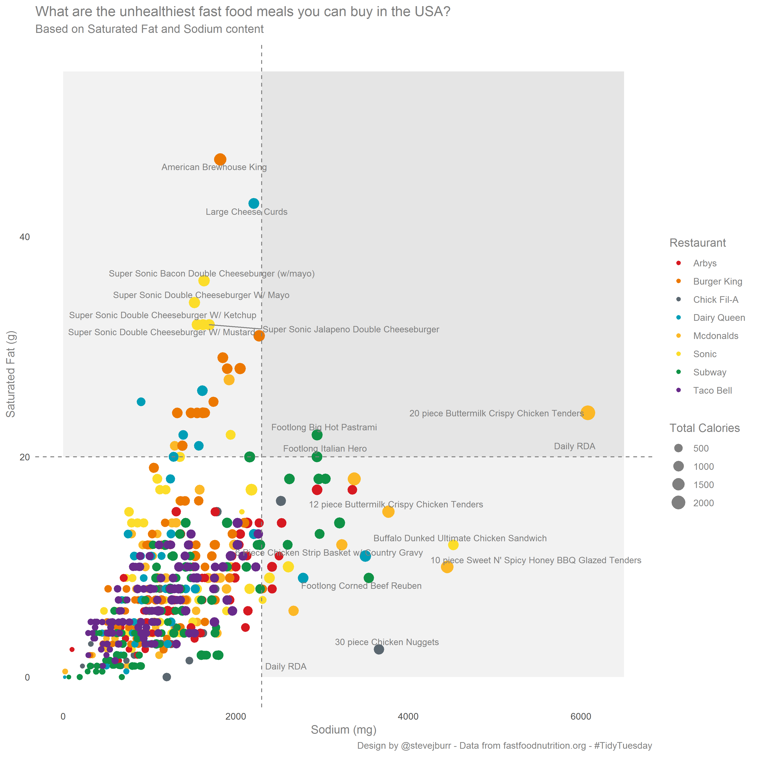
The key things I was thinking about when creating this visualisation:
- I tried to use recognisable brand colours, I got these by a slightly painful process of grabbing them from the brand websites. This was a lot harder than I thought it would be, because a huge chunk of the brands all use a lot of red. This is an interesting thing to note, Red is seen as a strong colour in Western culture which is why it gets used in this way, but it does mean none of these brands are doing a great job of standing out from the crowd.
- I quickly Googled some rough Daily RDA figures and added these as benchmarks to put these figures in perspective. It’s pretty shocking that tehre are plenty of products which give you more than a day’s worth of Salt or Sat Fat in one menu item.
- I wanted to make the top right corner (exceeding daily RDA on both metrics) stand out, so I used a darker grey background for this.
- When presented with a load of dots, it’s natural to want to know what they all represent. Without making the chart interactive, this is hard to do. I decided that it’s probably only the extreme outliers which are of interest in this particular plot, so I labelled everything in the top right hand quadrant as well as the top 7 scoring products on each individual metric. I chose 7 as it seemed like a good balance of clutter vs interest. The labelling was done with ggrepel which does a pretty good job of arranging these labels (given the very long descriptions of products).
I had one piece of feedback on how much overplotting there is in the bottom left hand corner. It’s a fair comment, and this might be fixable with transparency, but in this case I think I’m personally happy with it as is. I know you can’t see how many specific points are there, but you get a sense of there being “a lot of stuff” and they key story for me are all the outliers which you can see clearly.
One potential alternative I thought of would be small multiples of 2d density plots (by brand) with the outliers shown on top of these as individual points. This may be clearer, but would require a lot more explanation to a lay person.
I was amazed by the amount of interaction / feedback I got when I posted this on twitter. Apparently this visualisation has been seen over 2500 times on various twitter timelines. The R community is definitely an amazingly supportive bunch of people, so I’d encourage people to get involved.
It was really surprised to get a reply from Alyssa Goldberg saying that see was using my code for quadrants on a work project. That’s the first time anything like that has happened, so thanks Alyssa!
I definitely intend to keep engaging with #TidyTuesday, and will try to keep writing up my thoughts after each submission.
The code for this visualisation is on my Github.
If you’d like to discuss this then reach out on Twitter.