Tidy Tuesday - 11-09-2018
September 15, 2018
This is a slightly late submission, didn’t have time during the week as I was at EARL for most of the week (hope to write a few words on this soon!).
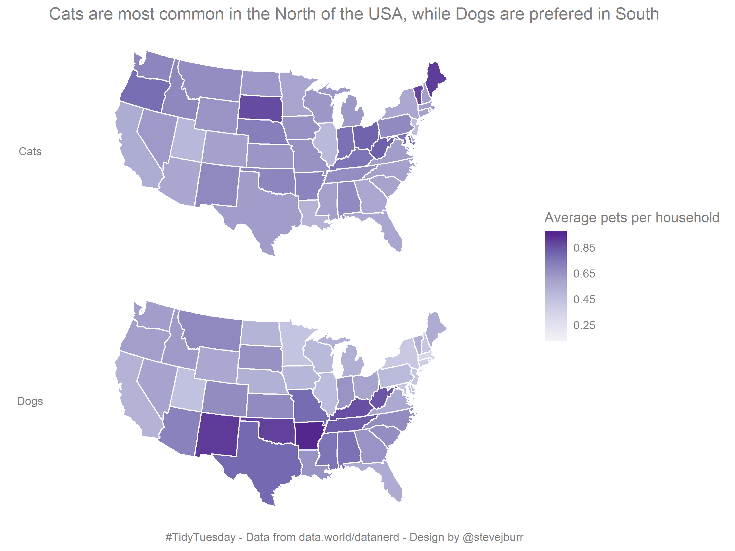
This week the Tidy Tuesday dataset consisted of stats on the prevalance of pet cats and dogs across the states of the contintental USA.
Normally when there are datasets with geographical information in #TidyTuesday or #MakeoverMonday I tend to avoid any use of map based visualisation. Partly this is due to inexperience, in my day job I don’t come across many opportunities to work geographical data. However, in a lot of cases it’s also hard to effectively show a lot of patterns within the context of a map, and visualisations like bar charts end up being more effective.
This time I decided to branch out and use a chloropleth to show the data, and I do think it effectively allows you to see clear regional patterns in pet ownership. These spatial relationships are where map based visualisations excel.
I went through a number of different iterations before ending up on this final form:
- My initial idea was to try and use colour to show the proportion of pets which are cats, and then to use opacity (/alpha) to encode the average number of pets per household. Because I wanted to use a diverging colour pallette, most of which go through a light central colour, this ended up being unclear.
- I then tried to split these two different metrics onto two chloropleths within the same plot - but because of the difference in distributions of values I couldn’t settle on a single or pair of scales which I felt was effective and fair. Using one scale for the two values meant that one or other of the plots was very flatly coloured, and I felt that having two different scales which mapped different levels of colour to the same % figure (albeit of different variables) would be confusing and easy to misunderstand.
- I also explored just doing a scatter plot of pet ownership rate vs the proportion of cats by this wasn’t very interesting and so I decided to stick with a map based approach.
My main takeaway is that when you already have easy access to the regions of interest (e.g. when you are working with US states) then it’s not hard to work with geospatial data using ggplot2. From previous experience things get a tad more fiddly when you need to start grabbing information from Google maps or finding/importing your own shapefiles, which is what tends to put me off in a lot of cases.
The full code I used to generate the plot is on my Github. If you’d like to discuss this visualisation then find me on Twitter.