Tidy Tuesday - 18-02-2020
February 20, 2020
It’s been quite a while since I took part in Tidy Tuesday, and this one is slightly late in the week but good to get back into the habbit of doing some different analysis outside of work.
The rest of this post will be pretty much a record of what I was thinking as I did my initial analysis. Hoping to spend an hour or two on this in total and see where I end up…
Read in the data:
Following the guidelines from the official repo, I can grab the data using the tidytuedayR package - see here
# Install the tidytuesday package to get the data:
# devtools::install_github("thebioengineer/tidytuesdayR")
library(tidytuesdayR)
library(tidyverse)

dat <- tidytuesdayR::tt_load('2020-02-18')$food_consumption
First take a look at the first few rows of the file:
head(dat)## # A tibble: 6 x 4
## country food_category consumption co2_emmission
## <chr> <chr> <dbl> <dbl>
## 1 Argentina Pork 10.5 37.2
## 2 Argentina Poultry 38.7 41.5
## 3 Argentina Beef 55.5 1712
## 4 Argentina Lamb & Goat 1.56 54.6
## 5 Argentina Fish 4.36 6.96
## 6 Argentina Eggs 11.4 10.5This looks like it is a nicely formatted table, containing values of “consumption” and “co2 emmission” split by country and food type.
Referring to the tidytuesday data dictionary, it looks like these are per person figures based on typical consumption patterns by country. Looking at the original data source we can see that the food category CO2 values are based on global median values. There is some more detail on this on the website, and it’s a reasonable approach to take. However, it’s important to think about what this means for how you use and interpet the data. Whenever stats around the pros/cons of meat vs plant based diets you can get some pretty different results based on the methodologies used, and it’s pretty common for people to pick the data source which best fits their agenda.
Generally, you tend to see that eating beef is pretty bad for the environment, but you can get some pretty different figures depending on what is included in the carbon footprint figures (e.g. clearing rainforest to replace it with cattle pasture is doubly bad) and using averages will make some countries look better/worse than they are in reality.
It’s also worth keeping in mind that there’s more to think about than just CO2, and the overall impact at a topline level may not be the same as the local impacts. For example, almond farming in California is very water intensive in an area which suffers from droughts and is seemingly having a negative impact on the insect population in that part of the world meaning replacing dairy with almond milk isn’t without consequences even if at a topline level it’s much better from a water consumption and CO2 perspective to do so (conversely continue to use local dairy products if you live in Northern Europe might be worse overall but might have a much smaller impact on the immediate local area in the short term).
Let’s get back to the data - based on what I’ve read of the data, I’d expect to be able to divide the two numeric columns and then see consistent values for each food in every country:
dat %>%
  mutate(co2_per_kg=co2_emmission/consumption) %>%
  arrange(food_category,co2_per_kg) %>%
  head()
## # A tibble: 6 x 5
## country food_category consumption co2_emmission co2_per_kg
## <chr> <chr> <dbl> <dbl> <dbl>
## 1 India Beef 0.81 25.0 30.9
## 2 Sri Lanka Beef 1.38 42.6 30.9
## 3 Mozambique Beef 1.04 32.1 30.9
## 4 Togo Beef 1.53 47.2 30.9
## 5 Gambia Beef 2.16 66.6 30.9
## 6 Bulgaria Beef 3.84 118. 30.9We do indeed seem to get the same value, so I can be happy I’ve understood the data dictionary.
First graph - country level differences
As the data is presented here, the most interesting metric is probably the CO2 emmissions. This is measured in kg/person/year.
Let’s take a look at how this varies by country at an overall level:
dat %>%
  group_by(country) %>%
  summarise(co2_emmission=sum(co2_emmission)) %>%
  mutate(country=as.factor(country),
         country=fct_reorder(country,co2_emmission)) %>%
  arrange(co2_emmission) -> co2_emmission_by_country
Now we have this table, we can print out the top and bottom 10 rows to see which countries appear where:
head(co2_emmission_by_country,10)## # A tibble: 10 x 2
## country co2_emmission
## <fct> <dbl>
## 1 Mozambique 141.
## 2 Rwanda 182.
## 3 Togo 188.
## 4 Liberia 203.
## 5 Malawi 208.
## 6 Ghana 218.
## 7 Zambia 225.
## 8 Ethiopia 242.
## 9 Congo 263.
## 10 Nigeria 268.tail(co2_emmission_by_country,10)## # A tibble: 10 x 2
## country co2_emmission
## <fct> <dbl>
## 1 Kazakhstan 1575.
## 2 Luxembourg 1598.
## 3 Brazil 1617.
## 4 Uruguay 1635.
## 5 USA 1719.
## 6 Iceland 1731.
## 7 New Zealand 1751.
## 8 Albania 1778.
## 9 Australia 1939.
## 10 Argentina 2172.We can see that there are a lot of African countries with low emissions per capita, and a slightly more geographically spread out set of (mostly) richer countries at the top end of emissions per capita.
We can visualise these two sets of results using a bar graph:
windowsFonts(Raleway="Raleway")

rbind(head(co2_emmission_by_country,10),tail(co2_emmission_by_country,10)) %>%
  ggplot() +
  geom_col(aes(x=country,y=co2_emmission)) +
  coord_flip() +
  theme_minimal(base_family = "Raleway")+
  theme(panel.grid=element_blank(),
        text=element_text(colour="grey50")) +
  labs(x="",
       y="CO2 Emissions from Food\nkg per Person per Year",
       caption="Design @stevejburr - Data source: nu3.de - #tidytuesday",
title="Per capita CO2 emissions from food vary greatly by country") 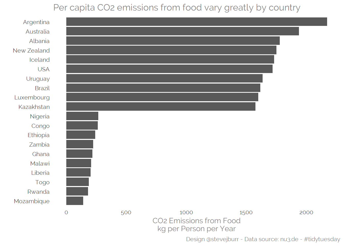
It might also be interesting to get a sense of the distribution of emissions by country -
co2_emmission_by_country %>%
  ggplot() +
  geom_histogram(aes(x=co2_emmission),
                 binwidth = 100,
                 fill="#9b0d0d") +
  geom_jitter(aes(x=co2_emmission,y=1),height=1,width=0,
              colour="grey50") +
  theme_minimal(base_family = "Raleway")+
  theme(panel.grid=element_blank(),
        text=element_text(colour="grey50"),
        axis.text.y=element_blank()) +
  labs(x="CO2 Emissions from Food\nkg per Person per Year",
       y="",
       caption="Design @stevejburr - Data source: nu3.de - #tidytuesday",
       title="Per capita CO2 emissions from food vary greatly by country",
subtitle="There a small number of particularly bad countries") 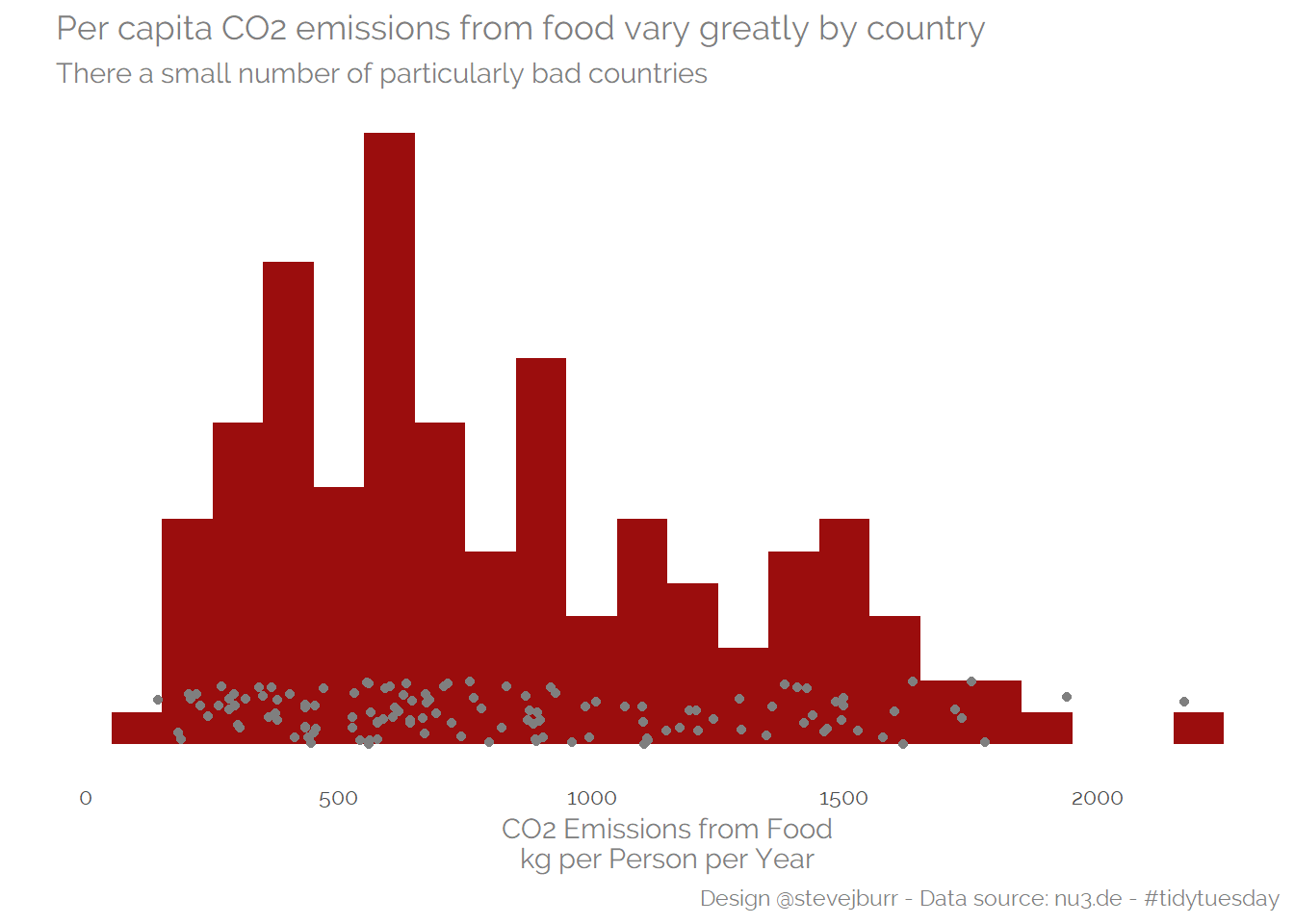
Understanding what drives country variation:
Given that the values used for each food are the same by country in this dataset, then the mix and amount of food consumed must drive all of the differences (this is still likely to be the case even if per country food figures were available).
First, let’s look at total kgs of food per person by country, and see how this is correlated with total CO2 emissions:
dat %>%
  group_by(country) %>%
  summarise(consumption=sum(consumption)) %>%
  left_join(co2_emmission_by_country,by="country") %>%
  ggplot(aes(x=consumption,y=co2_emmission)) +
  geom_point(colour="grey50") +
  geom_smooth(method="lm",se=FALSE,colour="#9b0d0d") +
  theme_minimal(base_family = "Raleway")+
  theme(panel.grid=element_blank(),
        text=element_text(colour="grey50"),
        axis.text.y=element_blank()) +
  labs(x="Total kg Food per Person Per Year",
       y="CO2 Emissions from Food\nkg per Person per Year",
       caption="Design @stevejburr - Data source: nu3.de - #tidytuesday",
       title="A lot of the variation in emissions can be explained by total consumption",
subtitle="But the relationship isn't perfect, mix must play a part") 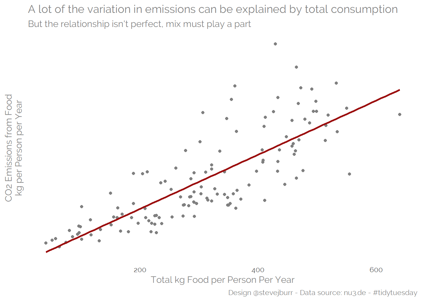
To understand mix, let’s look at % of consumption by food type (in kgs):
dat %>%
  group_by(country) %>%
  mutate(percent=consumption/sum(consumption)) %>%
  select(country,food_category,percent) %>%
  left_join(co2_emmission_by_country,by="country") -> mix_data

mix_data %>%
  group_by(food_category) %>%
  summarise(r2=cor(percent,co2_emmission)^2) %>%
  mutate(title=paste0(food_category,"\nR2:",scales::number(r2,accuracy=0.01))) %>%
  inner_join(mix_data,by="food_category") %>%
  ggplot(aes(x=percent,y=co2_emmission))+
  geom_point(colour="grey50")+
  geom_smooth(method="lm",se=FALSE,colour="#9b0d0d")+
  facet_wrap(title~.,scale="free_x") +
  theme_minimal(base_family = "Raleway")+
  theme(panel.grid=element_blank(),
        text=element_text(colour="grey50"),
        axis.text.y=element_blank()) +
  labs(x="% of Food Consumed",
       y="CO2 Emissions from Food\nkg per Person per Year",
       caption="Design @stevejburr - Data source: nu3.de - #tidytuesday",
       title="The importance of Beef, Milk and Rice in diets explains a lot of the variation",
subtitle="In addition to the differences in volumes consumed") 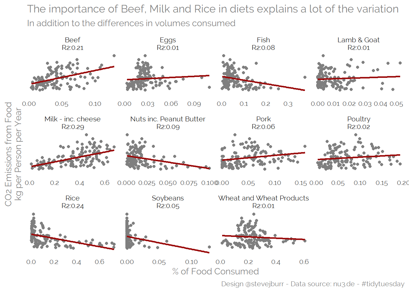
Ranking the factors
We can use models to try and understand how much of the variation in the data can be explained by the variables we have explored here.
We can use a linear regression model as a simple approach to understand the degree of variability explained by a subset of the variables:
mix_data %>%
  filter(food_category %in% c("Beef","Milk - inc. cheese","Rice")) %>%
  pivot_wider(values_from=percent, names_from=food_category) -> model_data

dat %>%
  group_by(country) %>%
  summarise(consumption=sum(consumption)) %>%
  left_join(model_data,by="country") %>%
  select(-country) %>%
  lm(co2_emmission ~ .,data=.) %>%
  summary()
##
## Call:
## lm(formula = co2_emmission ~ ., data = .)
##
## Residuals:
## Min 1Q Median 3Q Max
## -348.41 -75.04 -16.89 53.71 590.27
##
## Coefficients:
## Estimate Std. Error t value Pr(>|t|)
## (Intercept) -493.4477 64.7925 -7.616 5.61e-12 ***
## consumption 2.9984 0.1214 24.706 < 2e-16 ***
## Beef 9444.3706 517.4324 18.252 < 2e-16 ***
## `Milk - inc. cheese` -58.2620 122.2255 -0.477 0.6344
## Rice 219.9463 108.9410 2.019 0.0456 *
## ---
## Signif. codes: 0 '***' 0.001 '**' 0.01 '*' 0.05 '.' 0.1 ' ' 1
##
## Residual standard error: 143.2 on 125 degrees of freedom
## Multiple R-squared: 0.9045, Adjusted R-squared: 0.9014
## F-statistic: 296 on 4 and 125 DF, p-value: < 2.2e-16This model suggests that we can explain ~90% of the variation between countries CO2 per capita food emissions based off of total consumption levels and then the proportion of volume coming from Beef, Dairy and Rice.
Another approach is to use importance plots to rank the variables, these plots are provided by many modelling packages such as randomForest:
library(randomForest)

mix_data %>%
  pivot_wider(values_from=percent, names_from=food_category,
              names_repair ="universal") -> rf_data

dat %>%
  group_by(country) %>%
  summarise(consumption=sum(consumption)) %>%
  left_join(rf_data,by="country") %>%
  select(-country) %>%
  randomForest(co2_emmission  ~., data=., importance=T) %>%
  importance(type=2) -> rf_importance

data.frame(variable=row.names(rf_importance),
           importance=rf_importance / sum(rf_importance)) %>%
  mutate(variable=fct_reorder(variable,IncNodePurity)) %>%
  ggplot() +
  geom_col(aes(x=variable,y=IncNodePurity),fill="#9b0d0d")+
  geom_text(aes(x=variable,y=IncNodePurity,
                label=scales::percent_format(accuracy=1)(IncNodePurity)),
            hjust="right",
            colour="white")+
  coord_flip() +
  labs(x="",
       y="Relative Importance",
       title="Consumption levels are the most important factor in explaing country differences",
       caption="Design @stevejburr - Data source: nu3.de - #tidytuesday") + theme_minimal(base_family = "Raleway")+
  theme(panel.grid=element_blank(),
        text=element_text(colour="grey50"),
        axis.text.x=element_blank(),
        plot.title=element_text(size=10))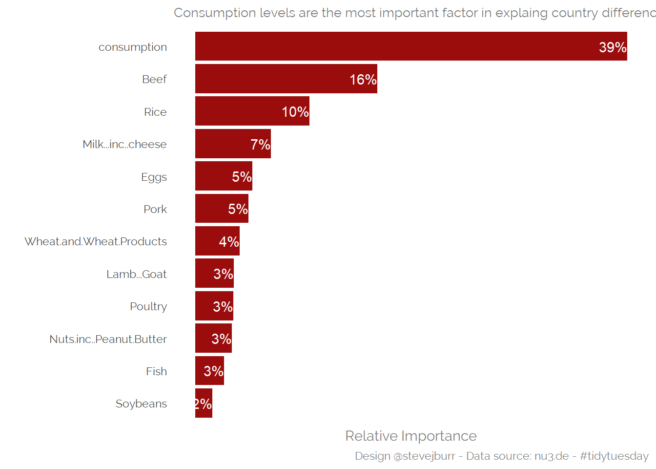
Summary
That’s the end of this post, it’s been a fun analysis to run on an important topic. I hope you’ve enjoyed reading it.
If you want to discuss it with me, then use the comments box below or find me on twitter.