Visualisation Review - YouGov's Sloping Stacked Bar Chart
September 19, 2020
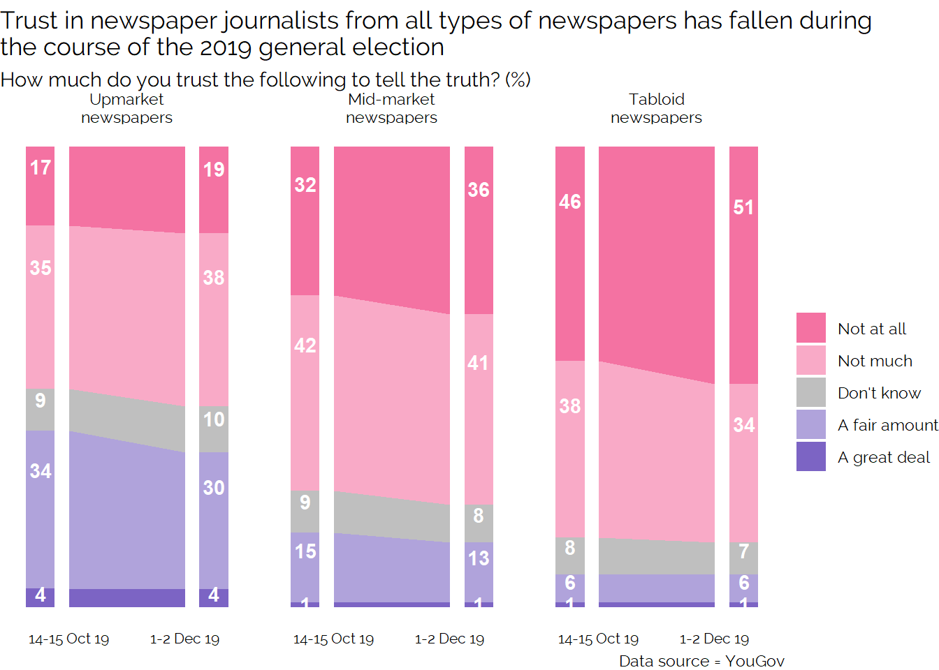
Over the last week, we’ve been having some interesting discussions at work about the following chart created by YouGov:
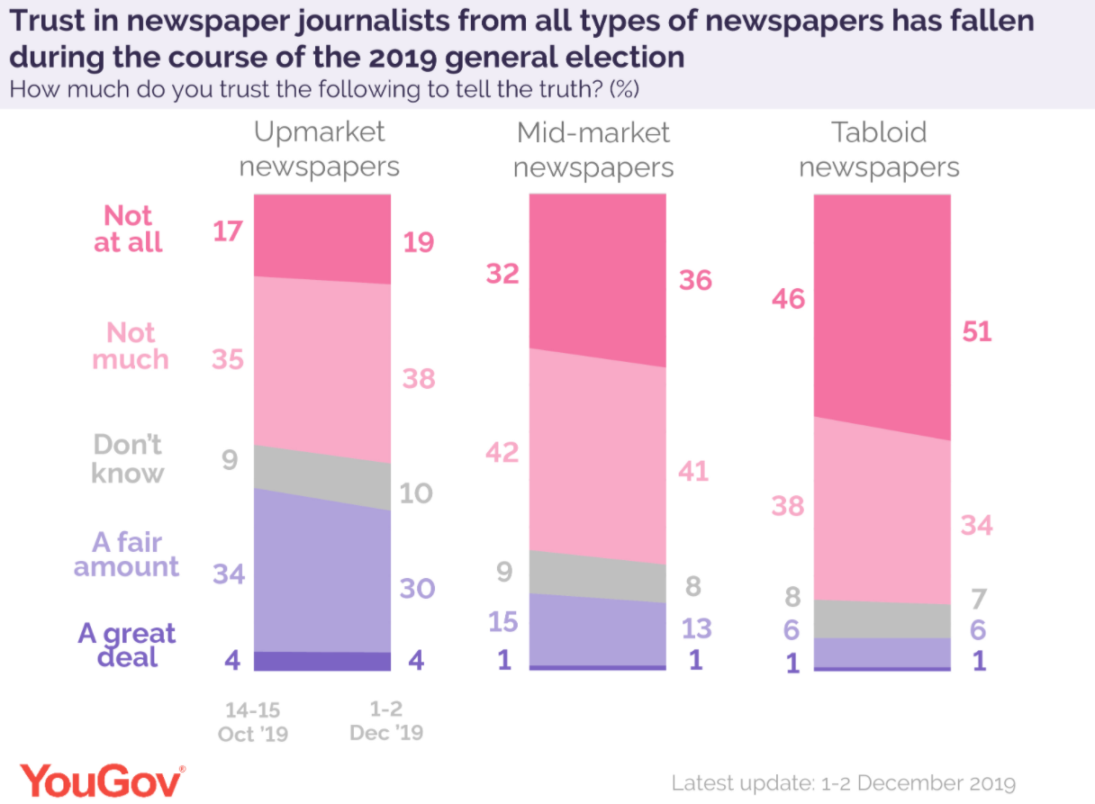
It definitely split opinion amongst the group. One major source of criticism was that it shows too much data for the point it is making in the headline, essentially three lines might suffice to make the main point. But, I think taken in isolation that approach would lead to many questions to see more of the data.
From my perspective, here are some of the pros and cons of this particular visualisation:
Pros
- Good use of colour, it works for colour blind people and shows the natural grouping of the positive/negative pairs of responses.
- The stacked nature preserves both the part to whole relationship of the data and the natural ordering of the responses
- The heading asks the readers of the visual to think about changes and explicitly shows those changes within the visual
- By including all the data, the reader can understand exactly where changes are occurring, are we seeing movement from trusting to non-trusting or is the movement from “Not much” to “Not at all”.
- I like how there are visually a large number of downward sloping lines to reinforce the headline message of falling trust.
- The chart is reasonably unusual, it’s not something I can remember seeing before and standing out in this way can be a benefit. Some readers of visualisations like seeing new/exciting forms.
Cons
- The slopes of the lines towards the top of the chart are partly determined by the slopes below them which may initially cause confusion. The reader is being asked to look at two lines and evaluate if they are becoming closer together or further apart which is not that common in mainstream visualisations.
- Novelty can also be a negative for some readers who instinctively viewing non-standard charts with suspicion or confusion.
- Showing all the data without editorialising and doing some grouping may be too much for some readers, or potentially confuse the message. For example if you look at Tabloids then the number of people with some degree of distrust is pretty much constant but the number of people saying “Not at all” has increased, should I view this as partly contradicting the heading (the sum is ~constant) or should my focus be on just the top part?
On balance I like this way of showing the data. I think it strikes a good balance of making its main point clearly while also providing enough extra data that those who want to spend more time reading and thinking can do so. I think that if you are going to release single charts like this either online or in print it’s worth including more data than the minimum needed to make your point to keep it engaging. This is in contrast to a presentation of the same data when you’d want to do the opposite.
I now want to have a good at building a similar chart myself in R and then go on to try a few different visual forms so that I can make comparisons and see if there are any ways of doing this which I think are better.
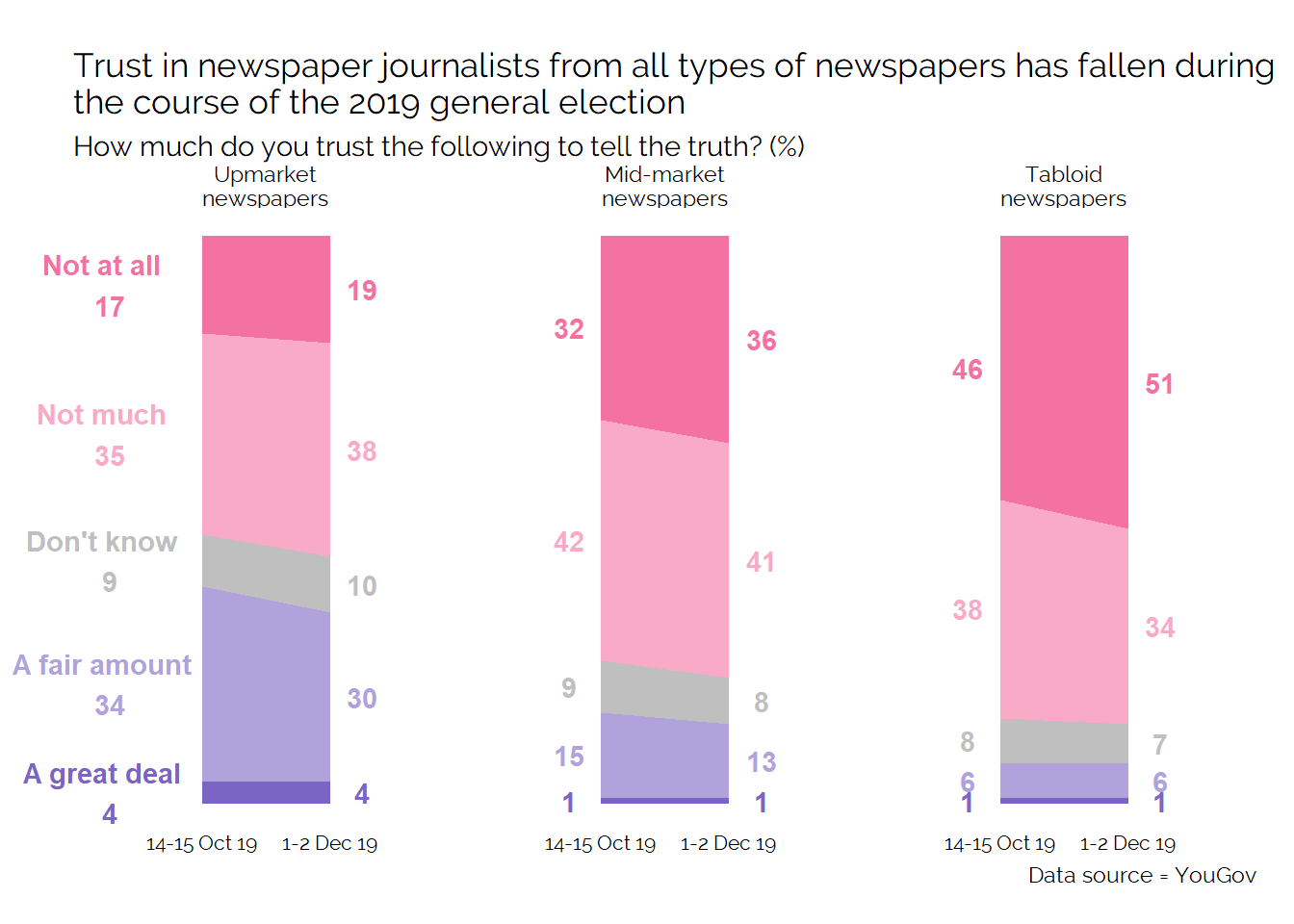
With a reasonable amount of work manipulating the input data to make all the labels work, you can get pretty close to the original visual:
In terms of alternative visual approaches I think that most people would instinctively turn to a stacked bar chart:
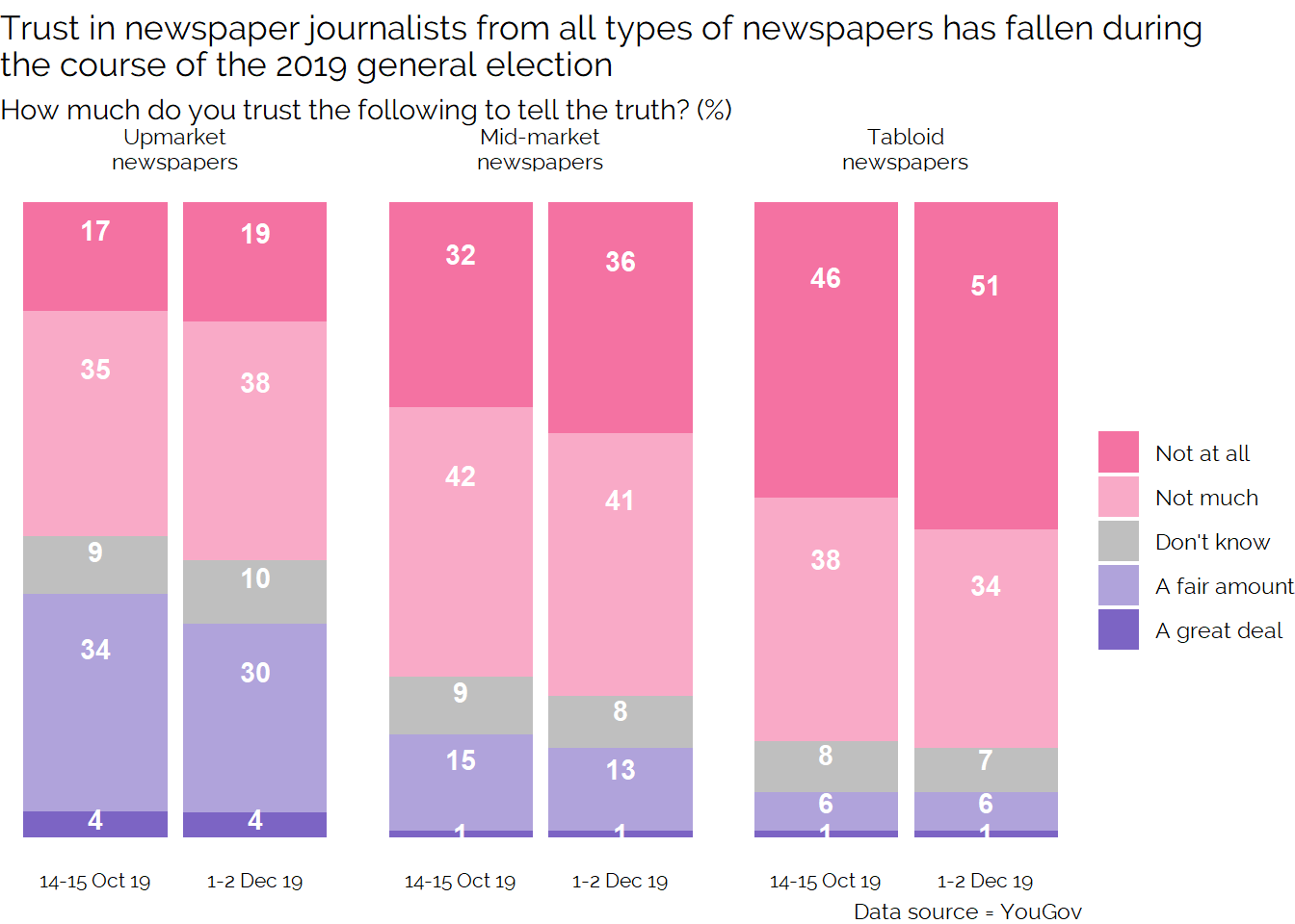
Looking at this alternative, I think the original YouGov approach is significantly better. Using stacked bars in this way is explicitly asking the reader to imagine the shapes which are shown in the original visual. I think it’s better to show these shapes directly. Because there is still stacking in the visual, this approach still has the challenge of uneven baselines making comparisons difficult. I also think it looks less visually appealing due to the larger amount of colour. Granted, I could adjust the widths of the bars to make this better but the first approach avoids visual clutter naturally.
One further option would be to try and combine both approaches and showing both the bars with either lines or filled in areas to direct the reader to the key comparison:
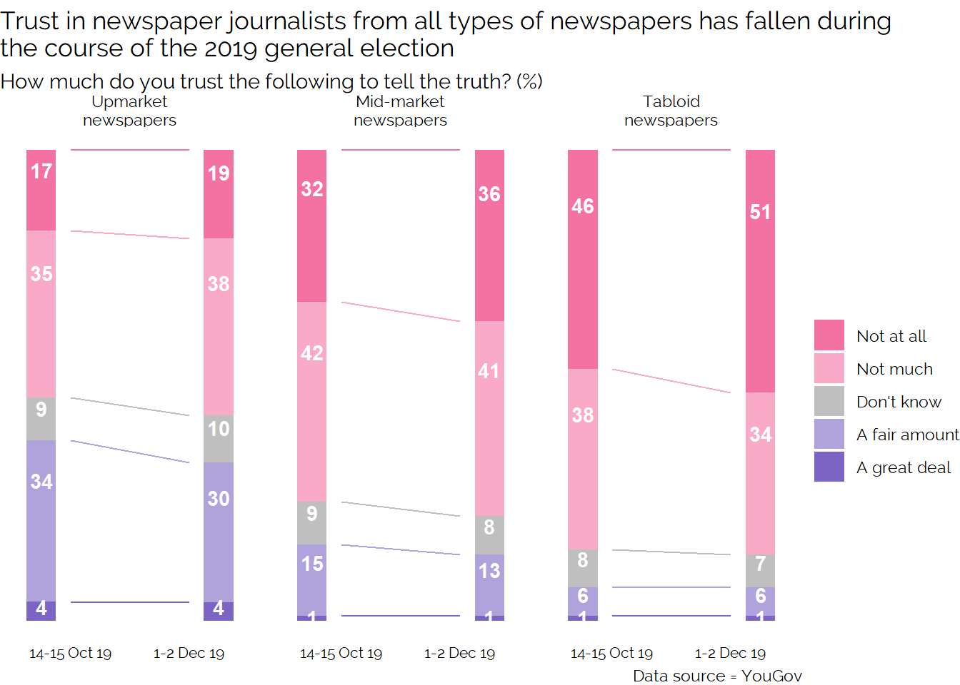
Of these two options, I think that using lines to supplement the stacked bar works better than filling in the area as it prevents the visual from becoming too cluttered while also indicating the comparison.
However, I think the original is still more elegant and effective.
If we move away from stacking the data, we solve the issue of having to deal with uneven baselines or uneven base slopes. However it becomes less obvious that we are dealing with a part to whole relationship, and the ordering of the responses can be less obvious.
The first thing we could do is create a slope chart showing all the data:
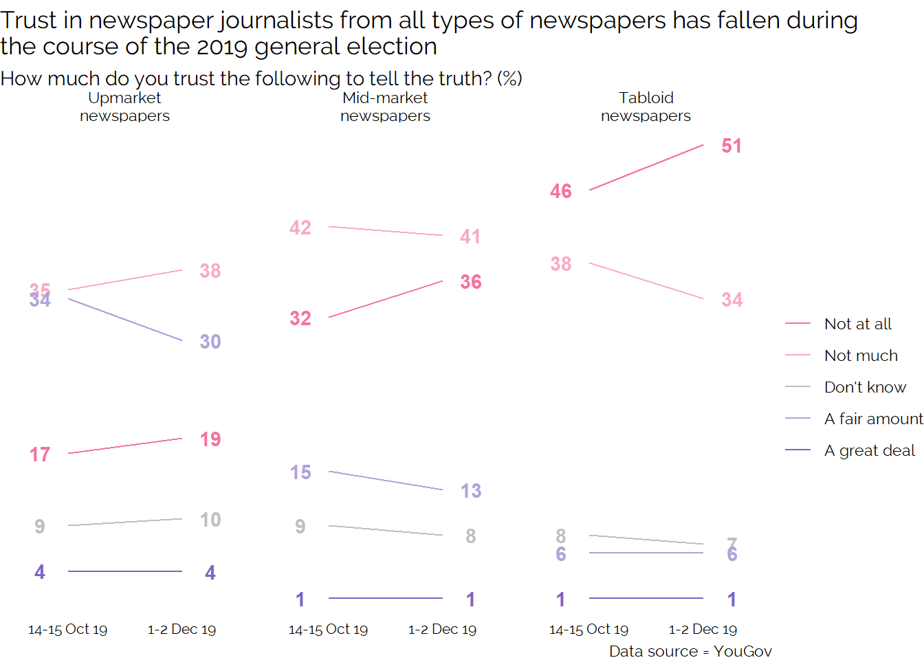
Using this approach makes different comparisons easier than the previous approaches. It is now very obvious which option is most selected for each of the three paper types, and for me it is much easier to identify all the different changes which are occurring in the data. For example, looking at this visual was the first time I’d really noticed the clear change from “A fair amount” to “Not much” within Upmarket newspapers.
At the start of this post, I said that I liked how the original visual allowed the reader to do some exploration beyond the headline. I think this visual is even better for doing that. However, because you lose the easy ability to add up the pairs of responses this does make it harder to understand the changes in these totals.
So while I think this visual is a better exploratory visual and a better way to understand the changes of individual responses this doesn’t align as well to the headline. This is a nice example of the potential trade offs with different visualisations and the need to pick the one which helps tell your story.
Further developing this approach, we can focus in on the total amount distrust:
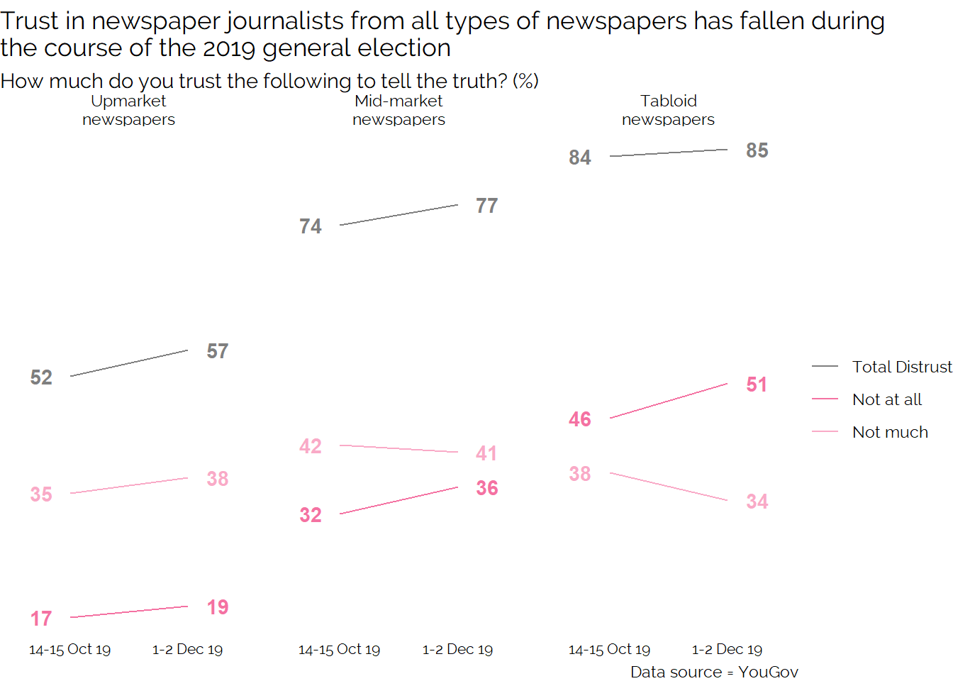
By focusing only on distrust we can more easily show the totals while keeping a bit of the detail. The trade off we make by doing this is that potentially interesting insights like the movement between the two moderate positions for “Upmarket newspapers” are hidden.
The final visual I’ll show here is the simplest and cleanest, and perhaps best suited to a presentation type setting.
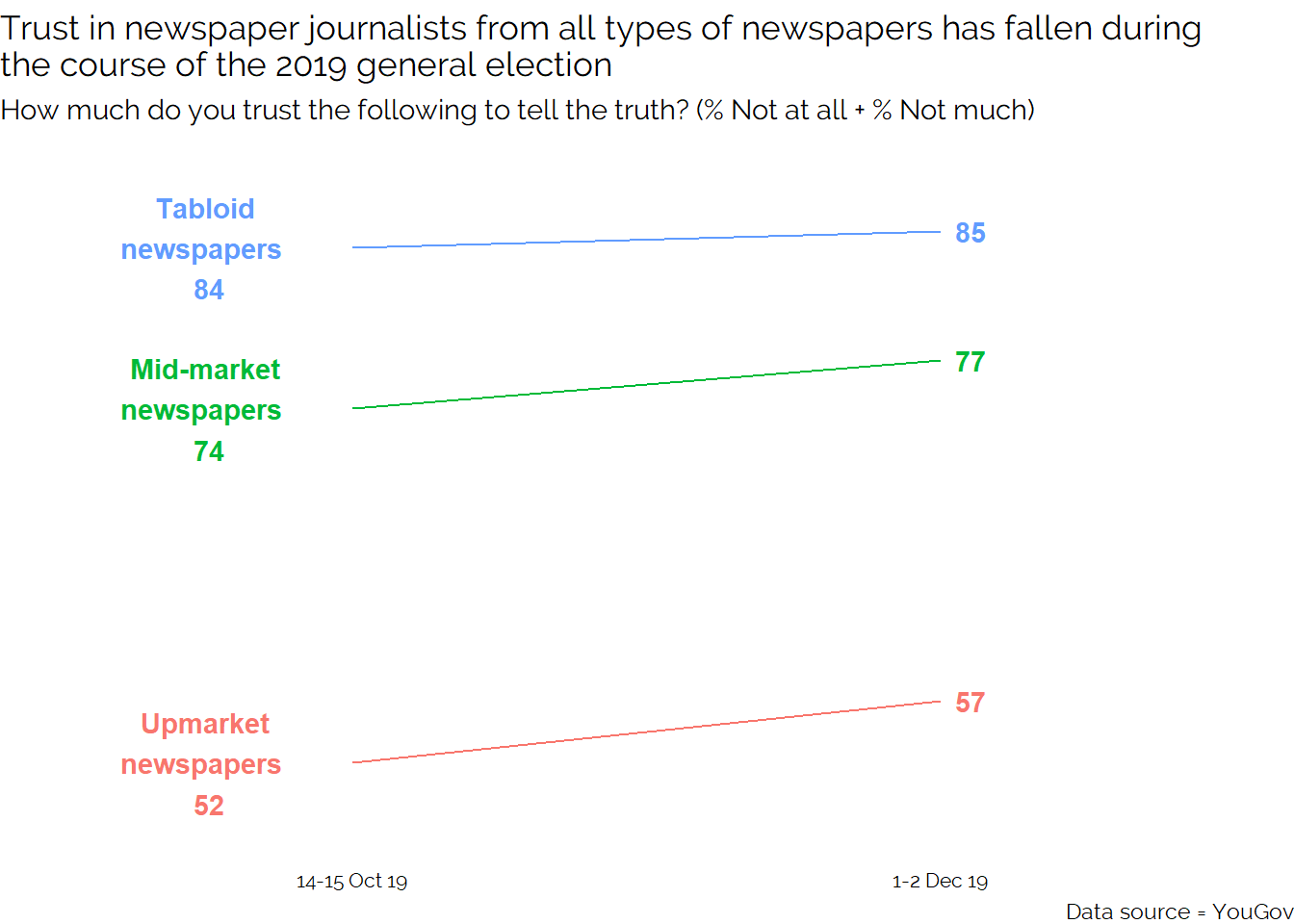
Having explored a few alternative approaches, I still like the original visualisation as it provides a good balance of showing all the data while focusing on a specific story in a visually appealing way. That said I think there are better options for pure exploration (the slope chart) and cleaner approaches to just showing the story (the three line chart).
If you have any thoughts or favourites you’d like to share, please let me know in the comment box below.