Who is the best ever Formula 1 driver?
August 2, 2023
After another long gap, I am back writing another sport related blog post.
This time, I’m going to look at Formula One, and have a go at answering what is likely an impossible task - answering who the best ever F1 driver is (and more generally, trying to create a data based ranking of all the drivers). Like in many sports there’s the challenge of comparing across very different eras but Formula One has additional challenges, most importantly the factor of the car which is hugely important in influencing who wins. The best driver in a bad car will struggle to beat a less talented driver in much better machinery except perhaps when bad weather or other strange occurrences come into play. To make things harder still, “better drivers” are more likely to get chosen to drive the “best cars” making separating the two even more challenging.
In the post, I’m going to build a multilevel regression model to try and answer this question using all historical race results. Within a single season, usually only two drivers (in recent times at least) will drive each car and so the only direct comparison you can make is between these two team mates. This isn’t that helpful as a single view - how do you know whether one driver is “out performing the car” indicating they are showing exceptional performance vs one driver is “under performing the car”? But, over the career of a driver they will tend to race for different teams alongside different team mates and the central idea behind the modelling approach is to combine all those different comparisons together and average them out. In essence this is a “more scientific” version of the sorts of debates fans might have - “Ricardo beat Vetel at Red Bull, was evenly matched with Verstapen but lost badly to Norris, therefore Norris will be a 10 time world champion”.
The goal of this is to build something relatively simple, and have some fun and not create something absolutely definitive - but even with much more time and data I am not sure you ever get to an answer which no one will debate. It is definitely fair to think that qualifying should be incorporated, that using lap time data instead of just race results would give a more comprehensive picture and that collecting/coding data which identifies specific driver errors would all make for a better model.
But, let’s not dwell on what I could have done and move on to what I actually did!
Defining a points system
In order to make a model of performance we need to create a target variable to predict. It makes sense for this to be some sort of “points”, but how these are calculated is going to be very important for how the analysis works.
Over the years, Formula One has had a number of different point systems so I could pick one of these and apply it to all years. But, for my analysis, I’ve decided to use something different which I think works better with my definition of “good” and the sorts of model I am going to fit.
There’s no “right answer” to how to do this, and the choice is likely to influence the results of the analysis to at least some extent. Any non-trivial data analysis will contain choices and subjectivity - we talk about concepts like “best” but these a typically vague and multifaceted concepts (e.g. Do we care about being fast? Consistent? Both (which is most important)? How much should we think about qualifying? Do we account for competition?).
In this analysis, I want to understand both car and driver performance together so that we can attempt to remove the car effect from a driver’s career results. So, we need a points model which helps us to do this. Thinking about what makes a good car, it needs to be both fast and reliable. The traditional F1 points system tends to favour finishing in the top positions, and not directly reward the act of finishing. I think there’s a difference between a car that consistently comes around 11th-15th and one which consistently breaksdown and never finishes - so to help to capture this I will give one point to everyone who finishes a race.
A similar argument around the merits of finishing a race can be made for drivers, I think someone who is fast but never finishes is worse than someone who is slower but reliably finishes just outside the points (depending on their car). In this case, I don’t think being first is much better than being second so I want to keep the gaps between positions constant (again, this is a choice which will influence the outcome!).
The final point system I decided on was that those who finish in positions 1-10 would receive 10…1 points, and everyone gets one extra point for finishing. For example, the race winner gets 11 (10+1) points, 10th place gets 2 (1+1) points and 12th place would get 1 (0+1) points.
These points will get used in the model.
Building the model
with the points defined, we now have a data set which contains for every race since 1950 up to the end of the 2022 season and a number of points for each driver. Our goal will be to build a model which predicts these points and explains their variation in terms of both car and driver factors. With this model we could then remove the impact of car from the number of points scored by averaging across cars or making predictions for all drivers in the same car.
As our points are integer counts, we are going to use a Poisson regression model. This is not fully appropriate for the data we have, but for a fun exercise I think it will work well enough. There are two major issues with the model. Firstly, a Poisson variable doesn’t have an upper limit but our points do (11) so if we simulate points using the Poisson distribution and fitted values/predictions from our model we may sometimes get invalid values. Secondly, the model assumes all the rows are independent but this is clearly not the case as there can only be one winner in each race, so again if you simulate from the model you could get odd results. However, I think the model will still do a good job at getting the relative expectations right and splitting these between driver and car.
For each season, we only have limited data points (<25 races) so incorporating “partial pooling” can help us to fit different effects while reducing overfitting. The idea here is that instead of trying to work out how good Ferrari are in 2021 alone we will also consider the range of performances across all teams in all seasons and assume that the distribution of effects across all seasons can help guide our selection for a given team/season combination (McElreath’s Statistical Rethinking book/YouTube lectures are a good source on understanding this).
For this reason, we’ll use a “multilevel regression” approach using the brms package - I didn’t spend time thinking deeply about the priors in this model so won’t call this overall analysis strictly Bayesian - as with the rest of the analysis there’s lots of room for investing more time in this part of the analysis.
With the model type and tool defined we need to specify the structure of the model. I tried a range of models of varying complexity and settled on something in the middle which “felt” right in terms of the results it was producing and conceptually felt sensible (again, no analysis is objective!). This was the following -
brm(total_points ~ 1 +
      poly(career_year,2) +
      (1 + poly(career_year,2)|Driver) +
      (1 | Car:year_chr),
               data=all_data,
               chains=4,
               cores=4,
               refresh=100,
               backend="cmdstanr",
               family="poisson")
Let me explain what the terms in the formula above mean -
total_points ~The model predicts the points received by each driver within each race1 + poly(career_year,2)The model contains an intercept which represents the expected number of points that the “average” driver / car combination would receive in a race. We allow a driver’s ability to vary across their career in a quadratic way, meaning that there is one change point in the curve. The idea here is that it seems likely that rookie drivers tend to get better as they gain experience over a few seasons while older drivers may start to show reduced performance towards the end of their careers. I tested a more complex curve using splines, but found that for many drivers there was not enough data to be really confident in these results so stuck with something simpler.(1 + poly(career_year,2)|Driver)Each driver has their own intercept, and their own career trend. It makes sense that some drivers will get better or worse at different rates and have varying baseline levels of ability - we fit this as a random effect meaning each driver’s value accounts for the overall variability across drivers.(1 | Car:year_chr)Each team/year combination has an intercept which represents the average performance of that car. This accounts for both speed and reliability (due to points for finishing). Though there are periods where a teams performance in one season influences others strongly (e.g. the recent Mercedes dominance), there are also rule changes which result in sudden shifts in this relationship (e.g. 2022 vs 2021). Due to the amount of data, it seemed more sensible to keep to single independent effects and not try to model these changes time impacts on team performance as it is also not the main focus on the analysis.
Results
With a fitted model, we can now answer the question of who the best F1 driver in history is (or at least who our model thinks is the best).
We’ll look at this in a few ways, firstly based on peak performance. In the model Driver’s ability can change over time comparing the highest values each driver has taken -
Peak Performance
To remove the impact of car, we’ll ask the model to predict how many points each driver would expect to score if they were in the “average car”. We’ll apply this prediction to every season they raced and find the highest scoring season - if we extrapolate beyond the end of real careers we can get unexpected results from extrapolation.
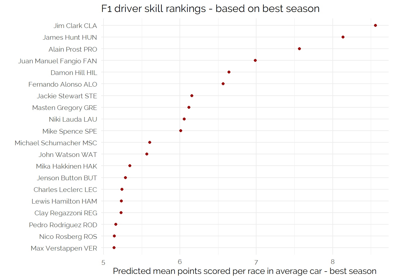
The output of this puts Jim Clark as the best ever driver and features Prost and Fangio in the top 5 which does not feel unreasonable.
Career Average Performance
Next, we can look at career average performance - this is interesting as drivers can fluctuate in performance at different rates, so a driver may have a lower peak but a longer/flatter “ability” curve.
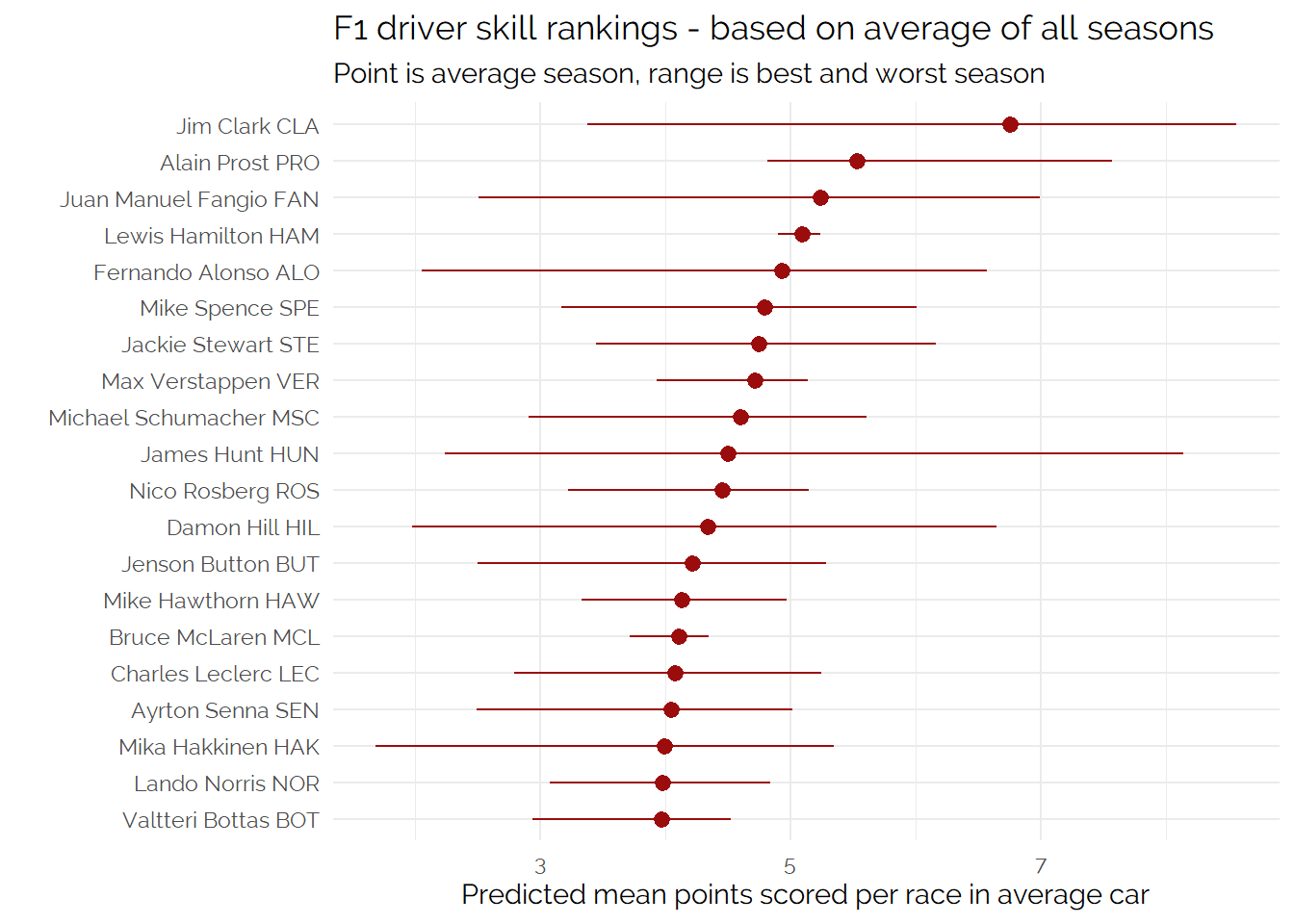
Looking at just the averages, one change which catches the eye is that Lewis Hamilton is in the Top 5, and his extreme consistency compared to other drivers.
We can look at the career evolution of these trends and see the contrast -
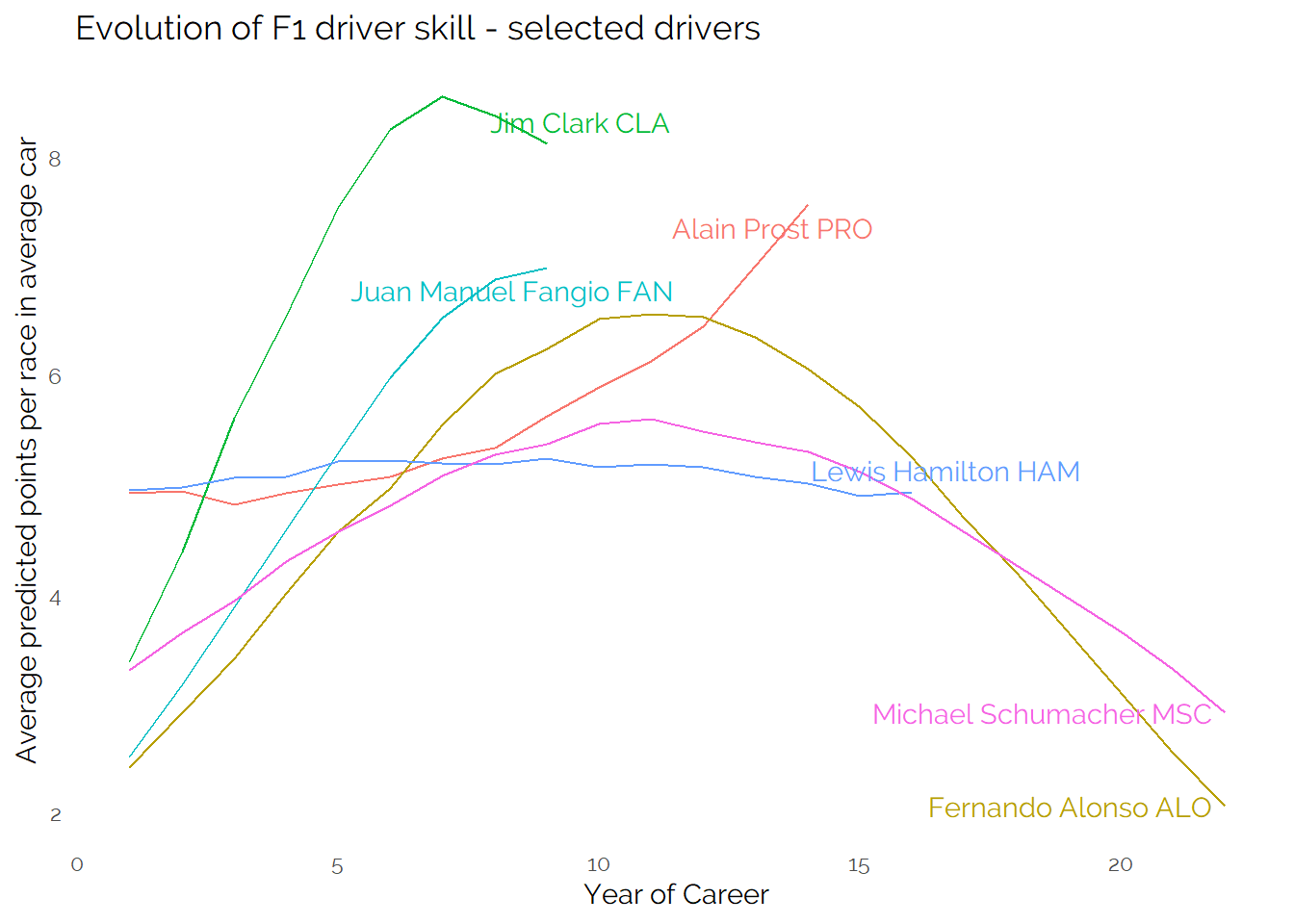
It shows the impact on the model of drivers who had success relatively later in the careers (Prost, Hamilton up to 2022). Hamilton consistently performing well in a good car in the latter part of his career has likely contributed to his lower peak but better average (vs Alonso and Schumacher who raced in less good cars at the end of their careers). This suggests that perhaps the model can’t perfectly untangle driver vs car performance - it does also show there is an impact on the choice of a quadratic model of performance over time.
Best 5 year average performance
Finally, some drivers have much longer careers than others. As we expect performance to decline over time once the driver is past their peak then averaging across a whole career might unfairly penalise those who had longer careers relative to those who had shorter ones.
To try and control for that, let’s look at the ranking based on the average performance across the best five years of a driver’s career (but we could have picked another number and gotten different results!)
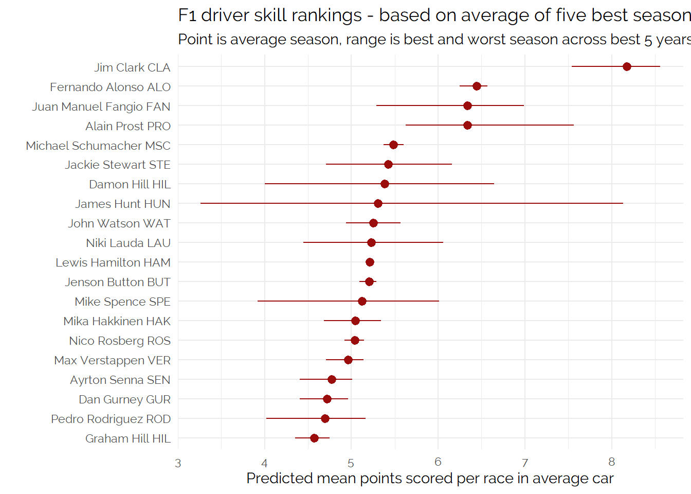
Based on what appear to be the characteristics of this model and the ways of summarising it, I think this final approach is my preferred one.
Conclusion
As stated at the beginning of the article - even using data, it’s not possible to get to one answer to such a complicated question as who the “best ever” driver is or an objective ranking.
Even with one model, you can come up with three (at least) answers to a question, and a huge range of other options!
I think combining the predictive model with averages (instead of just peaks) provides the better answer to the question - which of these approaches (whole career or best 5 years) you prefer probably depends on your subjective opinion of Alonso, Hamilton and Schumacher given how the difference choices impact their positions towards the top of the list and the number of championships shared between them.
That said, across everything I did here, one name consistently topped the list, and that is Jim Clark who achieved a lot in his tragically short career and produced some incredible statistical achievements around win %ages, laps lead and so on.
Consolidating the different analysis together, I think you can get to a top 7 which is something like:
Jim Clark
Alain Prost
Juan Manuel Fangio
Fernando Alonso
Lewis Hamilton
Jackie Stewart
Michael Schumacher
The final four are less clear than the first three, and this ranking is not as scientific as what has gone before.
I think it’s not a bad list - it is interesting the names which don’t appear towards the top - especially Ayrton Senna who would feature somewhere towards the top in most rankings of this sort.
More investigation could identify if there’s an obvious “flaw” in this approach which penalises specific drivers - which is back to the key point of this article that by doing that you’d be choosing an analysis which gives you the answer you expected beforehand showing the inherent subjectivity of “objective” data analysis!
For example, without trying it, I can imagine that including a measure of qualifying results or lap times may benefit Senna more than purely looking at race results.
Appendix - Additional analysis of recent drivers
The model used in this post is an attempt at using data / statistics to achieve something along the lines of comparing drivers who raced against each other in the same team to get to a comparison (but in a more consistent way).
Within the current grid there are number of drivers who have overlapped at Red Bull, Ferrari and McLaren over the last several years. As an additional analysis I’d like to see how the model ranks these drivers and plots their change in driver rating/skill over time.
This can help to give confidence in the modelling approach, do the results it produces map to our intuitions?
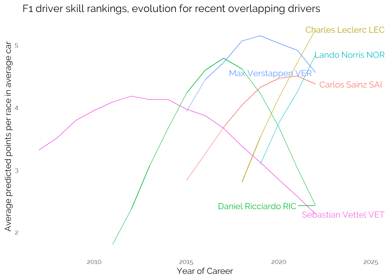
In this visualisation we’ve switched to use actual years instead of career years so that it is easier to understand the overlapping of drivers at the same team.
The story of this visual makes intuitive sense - Vettel won his world championships aided by a strong car and was closely matches with Ricciardo who performed strongly alongside Max Verstappen at Red Bull. Ricciardo was a long way off Lando Norris at McLaren - and Charles Leclerc has generally been ahead of both Vettel and Sainz at Ferrari.
It’s probably fair to expect a close battle between Leclerc, Norris and Verstappen in equal machinery - the exact scoring and ranking is arguable, it looks like Verstappen is hampered by a slightly longer F1 career to date than these other two. He started very young and based on the overall trend across all drivers he may be expected to be declining after this many years of his career (without enough data of strong performance to flatten his curve like Hamilton).
There’s evidence here that the model does not perfectly smooth out the impact of career length or perfectly decompose car and individual performance - but overall it does give a lot of results which “feel right”.
It will be interesting to see how the curves for these drivers develop after the 2023 (and further) seasons.